Showing posts with label portrait. Show all posts
Saturday, January 04, 2014
Skin palette
When I paint portraits, people sometimes ask what colours I use. I don't have a specific formula that I can provide, as it depends so much on the complexion of the individual. Most skin tones that I create are varying mixes of red, yellow, blue and white. I know that doesn't help if you're looking for specifics in terms of colour names and brands, but those colour choices change depending on the subject and what colours I have available.
For this portrait of my granddaughter I'm using cadmium red, yellow ochre and cadmium yellow, ultramarine blue, ultramarine violet,and titanium white. Brands are a mix of Utrecht, Kama Pigments and Winsor & Newton. I've added a small amount of Gamblin Radiant Turquoise and Radiant Red as well as Asphaltum in the darker shadows.
Each artist has her own favourite colour mixes and convenience colours in tubes that are to 'go to' when skin tones are needed. As my grand daughter is so pale, I may add a glaze to the shadow side once the oils are dry to give some warmth and depth. Of all the faces to paint, the ones that provide me with the most challenges are childrens faces. A child's head shape and softer facial features take subtle value changes to create form and accurate representation. Lots of measuring for accuracy is needed to keep a likeness.
Sunday, August 11, 2013
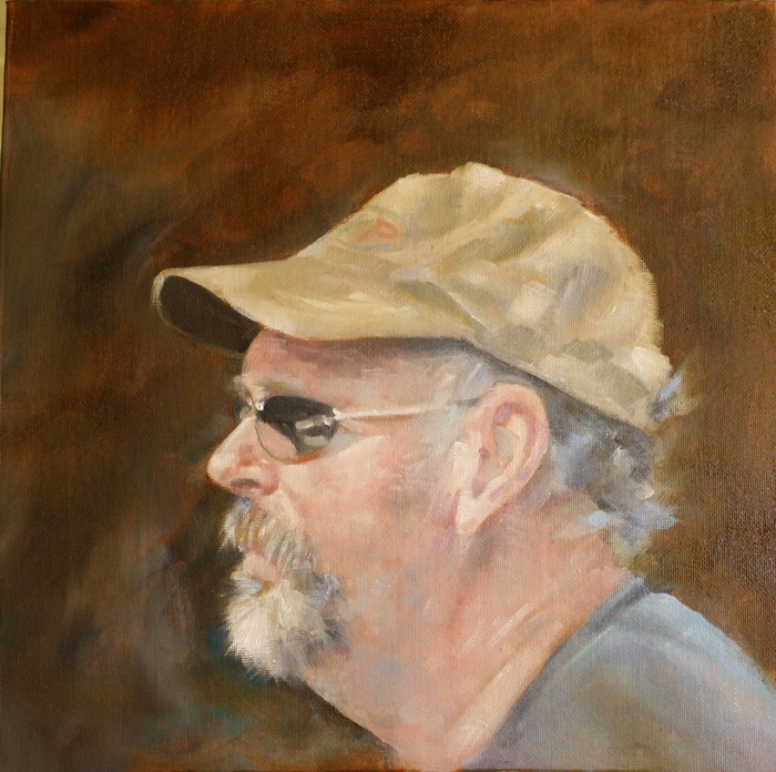
Gary Everest Portrait - complete
Gary Everest
Oil on canvas panel
11" x 14"
I've adjusted the colours and refined the shapes and added some colour to the shirt, that may need a little more work before signing. Right now, its going to sit for a week to dry and look at my from across the studio while I contemplate any last alterations before its final and hands off.
Here's a closer view of brush strokes and colours. As usual, my photography skills and photoediting as well as computer monitor colour limitations detract from the original. I so wish there were a way to get a true representation of a painting online. Or maybe its just my inability to do so well. In reality, the portrait is warmer in value. I may take the painting outside shortly and see if I can get a truer representation of colour.
I really enjoyed working on this portrait and Gary's working on mine which is quite fascinating to watch unfold. I love seeing how other artists work, its like peeking over their shoulder in their studio and is always such a privilege to do so. Do visit Gary's blog and watch his progress, you won't be disappointed.
It is always a challenge to work from a photograph and not have even brief access to the person in real life. The combination of the two, especially in portraiture, provides a wealth of knowledge visually that a photo can never reveal, both in skin tone and in personality, that are vital to making a painting work well.
Sunday, April 21, 2013
Billie and Bunny II
I thought there should be a more archivally permanent version of the Billie and Bunny sketch that I did last week, so here's a 5" x 7" in acrylic of the same piece. This is available for purchase on Daily Paintworks and you can also purchase a variety of reproduction options and note cards of this painting through Fine Art America.
I have also made available the first four Fishy Bits prints as notecards and reproductions as well and will continue to add prints as they are completed. Original prints are always available from my website www.jeanettejobson.com
Saturday, December 29, 2012
Tuna?
Tuna?
8 x 8 oil
Like most things, repetition can improve skills. Its no different with paintings and there are some pieces that need a second look. This is one of them.
A couple of years ago I did a painting of Tripod, called The Stalker, which sold fairly quickly. I liked the position and lighting and came across the image while looking for other reference pieces and thought I'd try it again.
This piece is higher key, and perhaps his attention is more to the sound of a can opener for his favourite food, tuna, now.
Sunday, September 30, 2012
Changing
I'm still working on portraits and studies for portraits and may do so for some time to come. Its a bit of a test/refresher for my portraiture skills and a change of subject from the usual fish and water. Not to say that they won't be making an appearance too.
I was also testing painting straight to canvas instead of with charcoal or pencil first. I'm not completely pleased with the outcome and feel I really need that structured value map to guide me, otherwise I spend too much time making adjustments to features to compensate for too loose a guide to start with.
Life is crazy hectic, I've had some eye problems that are ongoing and my ability to post regularly has suffered. It makes me think more about quality than quantity and I know I sometimes post simply for the sake of words and images, rather than sharing good information and art.
I am going to try for a single post each week and see how that works out for me. It may move to more but for the next couple of months I will post once, likely at the weekend. I have been blogging steadily for seven years, over 1800 posts, endless comments, hundreds of paintings - its a lot of information that I never knew was even in my head and to be honest, I'm running a little close to empty right now and need some time to regroup thoughts and ideas that are going forward into the future for projects.
This study has been a bear to get a photograph. The light is horrible today and the painting too wet to move to better lighting. Its not complete and I'll work on it a little more before calling it quits. Its in oils on 12 x 12" canvas panel. I quite enjoy portraits on this size support. not too small to make features difficult to paint and not to large to become a marathon painting session. Most portraits this size can be done over a period of a couple of days allowing about 3 hours painting time per day.
Tuesday, September 25, 2012
Stringy
After many months of painting water and fish, I wanted something different. I wanted portraits again.
There is endless interest in the human head and face, with so many people to choose from. I thought I'd get some practice in with some people I know before I hunt down new victims :).
This is one of my husband's friends who helps out in the woods. Brian, often referred to as 'Stringy' was a neighbour when I lived in Pouch Cove and his children went to school with mine. Odd how people get nicknames, more so males, isn't it?
This is in oils on a 12" x 12" canvas panel completed in about 4 hours.
Tuesday, June 05, 2012
Changing the subject
When I first started selling and marketing my art, many years ago in the UK, my bread and butter income was from animal portraits. I have evolved (or should that be devolved?) into fish and water, but I still keep a soft spot for painting and drawing animals.
I've been painting water steadily for a few weeks and needed a break so this little pug face was fun to play around with. Its on a 7 x 5 panel in oils left over on the palette from another painting. I started too far down the panel for some reason, but the dog was resting its chin on a surface. Then there's the nose that just won't do what I want it to... If it was a commission, this would be a study and I'd fix the composition on the main painting. But as it was practice sketch, I'm not worrying about perfection.
And pugs. Haven't they got such sad little faces, but simply adorable?
Tuesday, May 08, 2012
Sleeper
Sleeper
Available for purchase on my website
“Why do cats sleep so much? Perhaps they've been trusted with some major cosmic task, an essential law of physics - such as: if there are less than 5 million cats sleeping at any one time the world will stop spinning. So that when you look at them and think, "what a lazy, good-for-nothing animal," they are, in fact, working very, very hard.”
― Kate Atkinson
I am guilty of over tinkering the self portrait in the previous post. After frustration and hateful adjustments, I conceded defeat and wiped the portrait from existence. And I don't feel bad about it all. I captured a moment in time and now its gone as moments do. I will try again. We learn from each mistake and each failure.
What I have learned and continue to learn is to trust my gut feeling in painting. I have learned that the first strokes, put down fresh and without thinking too much are the best ones. I have learned that adjustments are very tricky and seldom add to a piece.
So despite what I learn and know, I will continue to make mistakes and kick myself for them. I will continue to solicit advice and input from other painters and continue to ignore that and let the little voice in my head fool me into taking yet another step towards the precipice. But I will continue to try.
So replacing the portrait on the same canvas is this snoozing cat. Still in oils, loose and I WILL NOT make any adjustments. 10" x 10" canvas panel
Saturday, May 05, 2012
May Self portrait
I don't know why I decided to do a self portrait this morning, it just seemed to fall into place. Its been awhile since I did one and time has a way of improving technique - and altering the subject matter too. Creating the planes of a face is always interesting and trying to match colours to shapes even more so to make a 2 dimensional image breathe life. Self portraits are such good learning experiences
So here is the portrait as it currently sits. There is still lots of work to do on it to refine it further. The mouth is making me crazy, it just won't do what I want it to do, but I'll keep modelling it until it submits. The whole piece a is pretty high key right now and I want to increase the shadow as the lighting for this is fairly strong, with that bright light coming from the right.
Its worth tweaking it til I get to where I want it to be, but not over tweaking so that it still has that 'painterly' look to it and isn't too stiff or contrived.
This is on a 10" x 10" panel in oils.
Tomorrow the local art group that I am involved with will hold a one day exhibition and sale of small works. For some strange reason I'm not running around like a mad thing tonight finishing up loose ends and all stressed. That probably means that I've forgotten something major!
The exhibition will be held at Admiralty House, 365 Old Placentia Road, Mount Pearl and will be open to the public from 11am to 5pm. Lots of original work, super affordable prices, and nothing larger than 8 x 10. Do drop by if you want to escape the fog and cool breezes, I'd love to say hello and share some of my work with you.
Monday, December 12, 2011
The Last Drop II
I don't seem to have long enough blocks of time to sit down and completely a painting, so I chip away at it in minutes and hours til its done. This is why you see endless 'in progress' pieces on the blog.
I have started this image a number of times. I swear my grand daughter will be grown up by the time I finish something I will be happy with. This painting was put aside and I wasn't happy with the skin tones, too blue and cool, even if she is quite pale and blonde with the skin tones that are more blue than pink.
I pulled it out in the wee hours of the morning when I could not sleep to see if I could revitalize it. I seem to switch from tight realism to loose impressionism at will. The original painting was tighter and I wanted something looser this time around. I wanted to let some of the underpainting come through but also give the skin a feeling of life. Its a little pallid right now but more colour will come.
It is 8 x 8 inches in oil.
Saturday, September 17, 2011
Portrait study
Ever the frugal artist, I was at the end of my palette after finishing up a few oil paintings, and used what colours were left to do a quick study of my youngest daughter when she was 3 or 4 years old.
I'd put out a tub of blackberries to thaw on the kitchen counter and found young madam tucking into the frozen berries with a spoon. I found the photo while looking something entirely different. It was meant to be.
This is the progression with no initial drawing. Sometimes quick studies are the easiest and most accurate as I tend not to over think them.
Saturday, August 06, 2011
Eveline - complete
8 x 10
oils on canvas panel
Update: I've added this better image now that some of the shine from the oil has diminished. This is truer to colour and value of the original, though still a little light.
I've finished the final glazing and touches on this piece and am calling it done. Well I may still tweak that left hand curler a little more, but aside from that I'm not touching it. Because there is fresh oil on it, its difficult to get a decent photo, but this may be close enough for now. Its a little darker and browner in real life.
Although a grisaille is usually the underpainting for a colour piece, I'm leaving this one alone as I like the sepia-like colour. I used burnt umber for the base with some titanium white then glazed with Transparent Oxide Brown which I adore. It adds such warmth to a piece.
I used poppyseed oil and a little turps for the final glaze then softened the strokes with a broad fan brush. It needs to dry and sit for a few days, meanwhile onto a new piece.
Friday, March 25, 2011
Father update
Robert William Barber
1920-1990
I've worked more on this today as I had the day off due to a late spring snowstorm. I've added more definition and smoothing of features with thin layers of oils. The hair is...I'm not sure yet. His hair wasn't grey even at 70 years of age, just a touch at the sides and always kept military short. Conveying that is not as easy as I thought as the scalp shows through as an undertone almost.
I think I'm going to leave the face as is, but give more definition to the clothing. He was sitting forward in this piece and I don't have the photo anymore so I need to recreate how the jacket will look in that position for light and creases, etc. I'll set up a jacket in a similar position tomorrow and work from that. Everything can be recreated when needed.
I still can't seem to get a decent photo of this painting despite tweaking camera and photo editing. I think the colours are close at this point, but images on monitors are never perfect.
Thursday, March 24, 2011
My father - again
My father has been dead for over 20 years. About 6 months before he died I started a portrait of him, but it was never finished. He saw the start of the piece and liked it, but life - and death - got in the way to stop its completion. Although I've tried to draw and paint a portrait of him several times since, it has just never worked out as I wanted. The likeness evaded me at every turn.
I pulled out the old portrait tonight to look at it again and see if I could revive it. The image below is the original portrait that was started about 21 years ago. It was painted in acrylic and as it was a thin layer I figured I would take a chance and paint over it in oils. The canvas board is 16 x 20 and the portrait a head and shoulders quite small in a dark background. Perhaps it was symbolic at the time, who knows?
Using another image of him, as the original photo is heaven knows where, I started repainting his features in oil and lightening and softening the background around him. Getting a photo of the current painting has been nightmarish, but this is the best I can do for now. Another one in daylight tomorrow may be better. I'll continue to work on this. I don't want it to be heavily detailed. It should be more like a memory, a bit misty.
This time I think its going to work.
Monday, February 28, 2011
Portrait winner chosen
I've made the drawing for the winner of an original portrait using a random number generator from 209 entries. These were from names of subscribers to my newsletter, my artist page on Facebook and from direct emails responding to why they would like a portrait. The winning number was 192 and I will contact the winner by email. The winner's name will be announced in my March newsletter. Thanks to everyone who participated!
This little jug was a study piece completed for the Daily Paintworks Challenge to help concentrate on values. The piece can be purchased here.
Saturday, February 19, 2011
The art of judgement and the judgement of art
Sterling Fellows
charcoal and white pastel
19" x 25"
I won't belabour the point as I've had my rant over on Facebook about the vaguaries of criteria for acceptance and rejection of art in juried competition. This piece was submitted and rejected to a juried competition. That's fine. No problem. My ticked box on the application form asked for adjudicator comments, in my hope that I would receive something that would help me in the future if the piece was rejected. The note that was sent with my rejection letter told me that I can draw well, create great atmosphere, but I need to add colour and broaden my composition.
Hello...there was no colour because that was the purpose of the piece. NO COLOUR. So the feedback is basically telling me, yes, you can draw well and create a scene, but we'd really prefer you made it in colour and choose a different composition. ie it would have been better if I hadn't done it at all or done it to someone else's criteria. I was asked for and included an artist statement. I guess they never read that as it may have given a little insight into my work and its theme of fish. These comments weren't telling me why the piece was rejected, or how I could improve it technically. I see these as comments from a group/individuals personal preferences in art and how they would prefer to see the piece if they had created it.
So I'm left shaking my head and mentally ensuring that I don't enter that competition again. I should have learned after the rules were changed the other year where a piece must be hidden from the world before being entered.
I don't mind having work rejected, in fact I expect it, as not all work suits all exhibitions and my piscean creations aren't everyone's cup of tea, nor is representational art. My problem is with the criteria, or what seems to be lack of, in both the ability of judges to choose work objectively and to respond, if required, with comments that can assist an artist to grow. I'm likely flogging a dead horse to rail at it from time to time, but I will continue to do so.
________________________________________
Now on to a lighter note...if you subscribe to my newsletter, you will know that I am having a contest until the end of February with a prize of an original portrait. However, I thought I'd share it here as well. Details of how to take part are below.
This contest gives you a chance to win an 8 x 10 original portrait. The portrait can be of you, a friend or family member or a pet. I will choose the medium and the winning name will be drawn on March 1st.
The pieces shown here are drawn in charcoal. Your portrait may be in charcoal, graphite, or coloured pencil. Perhaps painted. Its all part of the surprise...
There are several ways to win.
1. I will have a contest post on my Facebook page. Join my Facebook page
(you need to click 'Like') and let me know why you want to win a portrait.
2. Become a subscriber to my newsletter. Current subscribers and those added up until February 28 will be included in the draw. You can join in the link on the sidebar to the right here.
3. Send me an email between February 15 and 28 and tell me why you would like a portrait and of who.
The winner's name will be announced in the March newsletter.
Good luck!
Sunday, January 09, 2011
The last drop
I had started a portrait of my grand daughter ages ago, then go sidetracked but today I thought I'd have another try using the same reference photo. She was about two and it was just after her bath. She stood by the window in late evening light, eying up my camera, which was the incentive for staying still long enough for me to take a couple of shots. Its called 'The Last Drop' because, if you look closely, you'll see a little drop of water on the tip of her chin, as she was too impatient to be dried off thoroughly, wanting to get back to where all the people and action were.
This is the piece so far after about a half day's work on it. Its acrylic, 6 x 6" on canvas board and I'm working the layers up slowly and will start adding more glazes to deepen the colour. Her skin is very pale and there are a lot of cool blues in it, but I don't want to overdo it, so the glazes will be warm. I also need to darken the shading on the right side of the face that has more shadow to it. Again, it must be subtle so I don't overdo it or make it muddy.
Sunday, January 02, 2011
Study of Sarah in sunshine
I've had some images that I took back in August from a model who came out to the farm to pose for me. Its only now that I'm starting to work with them and decide just where they're going and what I'm doing with them. Sarah had lovely titian hair and it glowed in the sun. That combined with her pale Celtic colouring made it a perfect candidate for a little watercolour portrait practice today.
This is done on 140lb paper 5.5 x 8.5 inches. I wanted to leave it loose and ensuer each layer of colour stayed translucent. I'm not happy with the mouth. I kept reworking it and it just won't do what I want it to do. But for a study, it lets me see the colour range I can use in a main portrait. Although the reference image doesn't have dramatic lights, I want to also intensify the contrast between light and shade to give a strong illusion of bright sun, as well as darkening the hair.
I just love how studies can be so useful!
Monday, December 27, 2010
The deal
The completed painting is now available for sale on my Original Work page.
This fleeting image of Tripod in a Santa hat was a compromise between me and him. He very begrudgingly wore the hat and posed for a few photos in exchange for a couple of handfuls of Temptations - the crack cocaine of cat treats. Yes, the ads are right, cats will virtually come through walls to get whatever it is that is in these little kibble pieces.
I did a drawing of Tripod in a Christmas hat a few years ago, probably his first Christmas in this house and he was happy to pose. Now its a different story. As soon as I pick up a camera he hightails it out of the room or, if on a lap, gives me 'the look'. You know the one. It plots your downfall at a later date as he considers which is the best form of torture for humans. Tripod's favourite is the 3am cat call in my ear to insist on going out.
However, the deal was made. He got his treats, I got my photos and this is the result of the painting. Its on 10 x 10" canvas panel in acrylics. I planned on oils, but had run out of thinners and couldn't be bothered to drive in to town to get more as I knew it would be heaving with shoppers looking for sales.
I still have some tweaking to do with this, but here are the progress shots to its current state of completion.
Sunday, October 10, 2010
Contemplation
I'm still using up old canvasses and painting over images I didn't like. This is another of Tripod contemplating his next move . The subtle, thoughtful pose doesn't indicate what goes on inside his head. Its somewhere you probably don't want to go...
This is the image so far. I still have a little work to do to add some more definition to the face and its done. Its 8" x 10" on stretched canvas in acrylics. Eyes are difficult for me to achieve in this medium. The ability to blend paint well is limited in acrylic as it dries so quickly, especially as I'm using glazes for colour in the eyes.
A few well placed Anglo Saxon phrases and a few repaints and I think I'm there with the eyes.
Subscribe to:
Posts (Atom)


.