Saturday, January 24, 2009
The look
"After scolding one's cat one looks into its face and is seized by the ugly suspicion that it understood every word. And has filed it for reference."- Charlotte Gray
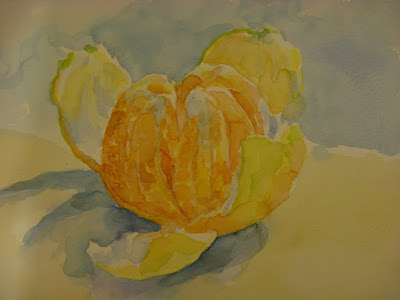
Anyone who's ever owned a cat knows this look. Its that mix of anger, disdain and extreme disappointment in the human race when they have once again failed to anticipate a feline's wishes.
This sketch in watercolour let me try to capture it.
Friday, January 23, 2009
# 3
graphite 8 x 10
I don't know why I drew yet another version of this clementine. I guess I'm just testing to see how different mediums look on the same subject. I'm sure I could go on to many other mediums but think I'll stop at these three.
My scanner seems to make horrible scans lately or perhaps its my tweaking ability. I prefer a photo of it, but that need to wait til daylight.
After doing so much painting for the last month, it feels good to go back to drawing again. I love the ability to create finer detail with pencil and the portability that goes with it. This little drawing came to work with me and I worked on it at lunch then finished it off tonight.
Now onto my next project!
Thursday, January 22, 2009
Portrait study
I am in a portrait study group and have been working slowly at the first portrait, which is of Rose Welty. I've changed aspects of it several times due to not checking my measurements carefully enough. I think its on the right path now but I have more work to do with it. This is the progress so far.
Most of the time I draw freehand, but sometimes when I want to really be sure a piece is correct I use an abbreviated version of a grid so I can gently place the main features then go on from there unaided.
I love using charcoal and white chalk on toned paper. I can manipulate it and control it (doesn't that sound so very sadistic??) Dry media will always be my fall back to comfort.
Wednesday, January 21, 2009
Ripples
There must be something in the air, as lino prints are springing up everywhere. But why not? Its a lovely indoor winter activity and becomes easily addictive. I've just received a new supply of lino blocks and a set of carving tools as well as a sheaf of paper to print on. And today my book arrived from Amazon: The Printmaking Bible by Ann D'Arcy Hughes. A lot of the information is well over my head at the moment, but it does entice me to experiment with more types of printing besides relief.
The initial proof of ripples on water didn't take up as much ink as I wanted or I didn't rub it enough, so I decided to add some colour to it, inspired by Vivien Blackburn's exotic lino print. I used coloured pencil and will continue to experiment with more lino prints and colours.
I like the abstract feel of lino prints and adding colour gives another dimension entirely without the process of reduction or multiple blocks. Hand coloured...
I've seen some portraits done in lino and would really like to try that next. It may take a little planning to work it out, so stay tuned.
Tuesday, January 20, 2009
More vitamin C

I am trying several other versions of the clementine reference that's in this month's Virtual Sketch Date. This is the watercolour version. I love the sunny colours of this fruit, it definitely brightens up a January day. However, technically I'm not entirely happy with it as it needs more white in it for the pith on the fruit. I should have taken the time to add some masking fluid, but I didnt. I may try a little gouache and see if that will be effective, or simply store the thought of better planning for the next piece.
Self analysis is very useful when you don't have an experienced critic at hand. And over time, you learn to spot weak areas and know almost instinctively what needs adjustment, what lines are out of whack and when to simply trash something and start over.
Its useful to draw or paint the same piece over and over and I see something new each time I do. The next piece will be in charcoal or carbon I think. And perhaps large. I'm trying to break out of small pieces and the transition is difficult. There is a comfort level for me in both dry media and in size restriction.
Going to larger pieces provides a new set of challenges in terms of the technical aspect of creating something larger than life on paper so that it is drawn correctly. Just the sheer size can become daunting as well, when I'm so familiar with working on a small size and the time frame that it encompasses. Larger works mean larger blocks of time for completion. I'll need to bridle my need to see completion earlier.
Monday, January 19, 2009
Three heads are better than one

Dora
9 x 12 graphite
9 x 12 graphite
I did some portrait drawing from life again tonight. The class doesn't seem to be moving in the right direction, so I don't know if I will continue, however, I do enjoy the chance to draw faces any chance I get.
I was the model for one of the 30 minute poses and it felt odd being there again. I used to model a lot for artists years ago and can't remember body parts going numb quite so quickly as they do now!
These are approximately 30 minutes each. I was trying to do some simple value maps within a couple of them to see if I could translate them into more refined drawings later, but without the model in front of me, it would be difficult to do.
This last scan is terrible for some reason. A bit of light under the cover perhaps. And I can't be bothered to scan it again right now.
Sunday, January 18, 2009
Does size matter?
I wanted to experiment with a larger piece to see the impact of it. I've always worked on small canvasses, perhaps feeling safer there. I took the small graphic self portrait that I did for the sketchbook project and translated it onto an 18 x 24 canvas. Of course in my haste to get something on canvas, I didn't paint the background, so the face and hand is currently bare canvas. Once it dries a bit, I'll go back and add paint to that section.
The rest is painted. I started out with just venetian red on the canvas, then wanted colour, so the sweater was added in viridian which I toned down a lot. I'm not sure if I want that in there now or not and if there would be more impact with all white and just the red, like an oversized lino print or whether I should go for a strong graphic feel with colour as the background.
Its quite nice to work on a much larger size, if not a little intimidating. Everytime I walk into the studio, the size of the piece hits me. However, often size does matter...
I have a lot of images on my hard drive and on an external hard drive and on cds. Some of these are well stored with lots of neat directories and files telling me what is in them. A lot more are stuffed away all over the place, leaving me searching forever for a particular piece.
To make one little part of my life easier, I've set up a Flickr account to store some of my pieces, but in particular the Watermarks pieces so that I can view them at a glance and know what areas I've covered and where I want to go.
I've even managed to create a little slideshow of the watery marks I've made so far. I'm always so impressed when something electronic works for me!
Subscribe to:
Comments (Atom)


