
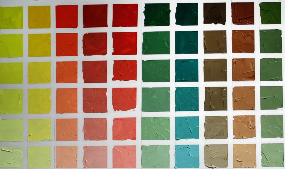
Cadmium Lemon Yellow colour chart
When learning colour theory I created stacks and stacks of colour charts. Working out combinations of colours in different mediums, the charts were extensive. When moving from the UK to Canada, some tough choices had to be made on what to take and the colour charts lost one of the battles.
As colour theory is such a strong component of what I teach in art workshops, I figured it was time to bite the bullet and make another set of charts, this time using the current palette that I use, a split primary palette, as well as a couple of other common colours thrown in for good measure.
I know everyone rolls their eyes at the thought of creating a set of colour charts, considering it boring and time consuming. But there is no other way as effective at familiarizing yourself with how colours react with others as creating a colour chart. Charts don't all have to be completed at once and some people take a lifetime to complete a set, adding to them as new palettes are explored or looking at neutrals or a specific combination of colour. The possibilities are as endless as the colours that are found.
For my new set of charts I'm using 11" x 14" Bristol paper and oil paint. Yikes you say, paper??? Yes, paper. Strathmore Bristol two ply 400 series is thick enough to stand a thin layer of oil paint without bleeding through. I'm using a palette knife to mix and spread the paint on the paper and there are no additions of solvents or oils to dilute the paints.
I marked the paper into 1" squares and taped a 1/4" removable tape between the squares horizontally and vertically.
To create the charts I will use one of the colours in my palette and mixing it with each of the split primary colours I choose, create 5 additional values from the mixed colours with the addition of white, creating tints. There are endless colour chart possibilities and they will be created as time allows. This basic chart shows the range of colours that can be mixed using 8 colours plus white in a split primary palette. I usually have raw or burnt umber on my palette, but have added burnt sienna and payne's grey in these charts too. Any of the colours that you frequently use can make up your colour charts.

Time consuming? It takes about 45-60 minutes to create one chart at this size, including taping, mixing, painting labelling, etc. A labour of love.

I started this series of colour charts in the same way I lay out my palette, starting with the lightest colour and working my way to the darks. I'd encourage you to try at least one chart and really come to grips with the range of colours that can be created. They make fabulous reference charts when you're trying to figure out what colours to use in a painting and are beautiful colour statements as well.
The colours I use in a split primary palette are cadmium lemon yellow, cadmium yellow pale, cadmium red light, alizarin crimson, permanent rose, ultramarine blue, pthalo blue, burnt umber. I added burnt sienna and payne's grey as my go to convenience colours that are often on my palette.
I mix equal quantities of the colour I have chosen with each of the other colours. i.e., cadmium lemon and cadmium red light, which provides the most saturated colour mix of each square at the top of each line. Small additions of titanium white to the colour mix lightens the value as I descend the line. Of course you could increase the number of squares and lighten the value all the way to white if you wanted.
7 comments:
I think I like this idea. I've never done any charts apart from a grey scale chart but I use colours like Naples yellow and Venetian red a lot which often don't do what I expect of them to. It would be wise to be prepared!
Thanks Jeanette.
Mary, colour charts are one of the very best investments of time for artists. You will really get a good sense of what your preferred colours do and how they mix with other hues. There are often delightful surprises as to what colours can be created.
I'd love to see the charts you create.
I love colour charts. They are so useful and in a strange way, have their own beauty. As I work mainly in watercolour, I find it fascinating to see how an oil painting colour chart is made. Yes, it can be time consuming and perhaps a little tedious, but they are perfect for those days when you're feeling uninspired. Thanks Jeanette, I am enjoying your blog!
I agree Shevaun, there is a beauty in them - and a satisfaction in completing them too.
So pleased you looked in can come along for the blog ride. :)
Colorcharts! The best way for making friends with your paints. I paint mostly in watercolor, but I constantly do color charts. I made a template of squares that fits a watercolor notebook, and I often make a chart, just for practice, or to work out a specific palette I'm interested in using.
I so agree mockingbirds. It helps to explore the ranges in each palette, no matter what the medium.
besides making dozens of colourwheels for college, i have never actually made colour charts for any of the mediums i use. not sure why, they sometimes can be useful, i think its lack of space really :/
Post a Comment