Sunday, March 27, 2016
Jelly
Jelly is probably considered old fashioned now and not sophisticated for children or adults to consume. I remember it with fondness from childhood and my own children's childhood as a treat. Jelly and its more elegant, but less tasty cousin, blancmange. Either one wasn't served in just any old bowl, it had to be in a jelly mould which came in all sizes and shapes. I recall a glass rabbit mould which I loved but it must have gotten broken somewhere in the passing of time.
I found this old pressed glass mould in a cupboard when clearing my mother's house. I remember it being my grandmother's, who lived with us, and it held many a sweet treat. In the 60s jellied salads became the rage. They weren't healthy but got vegetables into reluctant children. I recall one made with pineapple and grated carrot in lemon jelly and another with lime jelly and green peas. I know...yuck right? See here for some "interesting" salads that were made with jelly.
The bubble topped jelly mould was common and made anywhere from the 1930s to the 1960s. Seeing the contents layered through the glass made the eating more interesting perhaps.
Now as for drawing glass, its one of those perceived difficulties. Its all about light and shade and picking out the specific areas of each as well as those subtle variances of mid tone with bright shots of white highlights that made it work. Observation is key for glass, but very achievable if you take your time. This is a quick sketch in my Moleskine with a few wonky angles as I didn't measure, but I see it appearing as a larger charcoal piece in the future.
Saturday, March 26, 2016
The Roaring 20s
I've been going through some old photos of relatives and came across rather battered one of a great aunt. The photo was taken when she was around 18 or 19 at the time, sometime in the 1920s. I love sketching relatives from the past. Looking at clothes and hairstyles and seeing what physical characteristics are passed down from generation to generation is interesting.
The hairstyle fascinated me and made me do a little research on hairstyles of the 1920s. This is when the "bob" came into fashion which was a trend that caused a lot of controversy and perhaps was a push into women's rights and a break from the patriarchal society rules of the time. Film stars of the time, such as Clara Bow, jumped on the bandwagon and I would imagine that my great aunt, like any other teenager, mimicked trends and fashion - and rebelled a bit too. Apparently the introduction of the bob also spurred the creation of the bobbie pin.
I remember my great aunt as having the characteristic thick curly or wavy hair that ran in my mother's side of the family (I seem to have gotten the dead straight gene but kept the thick part), so cutting her hair into a bob must have been problematic in terms of maintenance as most curly or wavy hair has a mind of its own.
Thursday, March 24, 2016
In the Pink
In the Pink - SOLD
5" x 7" oil on masonite
For a private workshop this week I looked through my reference images for something different, yet not too challenging, for painting. I don't often paint flowers but with Easter/Spring in the air, I thought a tulip might fit the bill. And it did. The individual who I was teaching had not painted anything previously and never used a palette knife but did a fabulous job with her first painting of a tulip as you can see in the image below.
Its interesting to see how different people approach painting, especially those not influenced by previous painting experience. Some have a natural ability to see colours and shapes, while others struggle with that observation. Practice, of course, brings the training of eye/hand that helps with seeing shapes and judging colours. Each person brings their own unique vision and painting style to a piece and its wonderful watching it unfold.
Sunday, March 20, 2016
Advice to my younger self
Self portrait - 1975
graphite
Hindsight is 20:20 and wouldn't it be nice to be able to mentor your younger self and provide the sage advice that time and experience provides?
From the artist's view point if I could advise my younger self here are some things I'd say:
- Get a thick skin quickly. There will always be critics and they will wound you to the core. Get over it. As you move up the art ladder, there will be people who try to knock you off. This will come in a variety of forms, from blatant plagerism and copyright theft down to the jabs and remarks spurred on by the green gods of jealousy and hatred. Ignore your critics and those intent on trying to hurt you. Keep your vision strong and your belief in yourself and your art stronger. But never be afraid to fight for what is right and what is yours.
- Become identifiable. Perfect your technique and find your style and medium. Nothing gets you more rejections than poorly executed art, art that encompasses a dozen different styles and mediums or art that looks identical to 20 other artists. Your style belongs to you. You work hard to achieve it, so guard it like a dog does its bone.
- Practice your art. Work in your studio daily, no matter what. Practice equals beautiful art and it inspires creative work. As Chuck Close said, "Inspiration is for amateurs. The rest of us just show up and get to work." Create a body of work of 15 - 20 pieces. Then create another. And another...
- Learn the art of marketing yourself. No one else will do it for you. Not unless you pay them a lot of money. Promote yourself and your work constantly. Exposure to eyes is what makes art visible. Keeping it in a studio collecting dust will not benefit you, or the world.
- Share your knowledge. No, don't sell the farm and reveal everything, but share your knowledge of technique to other artists coming after you. After all, technique doesn't belong to you, you are only a medium through which it is passed down from artist to artist as it has for hundreds of years. It is your duty as an artist to show others artistic techniques.
- Create what you love. Don't be swayed by what subject sells in a gallery, what a best selling artist paints or what the current trend is in art. Create the art that resonates within you. It will sell if you want it to. Be patient and wait for the right person to claim it.
- Nurture yourself. Surround yourself with beautiful things, beautiful surroundings, beautiful people. It need not be beauty in the traditional sense of pleasing to look at, though that is always pleasant, but more the people and objects that are pleasing to the soul. Artists create best when their soul is satisfied.
- Ring the bell. Leonard Cohen once wrote "Ring the bells that still can ring. Forget your perfect offering. There is a crack in everything. That's how the light gets in." Don't strive for perfection. Real beauty lies in imperfection and uniqueness.
Friday, March 18, 2016
Late Afternoon
Late Afternoon - SOLD
5" x 7" oil on panel
"All afternoon in the deck chair, I try to describe to my notebook the colors of the water and sky. How to translate sunlight into words?"Dusk and dawn are the artist's most prized times of day because light is beautiful then. The sun is low in the sky, casting long shadows and tinging the landscape with amber light. Those moments just prior to dawn or before dark when light is barely there adds more mystery. Shapes are indistinct and colours muted.
Author: Frances Mayes
Watching the light and choosing the right moment to paint or capture the light with a camera opens up a world of beauty.
Sunday, March 13, 2016
Cloudy with a chance of rain
Cloudy With a Chance of Rain
6" x 6" oil on panel
Clouds are so forgiving to paint and the colours that can be found in them make them interesting subjects. Like all subjects, looking for the overall shape, noting values and hues and where they change is vital to make a cloud look like, well, a cloud! Clouds such as this stratocumulus have wispy edges where some of the sky can be seen, while the body of the cloud has a denser look and the form is achieved through colour and value change.
Living on an island in the Atlantic, there's no shortage of clouds and "cloudy with a chance of rain" (or flurries) is pretty common in the forecast, so models are never far away.
Save 25% on all small paintings over $50 in my Etsy shop until March 31st. Enter BIRTHDAY25 on checkout to receive your discount. Have a peek and chose your favourite!
Tuesday, March 08, 2016
Limited strokes with a palette knife
Limited stroke exercise - peacock
Multimedia paper - oil paint
I use a limited stroke technique in workshops that helps loosen up participant's painting and reduces the concentration on creating detail. Its a common thread with many painters, this urge to create detail long before the painting is ready for it. Putting details in too soon usually means that you end up painting them over and over and over as shapes and colours are adjusted in the painting. This technique of course can be used with a brush but the end result should be similar and the key is using sufficient paint with either tool.
The limited stroke technique takes a little pre-planning before painting. First, I create a sketch of the subject and draw a map of the colour and/or value changes within the subject. The piece should look like a puzzle with abstract shapes within in. Next, using the palette knife that I will paint with, but no paint, I work out approximately how many strokes it will take to complete the sketch by placing the knife strokes as if I were painting and counting how many strokes will be needed for each colour/value. I make a note of the number of strokes that I think it will take to complete the piece.
Limited stroke exercise - pear
Multimedia paper - oil paint
A stroke is defined as one movement of the knife and cannot be lifted from the support. There is no going back to adjust, dab, or change. The aim of the exercise is to see how few strokes it will take to complete the piece. The key is to use lots of paint and manipulate the knife to eke out the stroke capability so that you can cover as much area as possible. Make a mark on the page or on another sheet with the paint colour or with a pencil for each stroke that you apply. Add the total number of strokes at the end of the painting to find out if you used more or less strokes than you anticipated. Test yourself with more versions of the same subject to see how few strokes you can use to create it.
The resulting painting will be abstract blocks of colour or value. This is not a painting for your wall, this is an exercise to help improve your ability to see shapes and colours or values. You should have a representation of the subject, but no detail. If you have detail, the purpose of the exercise has not be achieved and should be tried again. To ensure that it doesn't become "precious", I use sketchbook or multimedia paper and oil paint which I know are not the best carriers for the medium, with oil seeping out and staining the paper. But it is an exercise for learning, not for keeping or selling.
In this exercise using the peacock, I predicted I would complete it in 35 strokes, but managed it in 33.
In the pear, I predicted 27 strokes and painted it in 21.
Try the exercise yourself and see what you come up with. You'll be surprised at how it will make you really observe your subject, values and loosen up your painting ability.
Sunday, February 28, 2016
Morning Glory
Morning Glory - SOLD
6 x 8 oil on panel
"The breeze at dawn has secrets to
tell you.
Don't go back to sleep." - Rumi
Insomnia has its benefits, such as seeing sunrises over the water that would go unnoticed when still sleeping.
Friday, February 26, 2016
Drawing koi - WIP
There are two schools of thought on creating an under drawing before painting.
The first school is that the creation of a drawn guide for paint placement is essential for accuracy.
The second school of thought is that an under drawing isn't necessary and may even impede freedom of expression.
I'm firmly in the first school of thought, having been trained in classical drawing and painting and feel that these have benefited me to observe and translate shapes and values accurately.
My current painting on the easel is a bit ambitious in complexity. Its worthwhile throwing a challenge at yourself now and then to push outside the comfort zone and make yourself sit up and pay attention. I've drawn it freehand as I do with nearly all my work. The top right hand side has been altered just a little to reduce the size of the fish as its out of proportion with the others.
I created a speeded up clip of some of the drawing process. I'm busy fighting with the learning curve for a new video editing program and this video is not fabulous quality, but you can see a little of my thought process as I draw perhaps.
The painting is 24" x 24" on gessoed masonite. I like this surface more and more for painting.
Saturday, February 13, 2016
What is it about red?
Cruise Line - SOLD
12" x 24"
Does red attract collectors? Colour is used in marketing to trigger sales responses and here you can see an infographic on how the psychology of colour is used.
I don't consider colour as the primary influence when creating a piece of art. It factors into composition, form and light and combined, it makes a painting come together. I have painted red boats previously and they have all sold, so perhaps there is something in the theory of putting red into a painting.
Red Boat - SOLD
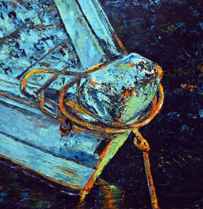
Buoy - SOLD
Autumn Gold - SOLD
Here are a few facts about paintings with red in them from a 2014 Telegraph article by Hannah Furness.
All four of the star lots in Sotheby’s 2014 February sale featured a striking red colour, including a Richter painting which sold for 17.4 million pounds.
An untitled work by Cy Twombly, valued at up to £7m, is said to be particularly desirable for being the "most red of all his works".
The importance of the colour red has been noted previously in the work of Piet Mondrian, with paintings featuring a red square thought to be more desirable.
In 2013 Brett Gorvy, co-head of contemporary art at Christie’s International, said red was the most lucrative colour in art works, followed by white, blue, yellow, green and black, in that order.
Philip Hook, from Sotheby's, has called the power of red " quite extraordinary", with a "judicious touch" giving a painting a "huge extra piquancy and impact".
The two top prices for works by Rothko are for red canvases, with four of the top five sales figures for Richter being for predominantly red paintings.
Saturday, February 06, 2016
The Storyteller
The Storyteller
20" x 20"
oil on canvas
“Tell me the facts and I’ll learn. Tell me the truth and I’ll believe.But tell me a story and it will live in my heart forever.” An old Native American proverb
I love weathered, rugged wooden boats. There's always a dozen stories at least in the chipped paint, the barnacles and rust. A modern fibreglass boat, while often elegant and streamlined, never is quite the storyteller that a well-worn vessel is.
This piece is just about finished. I let a piece sit on an old easel in the far corner of the studio where it catches my eye for a week or two and lets me know if any changes are required. Sometimes a touch up of a line or a colour enhancement take place, but rarely major changes.
While standing back from a painting every 20 minutes or so is very useful, give yourself even more space to really see a piece. Standing back further from a painting, depending on its size and situation gives a different impression of the piece than the "nose to painting" view. I know everyone (mostly artists) usually leans in closer to see detail, but especially in looser paintings, the detail is very abstract and only when you are at a distance will things jump into focus.
Friday, February 05, 2016
Heart Harvest
Heart Harvest
3" x 4" on ginwashi paper
I don't do a lot of printmaking, but I do thoroughly enjoy creating both relief prints and etching. The whole process, from design, to inking, making paper choices and the final reveal as the paper is lifted off the block or plate is intriguing to me.
I created this little print with spring in mind. Of course here that will be a long way off yet, but I'm optimistic that with the unusually warm winter we're having that spring may be a treat and not a misery of fog and dampness.
I'm not a fan or "Hallmark" holidays, which I always consider Valentine's Day to be, but if you do celebrate, this print could just fit the bill for the love of your life, or for a treat for yourself. A little bird pulling hearts, almost like worms, out of the ground, letting the wind scatter and share them to spread the love, is my thoughts behind it. And we all know that there's no harm in spreading some love around the world these days if you happen to watch the news.
I hand printed these in black or red in on ginwashi paper and have provided an option for personalizing a print with colour and words.
You can see the details of the prints in my Etsy shop.
Friday, January 29, 2016
Untitled boat
Untitled
30" x 40" oil on canvas
Some paintings take longer than others to produce and you never know when you start how the process will unfold. A painting may almost fall off the knife or I may have to paint and scrape and repaint ad infinitum until that moment arrives when it starts to come together.“The seed of your next art work lies embedded in the imperfections of your current piece. Such imperfections are your guides–valuable, objective, non-judgmental guides to matters you need to reconsider or develop further.” ~David Bayle
Working through what seems like a horrible session only to see that glimmer of recognition of the vision that you originally had. Its oh so easy to give up and try something easier, but there is no learning in that. Speed and ease should be removed from everyone's vocabulary when painting. Yes there will be times when both are there, but there will be more times when they are not.
This boat took a fair bit of working and reworking to get it to where I wanted it to go. I accept that not everything in the creation of art is easy and that's a major step in forward movement. Instead of abandoning a piece that isn't working as I want it to, I look at why it isn't working and fix those mistakes. Isn't that true of most of life and how to make it more pleasant?
Sunday, January 24, 2016
Thickening acrylic paints
As promised, here's a short video on thickening acrylic paint to use in palette knife techniques. I have another step by step video on using the thickened paints to demonstrate and am in the process of editing and making it available soon.
Enjoy!
Friday, January 22, 2016
Workshop demos
Orange Slice demo
5" x 7"
Oil on multimedia paper
The teaching adage of "See One. Do One. Teach One" applies to art workshops as well as any kind of learning. So aside from explanation of practical technique, participants need to also see how paintings are constructed and then get some practice putting that information into paint application. Whether they go on to teach one only the future can tell.
I do demonstrations of paintings and drawings at every workshop, some more finished than others, depending on how much time is available due to class size. I used to be terrified standing up there with expectant eyes on me, waiting for perfection. But now, I take it in stride, but of course, things don't always go to plan and perfection is rare.
I'm teaching some workshops for Anna Templeton Centre in the city centre. Its a lovely old (1849) building that used to be The Bank of British North America originally. Full of creaks and quirks befitting its age, it houses arts, crafts and design classes and is a wonderful space to work in.
Tuesday, January 19, 2016
Art journalling
Art journalling is a current trend over the last couple of years, turning into big business in some aspects. Its not fine art, but it explores creativity, colour exploration and drawing skills and encourages non-artists to dip a toe into the world of art. I've never been a big one for journalling, but always enjoyed sketching. On impulse I bought a new Moleskine notebook last weekend. I had used these quite a lot a few years ago and loved the creamy, wax-like paper surface. Perhaps I should have bought the sketchbook instead of the notebook, as the paper in the notebook is flimsier than the sketchbook and pen marks do show through to the other side, so I will be using one side only unless I decide to coat the pages with gesso if I want a double page.
I'm an abuser of sketchbooks and the Moleskine will be no different. It just may get a bit more abuse in terms of media and additions to pages. I don't view sketchbooks or journals as precious and "mistakes" should be embraced and shown as part of the process. Not everything will be fit for consumption, but some will be catalysts for paintings and further exploration.
Journals are a way to escape, be creative, work out ideas and release inner thoughts. An entry can take as little or as much time as you have available and become a colourful way of recording your view on the world. You don't need to be an artist to keep an art journal, but any time spent creating can only be beneficial if you're heading down that creative road.
I'm going to try to do something in the journal each day until its filled, then see where I go from there. I have several sketch books for general drawing but the journal will be a little different, a little more personal.
Attention seeking
You've worked on a painting, joined all the social media avenues, have a blog, have a website, but can't seem to get eyes on your work. How do you get your work to stand out in the giant sea of "art" that is now available online? With a recession biting hard at our heels, at least in Canada, it becomes more of a challenge to seek attention from the right people and make sales.
Monday, January 18, 2016
Drawing tips for success
Tea Bag
charcoal and white pastel on Canson paper
There is such a rush with some beginning artists to want to have a finished piece completed in such a short time. Unfortunately, that usually isn't the case and frustration bubbles up when it doesn't look as anticipated.
Drawing consists of a number of stages that need to follow in order for the drawing to be successful.
1. Decide on the size of your drawing so that it fits on the paper.
Running out of space on a page is a common problem for beginners. By marking boundaries for the top, bottom and sides of the space you want the drawing to reside in, eliminates this problem.2. Measure the size of the objects so they are in proportion.
Each subject has a specific height and width in the picture and establishing a basic unit of measurement provides the tool to ensure the the object is in proportion and ensures it is in proportion to other objects in the reference.
3. Block in the basic geometric shapes that you see in the subject.
All objects, when brought down to a basic shape, are made up from geometric shapes: circle, square, rectangle, triangle or cylinder. Look closely at your subject and establish the broadest shapes.
4. Start to define shapes more accurately.
Once basic shapes are in place, its time to start refining those shapes to reflect the subject more accurately. Use an H pencil and light pressure for all construction lines, so they can be easily erased or incorporated into the drawing.
5. Block in values.
Establish light, dark and mid values. These provide the form to the subject. Value mapping is drawing the shapes of values and provide a guide for adding values to your drawing.
6. Refine values.
Mid values are the most difficult for beginning artists to see. These are the ranges between very dark and very light and can have several values between the two extremes. Careful observation is crucial to see and understand the subtle value changes in a subject.
7. Add detail.
Jumping in with detail or highlights too soon in a drawing gives you a false sense that the piece is finished. Sharp details of light and dark and highlights should be the very last thing you add to a drawing. If added too soon, it's almost guaranteed that you will draw over them. Again and again and again before the drawing is complete.
8. Be patient.
A drawing takes as long as a drawing takes. There is no prize for finishing quickly. Build the drawing slowly, step by step. 80% of time should be spent looking at the subject, 20% drawing. Observation is so important to achieve work you are happy with.9. Practice.
Along with observation, practice is the most valuable method of becoming proficient at drawing. No amount of art materials, reading art instruction books, watching DVDs, admiring other drawings, or taking workshops will give you the skills that practice will. Without practicing drawing skills, progress will be minimal and diminish over time.
Practice. Every day. Even when you don't want to.
Sunday, January 17, 2016
Where do cows come from?
Under A Clear Blue Sky - SOLD
8" x 8" oil on panel
No, its not one of those "Mommy, where do babies come from" posts. This is about the origins of the current domestic cow. Now this is something you're either interested in knowing, or you've just hit the home button to get you out of this post.
Having lived on a dairy farm for a number of years and having the "maternity" field right next to the house on the farm, I was interested in cows, their behaviour and their personalities. Yes, they do have personalities just like any other animal. Some would have names, but a lot were just "cow" as there were so many of them.
Crasher, so named as she would pace up and down the hedgeline looking for an escape route. Once spotting a weakness the the growth, she'd crash through then stand on the other side wondering how to get back into the field again.
Or Lofty, a full two hands taller than the other cows in the field, so always recognizable and acting somewhat superior because of her height.
Sally was the old matriarch. Now barren, but still in with the rest of the herd, she'd try claiming every new calf as her own and was always in trouble for it with a new cow mother.
But back to the origins of cows.
From a herd of approximately 80 domesticated in southeast Turkey about 10,500 years ago, the current bovines have been domesticated from a now-extinct species of wild ox, known as aurochs, which roamed across Europe and Asia. Those cattle were then bred into the 1.4 billion cattle estimated by the UN to exist in mid-2011.
The original wild oxen (aurochs) were fierce and 1.5 or 2 times larger than the current domestic cow. Rumour was that a hunter or traveller would sooner face anything but a wild cow.
There, you now have your "did you know?" coffee break conversation for Monday morning.
Wednesday, January 13, 2016
Internal Fire
Internal Fire
11" x 14" Oil on masonite
Work in Progress
Reflections are the keystone of all my paintings, whether water surrounding a boat or the environment seen through glass or reflected on metal. The challenge of finding the shapes and colours to slot into place to create that magical effect never loses its interest for me.
I've painted and drawn glass before, as in this post, and these tended to be isolated studies of glass, but thought I'd go a step further with an interior scene. I haven't done a lot with interiors but the play of light on surfaces provides interesting subject matter. Mariana Gamboa kindly donated an image that was too enticing to resist.
Glass, like any other object, is a series of shapes, light and shadow. Beginners often find it intimidating, but I believe that is more about the initial perceived complexity. When broken down into smaller sections and looking carefully at the changes in values and colours, it becomes easier. Of course, the more complex the piece, the longer it can take and rushing to finish something is a good recipe for frustration.
This piece is done with a palette knife and my favourite colours - golds and turquoises. The painting is at the point now where details and little adjustments can be made to bring it to completion.
Subscribe to:
Posts (Atom)