
Definition from Wikipedia.org: "White is a color, (more accurately it contains all the colors of the visible spectrum and is sometimes described as an achromatic color—black is the absence of color) that has high brightness but zero hue. The impression of white light can be created by mixing (via a process called "additive mixing") appropriate intensities of the primary color spectrum: red, green and blue."
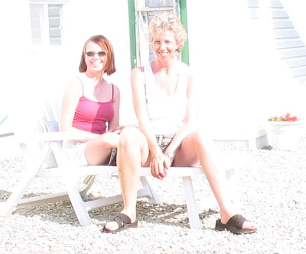
There is a coloured pencil project available in Wet Canvas. The project is about "painting white without using grays". I am in the process of deciding on a reference to use for this project. I enjoyed coloured pencils and learned a lot in Cindy's class last winter. I've had a little break from cp's and its about time I got back into them again. They are time consuming to build the colours, but the time is well worth spending for the end result. Here is one of the references that I am considering using for this project. Its an image of my daughter and me, sitting on the patio in very strong light. I'm not sure if the image is 'white' enough. I need the image to say 'white' immediately.
 The other option of a flower image may be more suitable. But if there's one thing I hate drawing or painting, its flowers. I don't know why, but they never appeal to me. Yes, they look beautiful, but the thought of drawing them makes my creative side shut down entirely.
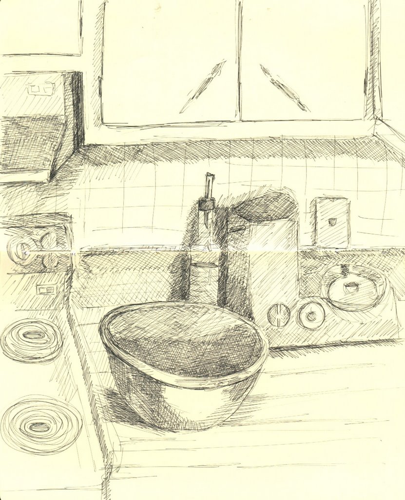
I have started on the second scavenger hunt, as the first finished with a clear winner. It wasn't me. I'm way to slow to even be in the running these days. But I enjoy the process and drawing from life forces me to observe closely those simple day to day items that I would often overlook in favour of something more exotic. Whoever thought I'd enjoy drawing the mess on the kitchen counter after supper!
Here are a couple of the drawings completed so far, including the kitchen counter tonight which I did in pen and ink in my Moleskine. I'm stingy using the Moleskine as I've nearly filled it. I have ordered another. Its crazy, I can never get them in Canada, so this one is coming from California. Borderless shopping. Whatever works. Other sketches here include my keys that I lug around daily like the jailor, and my nose. Its quite disconcerting to draw a nose that's disembodied.

 The kitchen scene was done in my Moleskine sketchbook with pen and ink, and no underdrawing in pencil. The elipse on the bowl isn't wonky, its an eggshaped bowl (and weighs a ton!).
Technorati Tags: sketch, white, drawing, scavenger hunt, moleskine
6 comments:
Two lovely women! The picture of you and your daughter is great and I was amazed when I saw the drawing of your nose. The hatching in the bg really made it pop.
I have the same problem as you with regards to flowers, Jeanette. There's just something about them that makes me go 'eh ... do I really want to sketch this?'
I think the photo of you and your daughter is a really great one -- the harsh lighting seems to have this artistic effect when you look at it for a while. Oh, and she's a very pretty girl. Probably takes after her mom. :)
Fabulous nose!
Thanks Mary. The nose seems really weird to draw without the rest of the face. Quite odd. Just wait til you try it.
Mallika, yes I don't know what it is about flowers that turns me off drawing them. I know I can do it, but perhaps its the complexity of them that I find daunting or the tones.
I'm still toying with using the photo of my daughter and me for the 'white' challenge. I'll have to decide ths weekend. And thanks for your comments. I know I'm biased, but I think she's pretty cute too. :o)
Thanks Anita, you haven't lived til you've drawn your nose. JUST your nose. Go try it. It will feel so strange.
The last painting I finished included my dog who is mostly white with fawn spots. I'm a painter using a limited palette without black or grey colors so painting the white-without-gray was very fun and easier for me, I think, because of that.
Here's a close up of that part of the painting:
http://www.smugmug.com/photos/70278014-M.jpg
Have fun. It is a very good exercise. The photo of you and your daughter is very blown out. Might I suggest using a photo that has more mid tones? That way you can "color" your midtones with more color, instead of having so much of the drawing blown out?
That is a beautiful painting Sara. The colours are muted and relaxed. Its lovely.
And you're right, the image of my daughter and I hasn't enough tonal values in it to make it an effective reference for this exercise. I have a couple of others in the back of my mind that I will make a start on.
Thanks for commenting and for showing me your painting.
Post a Comment