Thursday, February 14, 2013
Heart
I threw out a little challenge to other members of my local art group to come up with a heart for Valentine's Day. The time limit was very short - I only considered the option on the drive home about 36 hours ago but a couple of people in the group joined in.
Unfortunately, the Arts Northeast blog won't let me post pictures tonight for some reason, so I'll show you what I created and hopefully the gremlins in the system will allow me to post on the ANE blog later.
This started out with a sheet of watercolour paper that I had gessoed tissue onto and let dry. The resulting texture, with some additional string gel made a perfect surface that reminded me almost of veins and arteries running through the heart. A tiny bit of silver leaf finished it off. Its about 5 x 7" and acrylic as I wanted quick dry time.
I hope your V-Day was full of love.
Wednesday, February 13, 2013
Laid back
Sometimes you just have to relax and goof around. This is Jessie’s motto for life. There are no pretentions, no trying to impress, its all about enjoying life and having a good time. What you see is what you get and if you don’t like it, she doesn’t understand why and tries to persuade you otherwise. We could all take a page from a dog’s approach to life and just go with the flow instead of fighting it every step of the way.
This was a loose sketch done in pastel on newsprint. It was good to get loose and just let colour and shape guide my hand. A piece of paper that’s big enough, forgiving enough and with no expectation of outcome. I think I’m getting the canine insight into life already!
On another note, you may notice that my Etsy store widget is missing from my blog. After a number of years of selling on Etsy, I have closed my shop. I’ve found that Etsy no longer meets my needs. The sellers are too numerous and its looking more like a shop browser’s paradise and difficult for a fine art collector to sift through the craft to local original art. So I’m moving my small pieces for sale through my website at the moment and may try them on another small painting site in the future. But for now you can find them on www.jeanettejobson.com
What has your experience been with Etsy? Have sales slowed over the last year? Is there more craft than quality? Are fees an issue on Etsy or on other sites selling small pieces of fine art? Where do you sell your small pieces? Any input is always valuable.
Saturday, February 09, 2013
Winter Light
Pears are one of the most common subjects for painting and drawing. Simple, but also complex to capture the values to produce that round shape. I can't say that pears are my favourite thing to paint. Their overuse makes them seem almost too common, however, revisiting simple shapes and interesting light is always a good warm up.
Here's a short video of the steps I took getting to the final piece. I hate the red pear by the way it looks like a block of wood no matter what I do to it! :)
Thursday, February 07, 2013
Cecelia - SOLD
Cecelia sat by the surf, contemplating yet another herring. Yes, fish was good for the waistline, but her need for something more comforting was ever present. With one more look at the sea, she took to wing, heading for the nearest McDonald's parking lot to barter with the crows for left over french fries.
Yes, another small painting. I’m on a bird track but I do have other paintings in the wings, large pieces that will start to take shape over the next few days.
I do love birds of all kinds but haven’t painted many of them and not a seagull, well herring gull in this case. I find seagulls fascinating and living on the sea there are always hundreds of them around and they always seem to hang out at fast food restaurants. Easy pickings I presume. They are huge birds with bad tempers and a love for a fight with most any other bird that crosses their path. I recall a particular scary encounter with gulls at Paignton Zoo years ago at an outdoor restaurant.
Despite that, I still think they’re beautiful and deserve a large painting of their own soon.
Tuesday, February 05, 2013
Sparrow - SOLD
I can’t seem to settle into a major painting since before Christmas and keep producing studies or small paintings. I have ideas for larger pieces in my head and filling sketchbooks but they don’t seem to translate onto paper or canvas. I must buckle down and just produce and not let myself get side tracked.
This little house sparrow was one of the side tracks. 5” x 7” on stretched canvas in acrylics.
And some interesting facts about house sparrows:
1. In 1883, House Sparrows were legally protected in Texas. There was a law that disallowed the killing of any sparrow back then.
2. The House Sparrow first came to North America in 1851, when it was introduced to Brooklyn, New York. From there, the House Sparrow population quickly spread to the Rocky Mountains and on to the West Coast, mainly due to introductions in San Francisco, California and Salt Lake City, Utah.
3. Incubation of eggs takes just 11 days, and two weeks later the young will leave the nest.
4. Most pairs will try and raise at least two and often three broods a year.
5. Their adaptability can be gauged by the fact that they have been found living and breeding 2000ft underground in a coalmine; others have been recorded living their whole lives inside warehouses
Friday, February 01, 2013
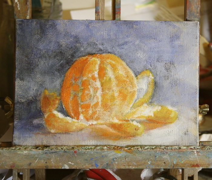
Orange study - SOLD
Pigments Through the Ages states:
The color we know as orange was referred to in Old English as “geoluhread,” which means yellow-red. The word “orange” was adopted after the eponymous fruit was introduced to English via the Spanish word naranja, which came from the Sanskrit word nāraṅga.
Orange and turquoise are my two favourite painting colours and they turn up over and over, especially in my fish paintings - well in most of my paintings you'll find traces of them. The orange I like is pure pigment, cadmium orange is a warm colour which turns more towards yellow and my turquoise of choice (more like easy access/no mix) is Daniel Smith cobalt teal blue, however I do create my own turquoise using ultramarine and pthalo green with titanium white. There are endless combinations of colours to create turquoise, depending on what value and warmth/coolness you want.
Still in acrylics I started this study of a clementine over a panel that I scrapped then restarted, using a black background over the offending part of the original painting and leaving the perimeter pale. Of course a form of blue and lavender crept in to offset the orange and there it was. No, not turquoise, but blues are never far away.
.
Monday, January 28, 2013
Blue Mussel
I couldn't settle on anything specific to paint tonight and decided to pull out my acrylics for some practice. After using oils for quite awhile, there is always a bit of a learning curve in using acrylics again. They're more common lately, as so many people have issues with oil paints and solvents and clean up is easier.
So hunting through my archives I found this little blue mussel shell. These are so common in Newfoundland seen on every beach it seems and are grown commercially. Unfortunately I am allergic to shellfish, so simply admire them from an artistic point of view.
This is on a 5" x 7" stretched canvas. I toned the canvas black and like the effect of a little darkness coming through the layers and will use the dark tone again I think.
Friday, January 25, 2013
1892
The Great Fire in St. John's, Newfoundland and Labrador on July 8, 1892, is remembered as the worst disaster ever to befall that city.
Daybreak on the morning of July 9, 1892 revealed the full extent of the fire's devastation.
"When morning broke the thick clouds of smoke still ascended from the burning ruins, and it was hours before it had cleared sufficiently to admit a view of the track of the desolating scourge. A walk through the deserted streets demonstrated that the ruin was even more complete than seemed possible at first. Of the whole easterly section, scarcely a building remained… of the costly and imposing structures and public buildings which were the pride and glory of the people, scarcely a vestige remained; and St. John's lay in the morning as a city despoiled of her beauty, her choicest ornaments, presenting a picture of utter desolation and woe."
There have been fires since, but none having the devastating effects that this had on the city. Rows of tightly packed old wooden houses and a strong wind whips fire into a frenzy and there have been a few near misses in the not too distant past.
So what is the connection between this painting and fire? I’ve been mulling over abstract or modern painting and dissecting the why and how of it to make it clear in my head. I’ll be writing another post about abstract art and my thoughts and ideas of how to get started with it for my own art group and will share some of those thoughts at a later date.
What I will share now is my finding that abstract art is not unlike most other forms in terms of construction. There has to be a concept to start with and an idea of palette, otherwise you’re slinging paint around without any pleasing form or contrasting areas.
For me, in creating abstract art, I become the medium and the painting shows me the path. Form and colour become intuitive and you just “know” what to do next. It is the case with this piece. It started out tamely enough, then a smear of modeling paste here and there, a strong pigment and a line and the idea of fire started taking over, just as a real fire would.
I have found that letting the painting guide me, as new age as that sounds, is a truth. Until you experience it, you cannot know the freedom it unfolds.
Saturday, January 19, 2013
Hot wax
Winter is a lovely time to dabble in encaustics, as there are always elements of heat involved. Melting wax on a hot griddle and fusing the layers with a hot air gun aren’t often things you want to do in summer’s heat, but they warm up me and the studio nicely in the colder months.
I don’t have a lot of experience using encaustics, but I do enjoy experimenting with the process of blending colours and more currently, embedding objects into the wax. These are two small pieces 6” x 6” on encaustic board where embedding is used. In the first, I’ve used a print of one of my paintings under layers of transparent wax. The fish and their circle is an original coloured pencil piece that I’ve only now made available for sale. The circle and its eternal, yet opposing directions reminds me of life and with that life, its origins, represented by the embedded ‘eggs’ on the lower half of the piece. In reality they are pink peppercorns.
The second piece ‘Eye of the Forest’ was inspired by the wooden layer of bark that I found discarded by some felled trees, the remnant of a knot where a branch arose. The patterning and placement flowed from there, as I wanted it to fit into a natural, yet somewhat dream like place.
Look for more encaustic from me this year, as time allows. I fully intend to test this medium and push its limits. Next step: burning surfaces, but not til I can get a clear day and a dry patch of driveway!
Sunday, January 13, 2013
Alternate watercolour techniques
Frozen Pond
Mixed Media 6” x 18”
Its good to flex my artistic boundaries and play around with the interaction between the real world and that which is on paper. One way to do this is through frozen watercolour. Of course being in a northern climate, it makes it a little easier during winter to be able to test this out.
Frozen watercolour is a technique of exposing very wet watercolour pigments on a paper surface to freezing temperatures. The result is unpredictable, always different and quite unique.
In the painting at the top of this post, Frozen Pond, I wet just the water section of the painting before freezing so I would only obtain the patterning on that section of the piece. The majority of the frost patterning is on the right of the painting, just where I wanted it. I used optimal temperatures for this piece and in the image below, it was much colder. You can see the difference in results for the formation of ice crystals. They are longer and sharper then in the lower temperatures.
I hope to create a full tutorial on the subject, but will share what I have learned here if you would like to try this technique yourself.
1. I have found that optimum temperatures are between –5C and –7C (23F – 19F) that produce the classic feathery frost patterning. If very cold (-12C – 10F plus) the patterns formed are random sharp crystals.
2. A domestic freezer will not produce temperatures low enough to affect the water on the surface. It will freeze but with no resulting pattern.
3. Wind and humidity play a role in the pattern formation and you have no control over the end results.
4. The paper must be flooded with water, then very strong pigment washes dropped onto the surface, then quickly placed outside on a flat surface.
5. Allow about 30 minutes for the freezing process to take place.
6. The best watercolour paper to use is 200lb if not stretched. 140lb MUST be stretched prior to the freezing or it will buckle when wet and the crystals will form in the wetter areas.
7. Each and every time will provide a different result, based on weather, wind, humidity, paper, pigment, amount of water, etc.
8. An image can be painted and let dry then glazed with wet washes that freeze over the original painting. (see fish above)
Sunday, January 06, 2013
Fishy bits - the series
FlounderFor those who follow my blog or website, you’ll know there are often fish and aquatic themed pieces that I produce. This year, I’m still on that same page, but have decided to offer a range of relief prints of fish found in local waters. I will produce a new print each month which will be available as an unlimited edition, 4” x 6” in size. These will be printed on a variety of papers, Japanese, printmaking papers and handmade papers. The choice of paper is mine and a surprise for you.
4” x 6” Ink on handmade paper
The prints will be available for purchase through my website and all will be the same price of $22.00 each, including shipping. Collect all twelve in the series and frame them together or individually.
The first print proof in progress shows the transparency of the Japanese paper used for this printing as the cut block becomes clearer.
The January Fishy Bits is a flounder. I love these fish for gyotaku as they’re so….well flat! They look a bit like Mick Jagger with their amusing pout and their skin is like sandpaper. This image is based on a winter flounder that sits in my freezer, waiting for his debut in various forms.
Happy fishing!
Saturday, January 05, 2013
Mind mapping
There are times when we all sit staring at a blank canvas or sheet of paper, willing an idea or inspiration to come to us. Its frustrating when it happens. We all know it happens and we all know that it disappears again and often ideas flood in too quickly after the absence.
There are a variety of ways to look for new inspiration and feed ideas. One of these is mind mapping. This is really a brainstorming exercise, where you let ideas flow without considering their validity or rationality. They simply become thoughts laid out on paper that start to reveal themselves to you in terms of value and priority.
I found a little software program that allows you to create a map of words and ideas, but this could just as easily be done on paper. One of my ideas for this year is to create a new series or body of work. I have a number of ideas for concepts in my head and thought I’d try one of them in this brainstorming format and see if would clarify where I want to go.
You can see where my thoughts were hopping, but with a common thread of lines running through them. I can start to pull out and define more clearly the sections that appeal to me and begin the next stage which would be thumbnails of the final chosen ideas.
If you would like to try this out for your own mind mapping session, you can access the software free (for 10 sessions) via MindMeister.
Meanwhile, the crop of the painting at the top of this page, is a section of a piece that started this idea thread of lines. The piece will be a group of stuffed toys hanging on a line in oils on a 12 x 24 canvas.
Monday, December 31, 2012
Dreams for 2013
I’m not a resolution maker. They are far to easy to break within days of being made and then I feel all guilty and less inspired to produce or reform and so on goes the circle. So I call them dreams.
We all dream. We dream of practical and impractical things. We dream in our sleep and when we’re awake. We are also in complete control of our dreams (well, except the one where the dark shape is waiting under the cellar stairs…) and choose to make them become reality or not. Yes, we are in charge of the outcome. When we are unsure of the unknown or afraid of failure we throw up many obstacles to put in our path as to why we ‘can’t’ do something, but never seem as enthusiastic about tossing out solutions about overcominb those very obstacles and making dreams happen.
Many of our obstacles fall into one or more of these categories:
Obstacle # 1: I haven’t got enough time. My whole day and evening is accounted for. Every single minute.
Obstacle # 2: I haven’t got enough money. Insufficient funds for _______ (supplies, framing, marketing, travel, you fill in the blank'.
Obstacle # 3: I don’t know how to do it. Lack of technical skills
Obstacle # 4: They’ll say no. Fear of rejection.
Obstacle # 5: I can’t be bothered. Apathy.
Fear is often the culprit, hand in hand with rejection behind the obstacles. These are the bad boys who bully artists constantly, push them around and control their lives. They list in mocking tones all the reasons why we won’t succeed and how we shouldn’t even try. They smirk in satisfaction when we fail. But just watch them retreat like scalded cats when we push ahead!
Lack of time and money are excuses too. There are always ways to find both. Get up earlier, go to bed later. Ignore the housework. As for money, you will find a way if you really want this. Art grants, cheaper supplies, bartering, sell other things you own. How badly did you say you wanted this??
Apathy. Art is hard work. And its not for whiners who are unwilling to put in the hours to make it succeed. Yes, that sounds pretty mean, but its true. No one’s going to come knocking on your door and discover you. No one’s going to introduce you to others at an art opening. No one’s going to produce your paintings for you. If you don’t care, neither will anyone else.
As a visual artist, some of my dreams are loftier than others. Some I know I can tackle and win, some I know will be more of a challenge and I’ll have to be creative to get around obstacles.
Think about how you can get around each obstacle. There are ways. NO EXCUSES! If you make excuses, you’re feeding your fears. Push them back and keep heading for your dreams. You WILL get there.
Some of my dreams for 2013 are:
Produce a new body of work
Representation by a new gallery
Deliver an online workshop
Update my gyotaku book to include more technical information
Produce a minimum of three short information videos and ebooks
Create a series of reproductions of gyotaku prints
Experience an art retreat
Produce a minimum of three significant drawings in dry media
Of course, other things will come into the picture as the year unfolds and I will need to prioritize which of these goals become my top three through analysing marketing, opportunity, timing, etc., etc. and be prepared to stick with them, no matter how enticing A, B or C are when they show themselves.
However, all of them are achievable. And I have all the obstacles ready, just as you do, to throw into the path of success. The key is to really think about how badly you want to achieve a goal; what exactly is needed to achieve a goal, and to work out a plan to reach it.
What obstacles get in your way? What are your dreams? Make them happen in 2013! Dream big and step outside your comfort zone. Take the boat out of its safe harbour and find a new adventure.
Happy New Year.
Sunday, December 30, 2012
Review of 2012
Swell – oil
I haven’t looked back over my year until this month, or really made a lot of concrete plans for 2012, except to keep doing what I was doing, so it was interesting to delve into the year and see just what I was up to.
Am I pleased with progress? Yes and no. I have produced a reasonable body of work this year but still am not quite where I want to be in terms of a strong, unique style. A retreat or grant project may be needed to push my concentration down a single stream. However, considering that I also have a full time job that often is more than full time, I have managed to squeeze a lot into my time and I believe I have made progress.
Early in the new year, I will share some plans for 2013.
My plan for my art business is based on most business strategy – production of product, in my case, art and visibility of brand, which is me. Sales becomes a by-product of these two activities. These are the main goals and activities fall into one strategy or the other or both.
Production
Painting
I concentrated on waterscapes, but also moved into other areas, such as printmaking and portraiture and experimented with a palette knife which opened new territory and freedom for me.
Abstraction found itself creeping into my work, but also switching with realism. I found the abstraction a great release when I couldn’t or didn’t want to think, but just paint, almost letting the painting find its own path.
Abandoned in the Garden Glass Marbles
The aquatic theme remained throughout the year with boats and waves catching my eye. I started experimenting with stronger colours for water late in the year. A trip to PEI inspired Heat Wave with the red sand and a very hot day.
Printmaking
In early summer, I worked on developing some prints using gelatin and acrylic plates, creating monoprints and monotypes. There are a lot of possibilities for these techniques, but I haven’t had time to really get into them yet.
Back Pasture – Monotype, oil based ink Polar Star – gyotaku monoprint
Encaustic
I started work with encaustics in 2012. Its a fascinating, but time consuming venture and the supplies are not inexpensive. However, the results can be amazing and I enjoyed my venture down this path. Now the supplies and equipment in the studio, I will be producing more pieces in the new year.
Fissure – encaustic
Drawing
I promised myself that I would draw more in 2012, but didn’t achieve that goal with any significant drawings produced. However, I did sketch fairly profusely, which helped hone my drawing skills and created many thumbnails and ideas for paintings.
Eye issues caused some challenges in the fall and still are not completely resolved, so it was a bit of a setback. The last thing in the world that an artist needs – vision problems! However, long waits in specialist offices left lots of time for sketching with no pressure for perfection.
_____________________________________________________________________________
Visibility
Gallery Representation
It is here that I made the most progress and the progress has a foot in both priorities. In March I was accepted by Spurrell Gallery for representation and in June by House of Diamonds. These emptied the studio of pieces, mostly water related, and exposed my work and name to a broader audience and also increased my need for additional production as well as impacting pricing.
Flight Path – Spurrell Gallery
Weekend Warriors – House of Diamonds
Silent Watchers
Its interesting to understand just who is watching you, even if you don’t realize it. At least half a dozen times this year, I’ve been in conversation with someone in the local art industry who has said, “Oh, ‘you’re’ Jeanette Jobson, I’ve seen your work.” It is an incentive and a compliment to continue producing and marketing when you know that people do see, even if you are not always aware of it.
Gyotaku
In July I took part in an exhibition on the 20th anniversary of the cod moratorium at Five Island Gallery where I entered three gyotaku pieces. They stayed at the gallery after the exhibition and I have been invited to provide new work for that gallery in 2013. The gallery is seasonal, open from May to October.
Art group
Arts Northeast, the local art group that I am part of, took on a more cohesive structure with members settling in and making plans for the future. A domain name and blog site was created for the group that is slowly coming together and we had a spring group exhibition in May and took part in a fundraising art auction for Children’s Wish Foundation in November. The group continues to evolve and grow through opportunities for networking, critiques and workshop sessions.
Online Sales
I took a foray for about three months into Daily Paintworks to test the waters for sales there. There are a lot of artists selling mostly small pieces there and varying degrees of expertise, so competition to be seen is a challenge. I did sell a couple of pieces but seemed to have more success on Etsy, where I stayed. I may return to DPW in 2013 and see if the monthly fee is worthwhile to try to sell there. Like all places and all pieces, the quality of work is what sells, as well as longevity in the market.
Communication
I switched over to MailChimp from Constant Contact for my mailing list production. It provides the same features more or less but without cost. The switch of mailing lists was fairly seamless. I reduced my communications to quarterly with occasional emails on specific events or sales. Numbers to my mailing list continue to grow and signup is simple from my website or Facebook page.
I changed website providers and had a fairly soft release of the new site in late November. The hosts FASO design specifically for artists and managed the switch of domain name for me as well. Paintings are well laid out in categories and available for purchase direct from the site, still at the same name www.jeanettejobson.com
I reduced the number of posts to my blog, Illustrated Life, to once a week as I really didn’t have time to keep up with it as well as social media and art production and administration/marketing. Occasionally posts appear more frequently, but the once a week timing seems to work well for now. Yes, comments and readership slow to some degree with a reduction in posts, but the spread of information over various outlets ensures all readers have information in a form that they are most comfortable with receiving.
Thank you
My sincere thanks for reading, commenting and your friendship and interest over the past year. I wish you a healthy, happy, and peaceful New Year.
Saturday, December 29, 2012
Tuna?
Like most things, repetition can improve skills. Its no different with paintings and there are some pieces that need a second look. This is one of them.
A couple of years ago I did a painting of Tripod, called The Stalker, which sold fairly quickly. I liked the position and lighting and came across the image while looking for other reference pieces and thought I'd try it again.
This piece is higher key, and perhaps his attention is more to the sound of a can opener for his favourite food, tuna, now.
Wednesday, December 26, 2012
We are not amused...
Not all of the time at least. After a particularly gruelling week leading up to Christmas the beginnings of a self portrait show the mood. This study for a portrait shows a toned orange/red background that I quite like as the colours show well against it and the warmth of the tone shows through in places as well.
Here are a few progression shots. This study is on a 12 x 12" panel in oils.
Tuesday, December 25, 2012
Merry Christmas
I have always thought of Christmas time, when it has come round, as a good time; a kind, forgiving, charitable time; the only time I know of, in the long calendar of the year, when men and women seem by one consent to open their shut-up hearts freely, and to think of people below them as if they really were fellow passengers to the grave, and not another race of creatures bound on other journeys. ~Charles Dickens
Let this time of year renew and relax you, as you enjoy time with family and friends.
Merry Christmas and every good wish for the new year. Let me share one of my favourite pieces of Christmas music, In the Bleak Midwinter. This piece was based on a poem by the English poet Christina Rossetti written before 1872 in response to a request from the magazine Scribner's Monthly for a Christmas poem. It was published posthumously in Rossetti's Poetic Works in 1904.
Monday, December 24, 2012
Festive 50 sale
Merry Christmas!
I am clearing out the studio and will be pulling a lot of pieces from Etsy to make way for new work in 2013. On December 24, 25 and 26, 2012 I am offering a 50% discount on ALL work available in my Etsy shop, both reproductions and originals. This is a one time opportunity, then the pieces will be gone.
Enter FESTIVE50 at checkout to save 50%!
Jobson Fine Art
Saturday, December 22, 2012
Twelve for 2012
After reading a similar post on Casey Klahn's blog, The Colorist, I thought I'd borrow his idea of choosing 12 of my favourite paintings that I produced this year. The process of curating and jurying your own work gives you a more critical eye for composition, value and colour. It can be difficult to step back from your own work and be objective, but whittling down the pieces through a series of slide shows, the same way as any juried work would be selected, helped me make my choices.
So here is my selection, not in any ranked order. Its a bit of an eclectic bag, but aquatics seems to push its way to the front somehow. As always, there are other pieces that didn't make the grade, but that I enjoy on various levels. Its a good exercise to go through and I'd highly recommend it. What you thought may be your favourites may not be once you've really examined them.
Do you have a favourite among them?