Saturday, February 15, 2014

Colour charts

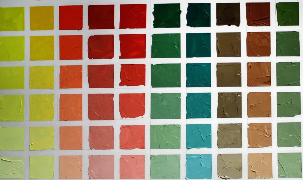
 Cadmium Lemon Yellow colour chart

When learning colour theory I created stacks and stacks of colour charts.  Working out combinations of colours in different mediums, the charts were extensive.  When moving from the UK to Canada, some tough choices had to be made on what to take and the colour charts lost one of the battles.

As colour theory is such a strong component of what I teach in art workshops, I figured it was time to bite the bullet and make another set of charts, this time using the current palette that I use, a split primary palette, as well as a couple of other common colours thrown in for good measure.

I know everyone rolls their eyes at the thought of creating a set of colour charts, considering it boring and time consuming. But there is no other way as effective at familiarizing yourself with how colours react with others as creating a colour chart.  Charts don't all have to be completed at once and some people take a lifetime to complete a set, adding to them as new palettes are explored or looking at neutrals  or a specific combination of colour.  The possibilities are as endless as the colours that are found.

For my new set of charts I'm using 11" x 14" Bristol paper and oil paint.  Yikes you say, paper???  Yes, paper.  Strathmore Bristol two ply 400 series is thick enough to stand a thin layer of oil paint without bleeding through.  I'm using a palette knife to mix and spread the paint on the paper and there are no additions of solvents or oils to dilute the paints.
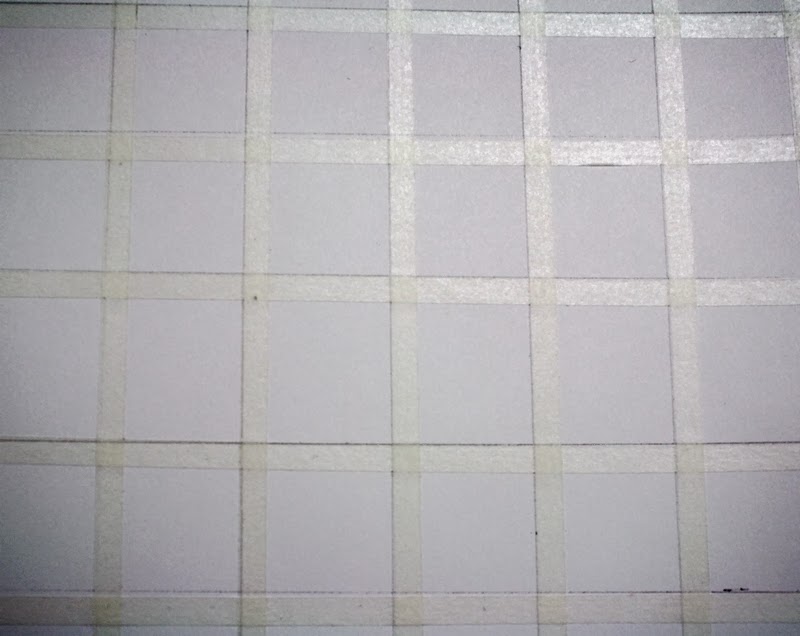

I marked the paper into 1" squares and taped a 1/4" removable tape between the squares horizontally and vertically.  

To create the charts I will use one of the colours in my palette and mixing it with each of the split primary colours I choose, create 5 additional values from the mixed colours with the addition of white, creating tints.  There are endless colour chart possibilities and they will be created as time allows.  This basic chart shows the range of colours that can be mixed using 8 colours plus white in a split primary palette.  I usually have raw or burnt umber on my palette, but have added burnt sienna and payne's grey in these charts too.  Any of the colours that you frequently use can make up your colour charts.


Time consuming?  It takes about 45-60 minutes to create one chart at this size, including taping, mixing, painting labelling, etc.  A labour of love.


I started this series of colour charts in the same way I lay out my palette, starting with the lightest colour and working my way to the darks.  I'd encourage you to try at least one chart and really come to grips with the range of colours that can be created.  They make fabulous reference charts when you're trying to figure out what colours to use in a painting and are beautiful colour statements as well.

The colours I use in a split primary palette are cadmium lemon yellow, cadmium yellow pale, cadmium red light, alizarin crimson, permanent rose, ultramarine blue, pthalo blue, burnt umber.   I added burnt sienna and payne's grey as my go to convenience colours that are often on my palette.

I mix equal quantities of the colour I have chosen with each of the other colours. i.e., cadmium lemon and cadmium red light, which provides the most saturated colour mix of each square at the top of each line. Small additions of titanium white to the colour mix lightens the value as I descend the line.  Of course you could increase the number of squares and lighten the value all the way to white if you wanted.

Tuesday, February 11, 2014

Empty heads


With my hand still a bit out of kilter I've been working with other art techniques and mediums that require a different way of holding a tool and the trick seems to be working for my hand mobility.  I think I'll be picking up a palette knife again tomorrow or the next day.

Like most artists, shopping trips for something, anything, involve keeping an eye out for objects that have potential for compositions.  Last weekend I found some glass heads and I couldn't resist one for the studio classroom.   There were several colour available, including bottle green and cobalt blue but I liked this one that was almost clear with a hint of turquoise in it.


Of course I had to play around with a quick sketch of the head using pen and watercolour wash in a totally unsuitable sketchbook that ripples with the moisture.  But that's fine.  My sketchbooks are working tools, not designed to be works of art in their own right.

I'll be setting up some compositions with the head to find just the right one to do some drawing and painting with it.

Thursday, February 06, 2014

Cats and fish


I've been resting my right hand this week and avoiding the palette knife due to a repetitive strain injury.  I have a big project coming up so I don't want to risk overdoing it and having real problems later, so small pieces for short periods of time, using different motions seems to do the trick right now.  Pieces like this series of little cards that will be available soon as downloadables from my Etsy shop.


The originals are in watercolour and will be available, once constructed.  Yes, I'm even having challenges doing that this week in terms of hand flexibility.  But hopefully, by the end of the weekend, I'll have the bugs sorted out and have downloads available with instructions on how to make them come to life.


I plan on more fish and cat cards like these and I'm always happy to receive new inspiration from other cat lovers. Just send a message including a clear photo showing your cat's face and eyes in a forward facing pose and he or she may be a future greeting carrier! 

Monday, February 03, 2014

Custom cards


As a child, I would spend hours creating dolls and houses and theatres and puppets out of cardboard, paper and boxes.  It seems that never leaves me entirely.

I have some tendonitis or similar in one hand and am giving it a little rest from the palette knife, but can never stay away completely, so this weekend I thought I'd do some work on an articulated card concept I've been playing with.  These will be available as printable sheets that can be cutout and assembled.  I have a couple of pieces completed but not assembled yet, as the cutting out is an issue for me right now.  These are created on 250lb watercolour paper, then painted with watercolour.  I haven't used my watercolours in ages and quite enjoyed using them again.  I love how the colours meld together making them perfect for creating fish.


I'm considering offering custom cards of pets using this template. The purchaser would provide the face of the cat in a photograph (there will be dog ones too) and the original will be shipped.  This prototype has Tripod as the model (he works for food only he told me)  It comes with several insert tags that one can write messages on depending on the circumstance.  Its 9" tall and 4.5" at the widest point.   Definitely not a toy, but a unique piece of art can can be framed or given as a unique gift.


I'd love to know what you think of the concept.


Saturday, February 01, 2014

Pushing through

 Leapfrog - SOLD
30" x 40"  oil on canvas

One of the most common issues I see with people learning to draw and paint is giving up too soon.If expectation is not met in a short period of time, boredom sets in or a feeling of "I can't do this."  The point at which that feeling is reached is usually the pivotal point for a piece of art.  The bones of the piece are in place, but the final vision can't be seen, so the maker becomes frustrated and it is easier to stop than forge ahead. Keeping the vision that inspired in the first place and knowing that it will take time and hard work to reach that vision seems to be the issue.


When I started this painting of  boats, I screwed up the initial drawing.  That could have been enough for the inner voice to say "stop", but I didn't let it.  I redrew the piece then started on the painting.  All the way through, I revised and resolved problems.  The process of creating is one of constant conversation in my head that guides my hand and eye in what to put where, what colour to choose, and whether it works for me or not.   I don't let the inner voices get to me much anymore.  I shut them down and its quite amazing how quickly they retreat when they're stood up to.  If I let them in, they'll tell me that I can't draw or paint; that I should stop because what I'm painting is rubbish and I should go take up knitting again.

The half way point in any drawing or painting is full of pain and questions.  Its meant to be.  It forces you to think through, seek the vision, resolve the problems and know that what lies ahead WILL work.

Still reading the biography of Lucien Freud, it seems none of us are alone in this journey of self doubt.  Freud used to lie on the floor and cry or have total tantrums when starting most paintings, or sometimes part way through, as they frustrated him so much.  But he kept going.  That is key.  Half way is half way - to hell or heaven.  I choose heaven.

Tuesday, January 28, 2014

Blurring the line between reality and photography


 Leapfrog - in progress
30" x 40"  oil on canvas

I am the first to encourage technology use in art - up to a point.  When reliance is completely on a subject that can only be scrutinized through an artificial lens, the view point becomes skewed and a lot of valuable information is lost.

Of course, not everything can be seen in real life and some things simply don't sit still long enough to do detailed paintings or drawings.  However, with experience and a keen eye for repetitive motion, capture of light and lots of practice, even fast moving subjects such as animals and children can be painted or drawn.  The masters had this down to a science obviously, when digital images or even cameras were not the tool of choice or ability to assist painting tasks.

I am sure that if many of these people were alive today they would use photography and digital technology and photo editing and projectors, etc., etc. to make their life easier.  But I don't believe they would rely on them for all the information they needed.

I use photos for reference.  I have little choice in winter when boats are in sheds or upended on wharves or docks with snow and ice piling around them.  I use photos as the bones of a piece.  They are my idea and provide the structure that shows me shapes and colourways.  But I don't stick with them to record each detail.   I draw by hand, though if I'm really in a hurry and really need accurate placement I will use a projector to find relationship points that are my guide to completing a drawing.  But mostly I draw by hand/eye/mind and enjoy the fact that my pieces aren't exactly as an initial photograph looks.


Once the drawing is done and the palette decided on, I toss the photo and go on instinct.  I add colours that others may not see.  My mind and my experience see colours within colours, within shadows, within light.  I only refer back to the photo to ensure that I'm capturing light or shade in the right sections.   There is so much freedom in not being dictated to with a mechanical image that lies about colour and shadow depth, warmth or coolness and even shape.

So use a photograph, but let it be the starting point for your creativity.  Move outside the lines and the colours.  See the real object wherever possible and let its shapes and colours inform you.  You will gain a lot of knowledge from reality and it really needs to be your partner in creating a painting that is art, instead of a painting that is a copy of a photograph.

Monday, January 27, 2014

Boogie boarding


 No, I haven't taken up surfing, just added a tool to my sketching arsenal. 

The Boogie Board is an LCD writing tablet measuring 8.5".  Its a paperless way to sketch, lightweight, portable and an easy way to capture ideas.  I can't save images or words on it, but can photograph them.  I think there is a newer version of this board out that has wifi capability but for quick sketches, this works well for me. 

I have so many sketchpads and odd bits of paper lying around the house, this becomes one more way to draw.  I can use a finger or the stylus that's included.  With a press of a button the screen erases and I can start over again. 

Here's a quick sketch of a puzzled looking dog done in about 10 minutes to give an idea of what drawing looks like on this device.

Saturday, January 25, 2014

The Hitchhiker

30" x 40" oil on canvas

I've sailed past the greens and am now into the greys in a new painting.  Well truth be told there are greens in the new painting, but its not in a fit state to be seen quite yet.  There are a group of boats in the composition and I've found that in any grouping there is always *one* section that causes grief in terms of structure.  This grouping is no different.

Yes, I could have projected an image onto canvas and gotten the outline perfectly  but I prefer to draw by hand when possible and when enlarging that can have its challenges.  Here's a sneak peek at the composition draw directly on the canvas.  The foreground boat is the culprit but paint is making it conform nicely.


So while I wrestle it to the ground, I'll show you the completed painting 'The Hitchhiker" with all those greens in it.  I've been making progress on some large pieces and have four of them completed with this current one being # 5.

I've developed a painful, stiff hand over the last week and its slowing down progress and making lots of tasks difficult.  Its the one thing that an artist dreads isn't it, a hand problem.  Anything serious and it kisses goodbye painting as we know it.  More than like, its arthritis, which cold winter weather doesn't help, so heat and sometimes fingerless gloves for painting work to keep the symptoms at bay.

But, as Lucian Freud was quoted in the book I'm currently reading about his life "Breakfast with Lucian",  Painting is "pain" with a "t" on it.

Friday, January 24, 2014

Completed demo

 Still Life with fruit I
9" x 12" graphite

It may be a bit difficult to call a demo a demo if only the value map and contour drawing are done in class and most of the shading later.  But time is always a challenge in drawing and as I tell workshop participants, there's no rush and no time limit on drawing.

Its the rush that becomes the downfall of many a good drawing.

Here is the in-between drawing from the last post to this one. Taken with my cell phone, the image isn't as crisp as it could  be.


In workshops I usually have a completed drawing done in several stages so people can see how I construct and shade a piece.  There's a continual conversation going on in my head which I try to verbalize in class.  Its a voice that's constantly comparing relationships of one object or space to another to make sure proportion is correct.  It sounds crazy, but it works.  I think we all have a voice (or two) in our heads that guide us through drawings and paintings.

This is the finished drawing from last weekend's workshop. I always forget how much I enjoy drawing until I am away from it for awhile then return.   The next advanced drawing workshop is in May and will be all about drawing animals.  Like still life, there's a formula for that too.  Really, its that simple with drawing.  You just need to know how to compare relationships, measure proportion and be patient.  Oh, and practice!


Monday, January 20, 2014

Pushing the envelope

stil life demo 1 sm

Classic drawing techniques start with an envelope.  This is a line/value map drawing of the most basic overall form that makes up the general outline of the subject, whether it contains a single object or many objects together.  If you squint you will reduce the form to its simplest shape and see the starting point of the general shape.


drawing - envelope 1 sm

One of a beginner’s points of conflict in drawing is running out of room on the paper. This is usually the problem of starting with a specific object then adding more and more until the edge of the paper is met.  By creating an overall shape and deciding on the width and height before any detail is added, you eliminate overruns and ensure that your drawing always meets the confines of the picture plane you’re working on. Once the overall shape is in place, refining the forms within it becomes easier to control.
still life 2 bwsm

This drawing was part of an advanced drawing workshop that I held over the last couple of weekends on still life studies.  In the first section of the workshop, different elements that traditionally make up a still life were drawn, culminating in a full still life study this weekend.  I threw out some options on Facebook to see what others thought about arrangements, and of four that I provided, this was the most popular.  While I had another preference, this was the simplest in terms of form.  Participants were given an option of photographic or life reference to use.

The top image is my demo drawing from the photographic reference.  I draw from a 32” tv screen in the classroom actually are very rarely print out a photo to use as they’re consistantly poor in terms of providing sufficient information.

The sketch below is the second demo drawing I did, but from the life arrangement instead. I was standing and walking back and forth and kept losing my viewpoint.  I was starting to add some values to the forms and will continue to work on the piece as it will form another tutorial for the future.

still life from life 1 sm

Friday, January 17, 2014

Coming to terms with green


The Hitchhiker - work in progress
30" x 40" oil on canvas

When I moved into the house I currently live in, everything - and I mean EVERYTHING, was painted a pale hospital green.  The previous owners obviously liked green.  A lot. Walls, ceilings, woodwork, trim, doors - in every room and hall. I think that added to my green prejudice. The only rooms that were spared were the bathrooms and then only because they were tiled.  Purple or blue or beige.  Yes, I know... 

Aside from my unwillingness to tackle flowers in paint, my other dislike has been using greens.  Its not a colour that appeals to me to be honest.  I never think of anything pleasant to associate with green and I think I can safely say that I don't own any piece of clothing that is green.  Oh sure, greens of grass, trees, leaves are ever present and I do appreciate the overall expanse of greens in nature.  But recreating them on canvas?  That always would strike fear into me. And into many others too it seems.  There's a lot of green phobia out there!   Maybe some of that fear is simply the vast range of green hues, its pretty overwhelming when trying to figure out how to get just the right one to make your painting work.

The last boat painting I completed, Fox Point, as well as this one that I'm currently working on, have a lot of green in them and over time I've come to terms with the colour.  While there are endless tubes of ready made greens in paint, I believe that mixing my own colours is the only way to achieve the hue I want, and it lets me control whether I want to brighten, intensify or cool it down.  I can match colours perfectly every time and its easier on the bank account when I'm not out hunting for the perfect match or slavishly copying the palette of another artist in the hopes that it will lead me to glory.

Premixed tubes can contain some pretty garish colours that don't resemble anything that real life presents and would be an exercise in frustration to use it straight out of the tube.  There are some earthy premixed greens that are in my arsenal however, such as Terra Verte and Olive Green that make good starting points, but always add other colours to them to meet my personal needs.


It becomes a challenge for me in colour matching and if you've watched my colour matching video  on my YouTube channel, you can see that exercise, along with a video on the basics of colour mixing.  Like drawing, colour mixing is one of those key pieces in technique that you really need to have under your belt to be proficient in painting in any medium.  Yes, even the greens.  I'll be making a short video demo on mixing greens soon, as much to jog my memory as to help anyone else who may find it useful.  In it, I'll explore the common and not so common colours mixes that make up greens.

Greens in The Hitchhiker are created with phthalo blue, cad lemon yellow, ultramarine violet, cad red, yellow ochre, and white. Colour combinations that you may not have considered as making greens are worth exploring such as ochres, oranges mixed with ultramarine or phthalo and even black and ochre.  The range of colours from saturated to desaturated is amazing and experience in mixing them becomes your teacher.

Tuesday, January 14, 2014

So, what do you do in the studio....?


11 x 7 pastel 

Its funny how the average non-art person thinks an artist is this creative soul who  hangs out in the studio, plays with paints then has someone buy the result. I wish it were that easy. I'd say that business and marketing likely take up 50%, sometimes more, of my  time in the studio.  Art is like any other business and time has to be devoted to the business or it starts to decline. 

I spread the admin over the week, assigning small chunks of each day to dealing with the business and marketing side.  If there's something more important happening, this daily work can take a back seat, but not for long.  The business and marketing side of art is time consuming and each take away from painting time but all contribute to the business of art. So what DO I do in the studio....?  Here's an idea of what goes on.

  • Financial management (sales, expenses, taxes, reporting, etc.)
  • Promotion for paintings, workshops, galleries, events
  • Answering email
  • Newsletter preparation
  • Workshop preparation (writing, filming, advertising, booking, managing, delivery)
  • Project and grant writing and management
  • Sales and shipping
  • Gallery exhibition planning and management
  • Networking in person and through and social media
  • Blog and website management and writing
  • Editing and managing online sales and reproductions
  • Photographing and editing images
  • Inventory management (art)
  • Inventory management (paint and supplies)
 After all that, there is production time.  The actual time where I get to do the fun part, the painting.  This is vital as it IS the business 'product' and must be nurtured as well as the administration around it for it to succeed.  Finding the balance between the two is important as they are the perfect marriage for success.


Thursday, January 09, 2014

Still life


What makes up a still life drawing? Any collection of objects and arrangment of them that you find pleasing, but usually is a combination of objects with different textures and sizes and interesting lighting. In my Advanced Drawing - Still Life workshop, you'll learn more about setting up a still life and create studies of textured objects as well as glass, which is a common item in still life compositions. 


Still life study in oils - Christmas leftovers

When a glass object is broken down into areas of light and shadow, it becomes a puzzle that you need to solve through careful observation and drawing technique. Here's an example of a heart shaped bottle, from the initial value map drawing to the start of shading to capture the values that give glass its unique qualities of shine and transparency.

To learn how to draw glass and other common still life objects and textures, consider registering for this workshop. There are still a couple of spots left in the January 12/19 workshop with registration available through my website.


Win your workshop registration!

Simply register for the workshop of your choice through my website www.jeanettejobson.com by March 31, 2014 and a draw will take place on April 1st to announce the winner.  If you register for more than one workshop, your name will be entered twice.  Good luck!

Tuesday, January 07, 2014

As good as...


"The greatest obstacle to discovery is not ignorance, it is the illusion of knowledge." 

Dip into Robert Genn's The Painters' Keys to read more about "Faith-based Art Making"

This past week has been wild with a huge snowstorm that dumped 40cm of snow on Saturday, -30C windchills and high winds then power outages as an aging hydro system kept giving up the ghost.  Its finally getting back to normal, whatever that is, and I'm able to spend a little more time in the studio instead of the barn, firing up a generator to keep growing pullets warm!  Whoever thinks life on a small farm is romantic and fun, should come here for a week, especially in winter.

 The storm did leave a gift however.  The wind blew a lot of berries off the trees and swept them into an arc, looking like a white wave with red stones washing onto a beach. 

I've added some texture to the portrait of my grand daughter and am refining shapes and values more as I go.  A painting continually evolves until it reaches my level of scrutiny to make it acceptable to be presented to the world.  Here, on my blog, you get to see all levels of art process, both good and bad, but the gold standard for presenting a final piece is more exacting for me.

Texture.  Whether its a smooth surface such as a child's skin or an uneven surface like the lion towel she has wrapped around her, creating that texture is paint is a matter of closely observing the value changes and shapes.  I think that many people get bored with trying to get something 'just right' and settle for 'as good as'.  And this can be where the frustration starts because 'as good as' is never what we should accept

I see 'as good as' in exhibitions, in online art, in creative efforts all over the place and while that's fine if its a sketch or a working study, its not fine if its for final presentation to the public. We know when we produce substandard work.  We know when we see it next to others' work which is technically better than we produce.

A degree of tedium can set in when painting expanses of background or texture and that needs to be worked through as its part of the whole.  Ignoring it or losing interest in completing something to the same standards as the rest of a piece shows in the finished work.

Yes, there are pieces that end up being boring and that's when you need to know not to belabour it and simply toss it or shove it into 'the drawer' where it can linger for months or years until you're ready to have at it again.  Decisions have to be made that a piece lives or dies, but 'as good as' doesn't cut it.  Always put your best work forward publicly, you won't regret it.

Saturday, January 04, 2014

Skin palette

 
When I paint portraits, people sometimes ask what colours I use.  I don't have a specific formula that I can provide, as it depends so much on the complexion of the individual.  Most skin tones that I create are varying mixes of red, yellow, blue and white.  I know that doesn't help if you're looking for specifics in terms of colour names and brands, but those colour choices change depending on the subject and what colours I have available.
 

For this portrait of my granddaughter I'm using cadmium red, yellow ochre and cadmium yellow, ultramarine blue, ultramarine violet,and titanium white. Brands are a mix of Utrecht, Kama Pigments and Winsor & Newton. I've added a small amount of Gamblin Radiant Turquoise and Radiant Red as well as Asphaltum in the darker shadows.

Each artist has her own favourite colour mixes and convenience colours in tubes that are to 'go to' when skin tones are needed.  As my grand daughter is so pale, I may add a glaze to the shadow side once the oils are dry to give some warmth and depth.  Of all the faces to paint, the ones that provide me with the most challenges are childrens faces.  A child's head shape and softer facial features take subtle value changes to create form and accurate representation.  Lots of measuring for accuracy is needed to keep a likeness.

Thursday, January 02, 2014

Seven minus five

kiora 2 sm

My grand daughter will be seven years old this month.  I don’t know how that happened as only a moment ago she was a baby.  Time definitely seems to speed up as I age, so I thought I’d better get a move on and paint this portrait of her before she grows up or I can’t remember how to paint.

I took a photo of her when she was around two years old.  Fresh from the bath and anxious to get her hands on my camera.  The light was just right and the look was perfect.  But the painting sat in my head over time with a few half hearted attempts to do justice to it that never quite worked out.

Now, on the edge of her turning seven, I wanted to try once again.  After the bustle of Christmas and the adventure of New Year’s, life can settle into a degree of normality or at least be quieter for awhile.  This little side painting is a good diversion and a break from larger boats, water and palette knives.

Kiora working drawing sml

Its in progress and the top image is the result of two evenings’ work.  Her colouring is very pale with blonde hair so getting the correct skin tone that keeps that northern European complexion but not making her look like a ghost or a frozen child is the challenge.

I love her hands most in this I think.  Its as if she was feeling the camera in them before it was there, fingers touching, anticipating. I’m still working on refining shapes and blocking in colour before I start working on the values more.  I like the process of creating a portrait and watching a face emerge from nothing.  Its magical, frustrating, challenging and rewarding all at once.

kiora 1 sm

Its in oil on 11 x 14 gessoed masonite board.  I love the slight texture that the gesso gives when applied with a nap roller.  In fact, it would likely make a good pastel surface too.  As always, I start with a detailed drawing.  This was done on tracing paper, so I could make adjustments as needed, then transferred to the board.  Then I start mixing colour and seeing what works, adjusting as I go.

Wednesday, January 01, 2014

2014 plans


green boat 2 sm

Hitchhiker – 30 x 40 - oil on canvas – in progress

I don’t make resolutions at the beginning of the year.  I never plan personal fitness or health goals.  They just happen along the way and putting them down in writing seems to ensure that they’ll disappear into thin air before the month of January ends.

For my art business, I make goals, a bit like a business plan in fact.  By creating measurable objectives, it becomes the only way I can evaluate my progress when I review at the end of the year.

As is always the case, I bite off more than I can chew.  I don’t let this worry me, because distraction and lateral movement can open doors to  more interesting opportunities.  A set of objectives or business plan is never set in stone.   Yes, you have the general ideas for direction but you have to be flexible as well.

However, having said that, I want to make my goals simple to allow me time to really concentrate on them and perform well.

So what will I do in 2014?

Painting

Sea Memories

Sea Memories 8” x 16” oil

Boats and water and fish

These subjects will predominate my work and I will continue painting on a large scale and using a palette knife to produce another series of paintings based on this theme.

I have a couple of projects in the works that I can’t say much about right now as they hinge on funding and partnerships and we all know where those two are involved, unravelling can occur!

Teaching

2014 workshops poster sml

Online Workshops

Yes, I know, I’m hauling that one out again.  But I’m better prepared now to put this into motion.  With my studio classroom workshops firmly in place, I have the elements of several workshops, I just need to spend time creating video to go along with them.  Drawing and Painting Water are two I have in mind right now.

When they are available, I’ll have them listed on my Workshop page through my website.

Communicating

Blogging

image

Communication tends to be brief these days, reduced to “Likes” on Facebook or 140 characters on Twitter. Of course I’ll still be on social networks and would love you to add me as a friend or visit my artist page.

I know I have reduced the number of blog posts in the last year to about one a week and I know readership and interaction dwindles because of it.  I want to change that by increasing the number of blog posts I produce to at least two, preferably three a week. I will also be refreshing my blog logo and theme. Its been stagnant too long and needs a facelift.

I am guilty of not commenting as much as I could on other blogging artists posts, so I will dedicate time each week to do so, as well as seeking out and supporting new artists.

So bookmark my blog, Illustrated Life, you’ll be reading more in 2014!

Tuesday, December 31, 2013

Looking into the dark corners

Coastal

I’ve been looking back over 2013 and celebrating successes, but I also know that there are areas that weren’t so successful.  We tend to push our failures to the back out of sight sometimes, instead of really analysing them for what they are and understanding what lessons we can take from them that will help us perform better in the future.

There is an expectation that each piece of work we start with will become a keeper. Unfortunately that’s not always the case.  There are a combination of factors that come together to create something that ‘works’ and that combination is rarely the same twice.

Its a combination of human and environmental factors that make a painting become a pleasing object.  Technical ability, energy or fatigue, silence or interruptions, emotional state of mind, quality of tools, subject matter, and available time all contribute to how well a piece turns out.

Artists beat themselves up regularly over outcomes without really looking at why something did not work and how to change it.   Its the same with any venture in art.  We see an outcome and despair over its failure, but often chalk it up to experience instead of seeing how we can learn from that or do it differently in the future to secure success.
So while I look back over 2013 I hope I learn from mistakes as well as celebrate in the successes.  I made a number of goals at the end of 2012 and its interesting to look back and see what I matched or missed.

From this date a year ago, my dreams were:

Produce a new body of work
 
Prism
I did produce a series of boats and water people  paintings and pushed into more palette knife painting on a larger scale, even venturing into fluorescent colours.


Bright Red

Representation by a new gallery
 
 gallery 1 sm
1424576_616141348425178_1875128287_n

I applied and was accepted by Peter Lewis Gallery in downtown St. John’s, participating in two group exhibitions there in July and November.

Deliver an online workshop
 
workshops 2013 poster1

I didn’t deliver an online workshop but I did offer a series of workshops at my home studio in the fall of 2013 which were successful and all fully booked.

Update my gyotaku book to include more technical information
 
Sea Jewels 2

This did not happen.  My focus moved more towards painting, though gyotaku still featured in my work in 2013 and will continue to do so with a gyotaku workshop planned for the summer of 2014.

Produce a minimum of three short information videos and ebooks
 
Online cover 2 sml

I did produce a book on palette knife painting “Introduction to Palette Knife Painting which is available through Amazon in hard copy or Kindle editions.

I produced several video tutorials on  colour mixing that I put on my Youtube channel, along with several other tutorials.  Unfortunately, due to an individual taking advantage of my work, I had to make the tutorials private and available to workshop participants only.  They will be enhanced and made available for a fee or through subscription in the future.

Create a series of reproductions of gyotaku prints
 
I didn’t get around to doing this and will push it into 2014 for completion.

Experience an art retreat
 
While I had access to art retreats on the island, time became the challenge this year with visitors, work load and getting an elderly parent into a care facility.  Having said that, I seem to produce my own retreats of sorts by immersing myself into blocks of time regularly for art production and experimentation.  Retreats don't have to be in another place, you can do them at home.

Produce a minimum of three significant drawings in dry media
 
Breakfast at Cora's sm
I completed only one drawing.  However, getting back into teaching drawing fires up enthusiasm to continue this goal.  The necessity to draw to prepare for classes and demos is also an incentive!

Other projects
 
Fishy Bits prints
12 months

In 2013 I completed a series of twelve original relief prints of fish found in the waters around Newfoundland and Labrador.  This fueled an Indiegogo project, as I wanted to purchase a printing press to complete the series and continue to develop my printmaking muscle.

bottlejack press

Unfortunately, I didn’t reach my goal for funding, but I did create my own printing press using a bottlejack press that works beautifully and continued to print the remainder of the pieces in the series.

thanks you

Five of the prints from this series were used in the December “Harvest” issue of Highbrau Magazine.


Sketch A Day in March

george st 2 sm

In March I threw out a challenge for others to join me in sketching daily and posting the results on my blog page.  It was a challenge some days to get a sketch done and posted online but I and a number of others managed.  The results can be seen here.

I have progressed in areas and pulled back in others, trying to balance my wants and needs with what is necessary and what fulfils my artistic abilities.  There are always ideas swirling in my head that are stored or written down for the future.  Already, I have plans in progress that lead me into 2014 and I know there will be more areas that will unfold and time passes.

I will be making goals for 2014, but as with all plans, they should be elastic enough to let me be side tracked into areas that pull my interest and offer opportunity.

Lunch & Learn - mini art consultations


I firmly believe that part of the artist code of ethics should be one of sharing knowledge. There are a lot of questions out there and I get asked quite a few, some technical, some about marketing, some regarding the business of art.

The "advice over lunch" concept is one that I use frequently in my business and wanted to extend that opportunity to artists, but online instead of  in person.  In a busy world, one on one conversations are the best way of transferring information.

So I created Let's Do Lunch - an opportunity for artists or collectors to ask questions from the simple to the complex and get practical answers, based on realistic pricing that fits everyone's budget.


Happy New Year!