Tuesday, April 01, 2014

Etching in the round

 Double Dipping

A late snowstorm shut down most things today and provided me with a snow day. Hopefully the last til next winter.  I can't begin to tell you how tired I am of winter, its been relentless this year.

So having a day to be in studio was a bonus.  I am in between paintings, so was clearing up, writing content for an upcoming online drawing workshop and uncovered some blank acrylic cd protectors.  These are the clear acrylic sheets, the same size and shape as the cd which protect the top of a stack of blank cds that come on a spool, if that makes sense.  As I use a fair number of cds at work there were a handful kicking around so I grabbed them, thinking I could do something with them.


Using an etching stylus, I scratched an image of a boy fishing for capelin with dip nets taken last summer at the beach.  Of course the central hole and circular ridge are present, but that adds to the uniqueness of the etching.


I used Caligo etching ink in Carbon Black to cover the plate, removed the excess, then hunted around for a few pieces of paper to test print.  The first I grabbed was an Unryu Japanese paper known as “cloud-dragon” This paper istranslucent with long kōzo fibers embedded in it.  I sprayed it lightly with water then sandwiched the disc, paper and padding and put it through my bottlejack press.  The image above is the result.


I did a couple more which were not as clear and may be because the paper wasn't as damp, but I will keep them and add some colour to them and see how well that works.  The etching burrs on drypoint tend to degrade with excess prints and don't hold as much ink, so the number of prints will be limited.

There are any number of options for etchings using these disc protectors that likely would just be thrown out or recycled in other ways.  Watch for more circular etching ideas using these in the future.

Monday, March 31, 2014

The End of Summer

 16" x 40"
oil on gallery canvas

I've completed the second salted cod painting.  I enjoy exploring the multitude of colours which appear in the flesh of the fish as it dries. Going from soft pastels to glowing golds or greys and blues to rich siennas, they never fail to fascinate.

And while dried fish takes a backseat in most food cupboards these days, salt cod seems to stay, at least in Newfoundland. Tradition and history die hard.

In communities dotted throughout the landscape, you'll find cod drying as it has done for hundreds of years on lines, on flakes, on anywhere that it can, to sustain and add to food sources during the winter.

If you'd like to try your hand at this centuries old tradition, here's how.

Friday, March 28, 2014

10 tips for funding applications

 Untitled -work in progress
16" x 40" oil on canvas

For artists who want to see an idea expand and are willing to put in the prep work, there are art grants available to assist on a variety of levels.  It take some research to find them and more research, careful planning and networking to bring a concept to a level where others may be willing to fund it.

I've discovered the following when considering applications for funding (and many apply to entering juried competitions as well)

  1. Have a unique concept.  Its quite amazing how much art is a repeat of something that's gone before.  Unless its a unique spin or technique on a subject, or an approach that explores a subject from a different angle,  its a difficult sell. Do your research on the organization you are considering applying to for funding.  Has a similar project been done?  Did it receive full funding?  Successfully funding projects are usually listed on the organizations' websites.  Take time to browse and see what's been previously funded.
  2. Plan the project in detail from the outline of the concept, to final details.  This walk through will reveal problem areas.  The general layout starts with an overview, which is a brief paragraph of what you will do, when and how.  A detailed explanation of what you will do, how you will do it, the time frame, the end result is next.  Finally a detailed budget should follow.  Depending on the organization, it may be simple, but should include a detailed breakdown of costs and a final total.
  3. Do budget research in real time.  Don't guess at prices.  Review and compare costs, including tax and shipping.  Get pricing from three companies for products or services that you will need.  You don't want to under or over estimate costs, it could affect the outcome of your project.
  4. Read the application instructions and follow them to the letter.  Obvious yes?  Often this is a slip up area, when vital documents are not included.  Make sure your checklist of included materials is there and in the quantities requested.  Ensure your art resume, biography and artist statement are up to date. If references are required, ask permission to use a person's name ahead of time so there are no surprises for them.
  5. Don't take the little things for granted.  Printing costs include ink, paper, photographs, copying fees,etc.  Its easy to think they won't take up a lot of time or supplies but they can mount up quickly, depending on the project.  Look at every aspect of your project and research the cost to you.
  6. Consider partnerships and networking in your proposal.  These are key words in today's business industry.  They expand reach, lessen costs and provide long lasting impact.  In many funding applications, they are an option that can tip the scale for your application.
  7.  Community involvement comes high on the list for gaining brownie points.  Consider how to share your work with the world.  Talk to a gallery to confirm an exhibition or set up one in another venue.  Run a workshop to teach a technique, give an artist talk.  Its all about sharing.
  8. Be professional.  If you are provided with funds, make sure you keep accurate records, images and written documentation to provide the granting agency with a report at the end of the project.  Being slow with reports, inaccurate accounting or the ultimate faux pas, not completing a project, will be a black mark for any future grants.
  9. Say thank you.  It sounds simple and obvious, but can be overlooked.  Give credit to funders on resources produced by your project, provide links on your website, blog, social media wherever possible.  Invite them to exhibitions, keep them informed.
  10. Give your proposal to someone else to read.  Have them proofread for errors and grammar and check budget figures for accuracy.  Ensure you know the deadline for applications and get your application in before that date.

Good luck!

Sunday, March 23, 2014

Seasons

12 x 24 oil on canvas

I am longing for spring with some heat in the sun, a glimpse of green grass, crocuses popping up and people smiling more.  It has been a long, cold winter that doesn't want to relinquish its hold on the land.  Its snowing as I write this, yes March 23rd.  Snow.  Sigh.


The change of seasons with longer days, brighter light and hope for summer can affect how I paint to some degree.  I know with these grey skies interspersed with hints of spring have me creating paintings that reflect light, pastel colours and feeling of warmth in them.

Seasons don't usually affect how much time I spend in the studio.  If I have to produce, I have to produce, its like any job - you have to put in the hours to get the product out.  But the breaks and day trips are longer as the land grows again and crops need tending, chickens need feeding and eggs need gathering.
18 x 24  oil on canvas

Light fuels inspiration too.  While grey days produce beautiful light, sunlight glowing through a leaf is always breathtaking.  Sketching moves outside the confines of a car when outside.  In winter, its just too cold and uncomfortable to perch on a snowbank or frozen puddle and sketch no matter how inspiring the view, so its done from a car. Sketching in summer and spring gives a new lease on creativity and feels different.  There is a freedom there that only the seasonal light and warmth can  bring.


How does spring affect your painting rhythm?


Friday, March 21, 2014

Endurance

 Three on Lace
9 x 12 oil on masonite

I'm in my ninth year of blogging.  I truly didn't think I would last two weeks,let alone pushing through the ninth year.  With statistics showing that many blogs dissolve into nothing within three months of inception, I must be long winded, obsessive or am going for a world record!

Its likely more of the first two that keep me typing to what seems like an empty box at times.  I originally started a blog to make myself accountable to produce art.  Its served that purpose and continues to be a niggling thought in the back of my head daily, whether I've posted here or not, that I must work on art and I must share my thoughts about it.  Whether there is audience or not is irrelevant.  Yes, of course, its good to have feedback, although I'm not a statistic hound and my blog has become similar to a personal art diary, with benefits of interaction with others from time to time.

There are other bloggers of similar vintage who produce wonderful work and words of wisdom.  Perhaps the long lasting bloggers should start a club to compare notes about blog aging. Blogging content and frequency has reduced over the last few years with the presence of social media and its effortless (or nearly) one button or 141 character method of expression.  While social media are very effective, I believe that blogging continues to be a draw for those people wanting to know the underpinnings and thoughts behind a comment or image.  Its rather like books, they'll never disappear even if electronic form and become the place where information and imagination reside.

Will I continue past the nine years and into ten?  Likely so.  If I've gone this far and still have something to say and someone takes something from it, its been a useful exercise.  Looking back over time there have been some popular posts and its interesting to look at them and remember the process, the event, the good and the bad.  Have a look at some of the popular posts in the list on the right side.  Is your favourite there?

Thanks for coming along for the ride, I hope you'll stay for the rest of the journey.  I like having your company.

PS  The painting above is a demo painting from a recent workshop I gave in palette knife painting.  Those who know me know that I find pears a bit boring as they are such a constant subject in paintings.  However, the simple shapes and composition makes them good for beginners to tackle.

Sunday, March 16, 2014

The value of colour

 Colour matching

If I had a magic wand for beginning artists, I would give them the gift of drawing and colour theory.  Both are areas that I see people struggle with and there is often an unwillingness to invest time in what are the backbones of art.  Without being able to create an underlying structure freehand and without knowing how to create colours and values, people become frustrated and unable to achieve their artistic potential. 

Artists need to  understand colour theory as much as they need to understand the importance of values.  These two areas are often a weakness where timidity and lack of technical skills play a part.  Both have a solution that involves some study of theory and some time spent practicing to really understand the rational behind the process.  I promise there will be an "Aha!" moment when it falls into place and opens the door for you to art without as much struggle involved.

Greys and browns

Just as in drawing with greys and blacks, paint colour also has a value.  Most people have seen a grey scale and its often one of the first things produced in a beginner's drawing class, but it rarely translates over in the colour world but is as important.  Values ranges or lack of them will make or break your painting.  Any object can be believeable in any colour if the values are correct.

The important things to remember are hue, which is the colour pigment itself; value, which is how light or dark a hue is; and chroma, which is the saturation level of a hue. Comparison of a colour to the range on a grey scale will provide you with an idea of value.  If you turn your colour or painting into a greyscale image, you can easily do the comparison to find where it sits on a value scale or compare it to a reference (if you're using a photograph) that's also greyscale.

Colour wheel

With time and practice you become familiar with colour values and can make the decisions around increasing and decreasing values.  The exercise at the top of this post shows my decision process in matching the colour chip shown.  I start with the overall hue, then I start to lighten the value, finally moving towards desaturating the hue using a complementary colour. 

The second image is a colour chart where I used a range of dark premixed tube colours then created my own chromatic black the the second column from the right.  The decreasing values in the column are increasing additions of titanium white to the colour in box above it.  The last column shows how I can increase the level of coolness or warmth by adding more of one of the primary colours used to create the base chromatic black.

Aside from learning to draw, the next best thing to know is colour theory. It will save you time, grief and money.


Sunday, March 09, 2014

Untitled

9.5 x 12.5"  pastel on Canson paper

Often titles arrive for paintings almost before they are begun.  Or while in process as colour and shape evolve.  Not in this case.  This boat remains untitled, so much so, that Untitled Boat may indeed become its title.

Having a number of untitled paintings can be problematic when it comes to cataloguing and tracking them.  Potential collectors and artists easily lose track if every 4th painting becomes "Untitled # ....."


Finding a name hinges on mood, lighting, place name, object name and a host of other variables. There are simplistic names based on obvious features or geographic settings, romantic sounding names, dredged up from a background of stories or symbolism around the work or clever titles based on tongue in cheek plays on words or settings or similarities.

An occasional "Untitled" label is fine and can enhance the mystery of a piece, but when overused, like anything, becomes confusing when used frequently or make the artist look as their vision wasn't complete when the painting ended.


Wednesday, March 05, 2014

Painting makeover

 Currents  SOLD
8 x 8 oil on panel

In anticipation of an upcoming birthday, I'm giving you a gift.  Free shipping between March 5th  and midnight March 9th on anything in my Etsy store.   Enter MARCH6 at checkout to get your discount.

Visit the store and save on shipping for items like this original painting, Currents, which will be posted later today in the store.

This was a remake of a painting done a number of years ago when I was refreshing my atrophied oil painting skills.  While the original was ok, I wanted more life and movement in it.  Using a palette knife I laid on a thick layer of oil then using a Catalyst texture tool W-02 I drew it through the water to create the lines of movement often seen in swirling currents around rocks.


Monday, March 03, 2014

Where do you start?


 It is a question I often hear when talking about bringing a painting from concept to finished product.

My start is a spark of inspiration in my head, from something I see, or read about or a photograph.  Or all of the above!

Most of my paintings begin in a sketchbook or on a scrap of paper. Some are scribbled thumbnail sketches where I work out values and composition.  Others have additional notes about light or colour so I can keep details fresh in my head back in the studio.  I must have sheaves of scraps of paper as well as sketchbooks.  I don't see my sketchbooks as little works of art, to remain pristine and perfect.  My sketchbooks are messy and paint strewn, scattered with mediums from pencil to oil paint and are the snapshots that serve as my working tools which lead to a painting. They are battered, dog-eared and used, just as any good tool should be.


This first sketch gives me colour note reminders, rough blocking of values in the shadows and overall shapes.  Of course it is nowhere near perfect nor is the boat shape.  All that will come together when I start the drawing for the final painting.  But the sketch is the germinated seed that grows  slowly towards the light.  It gives me all the information I need in case I never see this particular boat, water or light again. 

Becoming very familiar with your subject in its natural setting, especially if there is just a photographic reference, enables you to have the freedom to know how the environment affects the subject. You don't even need the exact subject if you make an accurate enough sketch and allow enough time to absorb colour information.


Here I instinctively know how light curves around the shape of the boat, where little highlights hit and how the water reacts to wind and movement.  I know it because I have seen a boat on water a thousand times, perhaps 10,000 times in my life.  I have spent hours roaming beaches in all weathers, watching waves both gentle and powerful, water both flat and rough.  Without ever seeing a scene again, and armed with a sketch, colour and value notes, I have the tools needed to create a painting.  

Saturday, March 01, 2014

Night Fishing - Collograph

 Night Fishing  - SOLD
8" x 10"  collograph


Its been a couple of months since I did any printmaking so decided that a collograph might be in order.  These are fairly simple to do with materials most people have lying around the studio.  A piece of mat or backing board, some white glue, acrylic varnish and printmaking ink.  I added in watercolour and watercolour pencils with a little pen and ink too.

My concept was from a sketch that I created for a future painting.  I use my sketchbook as a tool.  I don't care if its meant for water based media or dry; if the mood strikes me, the colour goes onto paper, buckles and all.


I drew the sketch onto a piece of 8 x 10 backing board then using a sharp knife cut around the shapes and removed top layers in some areas, leaving it looking like this.  I then sealed the surface with gloss gell to leave some texture in the water area and the old boat surface.  This also makes the board waterproof.  Another layer of acrylic varnish seals the deal.


When the varnish was dry I used Caligo Carbon Black etching ink to work into the plate then pulled a test print or three on my wonderful home made bottle jack press.  It works like a dream at a 10th of the cost of a printing press.  I used Japanese paper (I can't recall the name as I grabbed a few sheets from a pile I had previously cut) I was content with this print and then started to add colour once the ink was dry enough.


I started adding washes of watercolour pigment to the paper, wetting the whole surface as the colour bleeds on the Japenese paper, so I wanted the colours to merge with no hard edges.


Its fairly insipid at this point and I wanted to intensify colours and sharpen edges.  I used watercolour pencils to define the shapes.


I hope you try this technique, it is open to additions of colour or you can leave the print as it comes off the press. I'd love to see what you produce if you try it.


Tuesday, February 25, 2014

Colour Chart - ultramarine blue


I'm still working on my colour charts off and on when I get a moment.  Yes, they are time consuming, yes they take some paint and some work, but yes they are worth the effort. Nothing helps you become so familiar with your palette as does the process of finding values that you can achieve by pushing paint around.

This is the third chart still using my split primary palette.  This time ultramarine is the dominant colour and mixed across the top row with each of the other colours then downwards in ever increasing amounts of titanium white to decrease the value as I go.

Ultramarine blue is the workhorse of many palettes as it is versatile, cool, transparent and powerful.  Its bias leans towards red so mixed with yellows, either cadmium lemon or cadmium yellow light here, the greens produced are less saturated than the mix I'd get with Pthalo Blue and Cad lemon for instance.  You can read everything you need to know about ultramarine pigment on the Winsor & Newton site.

Titian made dramatic use of ultramarine in the sky and draperies of Bacchus and Ariadne (1520-23).

With the reds, the range of purple and violets in pronounced with a richer version in alizarin crimson and permanent rose as they have some blue in them giving a more saturated colour than when mixed with Cadmium Red Light has a yellow bias and desaturates more towards a purplish grey, which I quite like.

Four value ranges, from left to right, mixing pthalo  blue, burnt sienna, burnt umber and payne's grey with ultramarine and titanium white.

When mixed with the earth tones, chromatic blacks can be created, leaning towards browns in the Burnt Sienna, charcoal greys with Burnt Umber and blue-greys when using Payne's Grey.  Payne's Grey is a mix of Ultramarine, black and a little burnt sienna, so staying within that family a harmonious palette is created.

Next I will be looking at blacks and greys, both straight blacks and greys from tubes as well as chromatic blacks, which I prefer as they have more warmth and interest in them.

As a note, I have used mostly KAMA pigment oil paints in the colour chart and heavy weight Bristol paper 400 series 11" x 14" applied with a palette knife.

Friday, February 21, 2014

Colour value


This is another colour chart from the set I am reproducing, based on the split primary palette that I mostly use, along with another couple of colours I commonly use in paintings.   The dominant colour in this chart is cadmium red light, which is mixed with each of the other colours on my palette in the first box at the top of each row.  Each column has a progressively lighter value as it descends which is achieved by adding increasing amounts of titanium white to the paint mix.

Coming to grips with colour is one element of painting, but understanding colour values is as important, if not more so. Colour is complex and we often think of it as a hue only, without thinking how light or dark it should be and how to get it to the value we want without making a brown or grey mess. The same greyscale that is used in drawings works as effectively with colour in determining the overall value and where it sits on the scale.


If you convert an image of your painting and your subject into greyscale, you can see at a glance the value of the colours you have chosen, compared to what you are painting and know whether to lighten or darken them.  However, colour does play a role in how a painting is viewed and can become the pull even if the values aren't strong, or close in range.  Complementary colours often have this effect when they have similar value ranges but if converted to black and white, lose their visual strength.


By flipping the colour chart to greyscale, you can see more clearly the value of each colour and not get distracted by the colour itself. Simplifying every element of drawing and painting is a crucial step towards problem solving, which is what the creative process is all about.

The colours in this chart are not, except for the top row, saturated colours.  As white is introduced in increasing quantities the value lightens as well as cools and depending on the two colours mixed and their bias, can desaturate.  Saturated colours of primary and secondary mixes often have the strongest impact in a painting and can serve well alongside values to pull in the viewer with a brighter colour.


Saturday, February 15, 2014

Colour charts

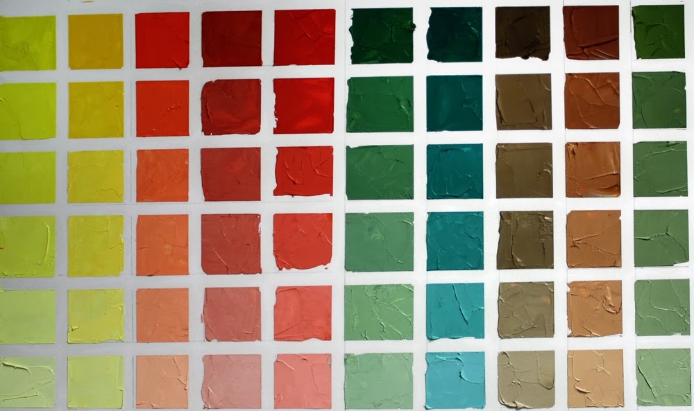
 Cadmium Lemon Yellow colour chart

When learning colour theory I created stacks and stacks of colour charts.  Working out combinations of colours in different mediums, the charts were extensive.  When moving from the UK to Canada, some tough choices had to be made on what to take and the colour charts lost one of the battles.

As colour theory is such a strong component of what I teach in art workshops, I figured it was time to bite the bullet and make another set of charts, this time using the current palette that I use, a split primary palette, as well as a couple of other common colours thrown in for good measure.

I know everyone rolls their eyes at the thought of creating a set of colour charts, considering it boring and time consuming. But there is no other way as effective at familiarizing yourself with how colours react with others as creating a colour chart.  Charts don't all have to be completed at once and some people take a lifetime to complete a set, adding to them as new palettes are explored or looking at neutrals  or a specific combination of colour.  The possibilities are as endless as the colours that are found.

For my new set of charts I'm using 11" x 14" Bristol paper and oil paint.  Yikes you say, paper???  Yes, paper.  Strathmore Bristol two ply 400 series is thick enough to stand a thin layer of oil paint without bleeding through.  I'm using a palette knife to mix and spread the paint on the paper and there are no additions of solvents or oils to dilute the paints.


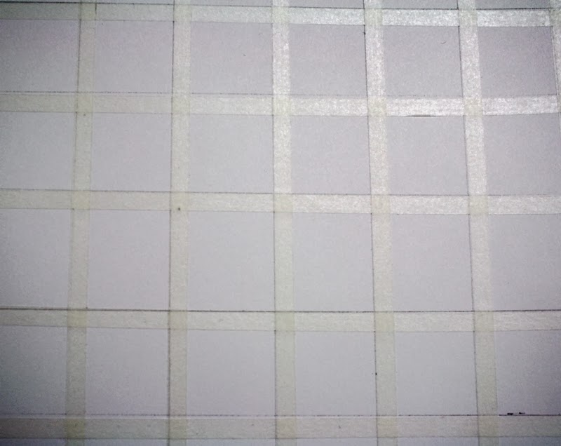
I marked the paper into 1" squares and taped a 1/4" removable tape between the squares horizontally and vertically.  

To create the charts I will use one of the colours in my palette and mixing it with each of the split primary colours I choose, create 5 additional values from the mixed colours with the addition of white, creating tints.  There are endless colour chart possibilities and they will be created as time allows.  This basic chart shows the range of colours that can be mixed using 8 colours plus white in a split primary palette.  I usually have raw or burnt umber on my palette, but have added burnt sienna and payne's grey in these charts too.  Any of the colours that you frequently use can make up your colour charts.


Time consuming?  It takes about 45-60 minutes to create one chart at this size, including taping, mixing, painting labelling, etc.  A labour of love.


I started this series of colour charts in the same way I lay out my palette, starting with the lightest colour and working my way to the darks.  I'd encourage you to try at least one chart and really come to grips with the range of colours that can be created.  They make fabulous reference charts when you're trying to figure out what colours to use in a painting and are beautiful colour statements as well.

The colours I use in a split primary palette are cadmium lemon yellow, cadmium yellow pale, cadmium red light, alizarin crimson, permanent rose, ultramarine blue, pthalo blue, burnt umber.   I added burnt sienna and payne's grey as my go to convenience colours that are often on my palette.

I mix equal quantities of the colour I have chosen with each of the other colours. i.e., cadmium lemon and cadmium red light, which provides the most saturated colour mix of each square at the top of each line. Small additions of titanium white to the colour mix lightens the value as I descend the line.  Of course you could increase the number of squares and lighten the value all the way to white if you wanted.

Tuesday, February 11, 2014

Empty heads


With my hand still a bit out of kilter I've been working with other art techniques and mediums that require a different way of holding a tool and the trick seems to be working for my hand mobility.  I think I'll be picking up a palette knife again tomorrow or the next day.

Like most artists, shopping trips for something, anything, involve keeping an eye out for objects that have potential for compositions.  Last weekend I found some glass heads and I couldn't resist one for the studio classroom.   There were several colour available, including bottle green and cobalt blue but I liked this one that was almost clear with a hint of turquoise in it.


Of course I had to play around with a quick sketch of the head using pen and watercolour wash in a totally unsuitable sketchbook that ripples with the moisture.  But that's fine.  My sketchbooks are working tools, not designed to be works of art in their own right.

I'll be setting up some compositions with the head to find just the right one to do some drawing and painting with it.

Thursday, February 06, 2014

Cats and fish


I've been resting my right hand this week and avoiding the palette knife due to a repetitive strain injury.  I have a big project coming up so I don't want to risk overdoing it and having real problems later, so small pieces for short periods of time, using different motions seems to do the trick right now.  Pieces like this series of little cards that will be available soon as downloadables from my Etsy shop.


The originals are in watercolour and will be available, once constructed.  Yes, I'm even having challenges doing that this week in terms of hand flexibility.  But hopefully, by the end of the weekend, I'll have the bugs sorted out and have downloads available with instructions on how to make them come to life.


I plan on more fish and cat cards like these and I'm always happy to receive new inspiration from other cat lovers. Just send a message including a clear photo showing your cat's face and eyes in a forward facing pose and he or she may be a future greeting carrier! 

Monday, February 03, 2014

Custom cards


As a child, I would spend hours creating dolls and houses and theatres and puppets out of cardboard, paper and boxes.  It seems that never leaves me entirely.

I have some tendonitis or similar in one hand and am giving it a little rest from the palette knife, but can never stay away completely, so this weekend I thought I'd do some work on an articulated card concept I've been playing with.  These will be available as printable sheets that can be cutout and assembled.  I have a couple of pieces completed but not assembled yet, as the cutting out is an issue for me right now.  These are created on 250lb watercolour paper, then painted with watercolour.  I haven't used my watercolours in ages and quite enjoyed using them again.  I love how the colours meld together making them perfect for creating fish.


I'm considering offering custom cards of pets using this template. The purchaser would provide the face of the cat in a photograph (there will be dog ones too) and the original will be shipped.  This prototype has Tripod as the model (he works for food only he told me)  It comes with several insert tags that one can write messages on depending on the circumstance.  Its 9" tall and 4.5" at the widest point.   Definitely not a toy, but a unique piece of art can can be framed or given as a unique gift.


I'd love to know what you think of the concept.


Saturday, February 01, 2014

Pushing through

 Leapfrog - SOLD
30" x 40"  oil on canvas

One of the most common issues I see with people learning to draw and paint is giving up too soon.If expectation is not met in a short period of time, boredom sets in or a feeling of "I can't do this."  The point at which that feeling is reached is usually the pivotal point for a piece of art.  The bones of the piece are in place, but the final vision can't be seen, so the maker becomes frustrated and it is easier to stop than forge ahead. Keeping the vision that inspired in the first place and knowing that it will take time and hard work to reach that vision seems to be the issue.


When I started this painting of  boats, I screwed up the initial drawing.  That could have been enough for the inner voice to say "stop", but I didn't let it.  I redrew the piece then started on the painting.  All the way through, I revised and resolved problems.  The process of creating is one of constant conversation in my head that guides my hand and eye in what to put where, what colour to choose, and whether it works for me or not.   I don't let the inner voices get to me much anymore.  I shut them down and its quite amazing how quickly they retreat when they're stood up to.  If I let them in, they'll tell me that I can't draw or paint; that I should stop because what I'm painting is rubbish and I should go take up knitting again.

The half way point in any drawing or painting is full of pain and questions.  Its meant to be.  It forces you to think through, seek the vision, resolve the problems and know that what lies ahead WILL work.

Still reading the biography of Lucien Freud, it seems none of us are alone in this journey of self doubt.  Freud used to lie on the floor and cry or have total tantrums when starting most paintings, or sometimes part way through, as they frustrated him so much.  But he kept going.  That is key.  Half way is half way - to hell or heaven.  I choose heaven.

Tuesday, January 28, 2014

Blurring the line between reality and photography


 Leapfrog - in progress
30" x 40"  oil on canvas

I am the first to encourage technology use in art - up to a point.  When reliance is completely on a subject that can only be scrutinized through an artificial lens, the view point becomes skewed and a lot of valuable information is lost.

Of course, not everything can be seen in real life and some things simply don't sit still long enough to do detailed paintings or drawings.  However, with experience and a keen eye for repetitive motion, capture of light and lots of practice, even fast moving subjects such as animals and children can be painted or drawn.  The masters had this down to a science obviously, when digital images or even cameras were not the tool of choice or ability to assist painting tasks.

I am sure that if many of these people were alive today they would use photography and digital technology and photo editing and projectors, etc., etc. to make their life easier.  But I don't believe they would rely on them for all the information they needed.

I use photos for reference.  I have little choice in winter when boats are in sheds or upended on wharves or docks with snow and ice piling around them.  I use photos as the bones of a piece.  They are my idea and provide the structure that shows me shapes and colourways.  But I don't stick with them to record each detail.   I draw by hand, though if I'm really in a hurry and really need accurate placement I will use a projector to find relationship points that are my guide to completing a drawing.  But mostly I draw by hand/eye/mind and enjoy the fact that my pieces aren't exactly as an initial photograph looks.


Once the drawing is done and the palette decided on, I toss the photo and go on instinct.  I add colours that others may not see.  My mind and my experience see colours within colours, within shadows, within light.  I only refer back to the photo to ensure that I'm capturing light or shade in the right sections.   There is so much freedom in not being dictated to with a mechanical image that lies about colour and shadow depth, warmth or coolness and even shape.

So use a photograph, but let it be the starting point for your creativity.  Move outside the lines and the colours.  See the real object wherever possible and let its shapes and colours inform you.  You will gain a lot of knowledge from reality and it really needs to be your partner in creating a painting that is art, instead of a painting that is a copy of a photograph.

Monday, January 27, 2014

Boogie boarding


 No, I haven't taken up surfing, just added a tool to my sketching arsenal. 

The Boogie Board is an LCD writing tablet measuring 8.5".  Its a paperless way to sketch, lightweight, portable and an easy way to capture ideas.  I can't save images or words on it, but can photograph them.  I think there is a newer version of this board out that has wifi capability but for quick sketches, this works well for me. 

I have so many sketchpads and odd bits of paper lying around the house, this becomes one more way to draw.  I can use a finger or the stylus that's included.  With a press of a button the screen erases and I can start over again. 

Here's a quick sketch of a puzzled looking dog done in about 10 minutes to give an idea of what drawing looks like on this device.