Monday, December 24, 2012
Festive 50 sale
Merry Christmas!
I am clearing out the studio and will be pulling a lot of pieces from Etsy to make way for new work in 2013. On December 24, 25 and 26, 2012 I am offering a 50% discount on ALL work available in my Etsy shop, both reproductions and originals. This is a one time opportunity, then the pieces will be gone.
Enter FESTIVE50 at checkout to save 50%!
Jobson Fine Art
Saturday, December 22, 2012
Twelve for 2012
After reading a similar post on Casey Klahn's blog, The Colorist, I thought I'd borrow his idea of choosing 12 of my favourite paintings that I produced this year. The process of curating and jurying your own work gives you a more critical eye for composition, value and colour. It can be difficult to step back from your own work and be objective, but whittling down the pieces through a series of slide shows, the same way as any juried work would be selected, helped me make my choices.
So here is my selection, not in any ranked order. Its a bit of an eclectic bag, but aquatics seems to push its way to the front somehow. As always, there are other pieces that didn't make the grade, but that I enjoy on various levels. Its a good exercise to go through and I'd highly recommend it. What you thought may be your favourites may not be once you've really examined them.
Do you have a favourite among them?
Straight Sailing
Sunshine
Weekend Warriors
Dragon Gate
Heat Wave
Lucie Rose
The Edge of Freedom
Shallows
Capelin Season
Fisherman's Cut
N'or Easter
Remembrance
Thursday, December 20, 2012
Christmas Disguise
Disguise
7 x 11 watercolour
This year, four other members of Arts Northeast and I worked on a Christmas challenge to provide a seasonal image that could be used as a note card or decorative pieces. A collaborative effort got it all together and with some technology the first of what I hope will be many challenges is on the Arts Northeast blog. Take a moment to visit the ANE site and see what the other artists have produced for the challenge.
'Disguise' was inspired by some wrapping paper I saw in a shop in late November. The fairly 'unChristmassy' look of the colours appealed to me and I thought a little fish could fit right in, just floating over the surface. The colour in the goldfish worked beautifully with the amber in the paper and against the teal background. I may not want to work quite that much detail in for awhile, but a masking pen is a godsend!
The original for this piece is available for purchase from my website.
Saturday, December 15, 2012
Strung Out
Salted cod has been a winter staple in Newfoundland for hundreds of years. Passed down from Portugese fisherman, the 'bacalhau' is as much of Newfoundland's heritage as fishing itself was. Small coves were skirted with fish flakes, built of stripped saplings with hundreds of cod lying out on them drying in the sun, brined in salt to preserve them first.
Even now, salt cod is easily found in stores in whole fish, split and packaged. Rehydrate and eat, it was the original convenience food in that respect. With the high salt content is has fallen from favour as even with several soakings in cold water, the salt remains to a fairly high degree in the flesh. A bit of an acquired taste perhaps.
Still some people dry their own cod and although the flakes are rarely seen now, there are other ways of drying, as I came across in Pouch Cove one day. A clothes line holding cod instead of washing. Well it does the same job I guess and was unique.
This painting is in oil on a 12" x 24" panel. Its still a work in progress so you'll see more of it again as it evolves and the colours more accurately reflect the fish and the surroundings.
Saturday, December 08, 2012
Angels
"But the gray and the cold are haunted
By a beauty akin to pain, --
By a sense of a something wanted,
That never will come again.”
- William Wetmore Story
There are endless stories, images and paintings about angels in varying forms from benign to sinister. For me, I like stone angels, usually those found in cemeteries. My favourite angel is the Angel of Grief, also known as The Weeping Angel, which is the 1894 sculpture by William Wetmore Story which marks the grave of William and his wife Emelyn in the Protestant Cemetery in Rome. Wetmore was an American lawyer who abandoned law to become a sculptor, moving to Rome in 1850. The Angel of Grief statue was the last work created by Story, in memory of his beloved wife and which he had finished before his own death in 1894. Since then, the memorial statue has been replicated numerous times throughout the world, but none as beautiful as the original in my opinion.
Like most Victorian statuary, symbolism plays a strong role and the use of a wreath is associated with someone who has attained distinction in the arts, literature, athletics or the military. Quite apt in this case and lucky for Story that he recognized his need to jump horses from law to the arts before it was too late. Ornate cemetery statuary is not commonly seen these days. Cost of production no doubt, as well as lack of stone mason skills are likely culprits, as well as the predominance of simple grave marker - perhaps a trend in fashion over the years.
So not having such a dramatic angel to draw inspiration from, I settle for a charmingly serene angel, not quite so grief stricken as the angel in Rome. The effects of time and weather is showing on her face in the form of moss as it traces lines along curves of the face and hair and into nooks and crannies of clothing.
There's great appeal in the aging of stone and how nature begins to claim back and change the appearance of shapes and colours, creating its own sculptures. Capturing this is challenging and I used several pastes in the initial layer, aside from the face, to provide texture before applying oil paint over that. Its not at completion yet, but is heading in the right direction. A little drying before a new layer can go on the perhaps she can go up on the wall to watch over the goings on in the studio.
Saturday, December 01, 2012
Heat Wave - progress
I've appreciated the warmth of this painting during the last week when its turned colder and we've had wild wind and the first snow of the year. The colours in this piece surprise me in that they work, or I think they do. But its all about values isn't it, not colour. If form can be recognized, the colour is irrelevant and the eye fills in the memory. There may be a few more water pieces in a similar palette before I'm through with this yet.
Of course the season and the powers of work and weather all have worked wonders at keeping me away from this painting most of this week, but I've pulled a few minutes here and a couple of hours there and its coming along and I'm happy with it so far.
I'm calling the background or top half done, now to let it sit for a day or two and then continue on with developing the foreground. That subtle sheen of wet sand along with colour and value changes that are minimal are important to capture to make the piece cohesive. The shifting sand in the immediate foreground has the basic values in place and will be refined more too.
Saturday, November 24, 2012
Heat Wave WIP
One of the interesting parts of being an artist is how your craft evolves with you over time. When I was in art classes and learning, I was led down traditional paths with an emphasis on drawing.
Since then I've moved from the tighter realm of realism into a more abstract feel at times and I have to say that its something I enjoy doing. I still fall easily back into the soft armchair of drawing as it was, and likely will always be, my first love. I am grateful for the years of drawing that I did as it gives me a solid ability to structure the underside of a painting. I am also ceaseless in promoting drawing as an essential tool for any artist in any medium.
Water is also one of my more current mainstays although I stray into other subjects as the mood or commission takes me. When I was in PEI this past summer and walking the soft red sand on the beaches I took lots of photos and always was interested in how the red showed through in the clear, warm water.
Another wave called me and this time it had to be red. This still contains all the traditional underpinnings of any painting, I've simply changed out the colours and bumped them up, letting the warmth show through with intense pigment saturation. I toned the canvas with a cadmium red/cadmium orange mix and am letting it show through the paint layers. The undercoat helps give warmth to the painting and is a good surface to see the colours against.
This may take a couple of weeks to complete depending on how much time I have, but I'll keep working away at it and show you the results. This is on 12 x 24" gallery canvas.
Saturday, November 17, 2012
Wetland Rain
Wetland Rain
5" x 7" Oil on canvas panel
Available for purchase in my Etsy shop
Last weekend I was driving home across a barren wetland and the rain was following as a dark band across the sky. As I went further east, I could see a band of turquoise sky sandwiched between the dark and pale clouds. The sun was highlighting the hills in their fall colour and little glimpses of shining water in the wetlands caught my eye.
A combination of memory and the ability to walk just down the road from my house and see my own wetland, gave birth to this oil painting.
Sunday, November 11, 2012
Remembrance
Remembrance
4" x 6" oil on canvas panel
I was brought up in a knowledge of war and how it impacted families. A great uncle died in World War I in France, whose body was never found. 22 years old. My great grandfather was a soldier in the British Indian Army and served in South Africa, the UK and Canada. My grandfather served in World War I, discharged after injuries and events he never spoke of. My father served in World War II and the Korean War. Aside from humourous stories, we never knew of what happened during those times. All the horror was locked up in their memories and taken to their graves.
The world today knows nothing of hardship and sacrifice except for the military who currently fight in wars. Even now, technology removes many barriers and remoteness from a soldier's life and make serving in the military very different than in the first two world wars. Food is available, shelter and the tools to do your job.
When my great uncle died on October 11, 1916, he died in a field in Gueudecourt, France under asurprise shelling attack by German soldiers. There was no internet, long distance telephone calls were expensive and often inaccessible during war time and his parents struggled with the news, trying to piece together information about his death. How, why...why, why, why?
We need to remember the horror of war. Unfortunately we don't seem to learn from it and continue to repeat the past in varying degrees as more families ask why and how when they receive this heartbreaking news. In Canada red poppies are worn around Remembrance Day to represent the battlefields of the past and the more than 100,000 Canadians who died there.
In Flanders Fields
John McCrae
In Flanders fields the poppies blow Between the crosses, row on row, That mark our place; and in the sky The larks, still bravely singing, fly Scarce heard amid the guns below. We are the Dead. Short days ago We lived, felt dawn, saw sunset glow, Loved, and were loved, and now we lie In Flanders Fields. Take up our quarrel with the foe: To you from failing hands we throw The torch; be yours to hold it high. If ye break faith with us who die We shall not sleep, though poppies grow In Flanders Fields.
Saturday, November 10, 2012
Will you be a Johnny today?
I think this phrase has been my mantra for the last month, perhaps two or three months, so I figured I may as well wear it on my phone! Speaking of which, I have made a few pieces available as phone covers and other merchandise on Zazzle. So if you want to sport a fish on your iPhone or as a new iPad cover, check out the options available at JobsonFineArt. If you use the code STANDARDSHIP on orders over $39 up to November 11th, you'll get free shipping.
I'm revisiting how I market my art, brand myself and service my collectors, both past and future. Each day this month, I've written down an idea on how to improve what I'm doing, how to find new markets for my paintings, how to make my work and my brand more appealing. It can be little things that we consider inconsequential. But often the littlest things are the ones which have the most impact on others and in our lives.
In the world of art and marketing there is a common denominator. It is story telling. That story telling is something that hooks people's memories, needs and inner thoughts. The story, whether it rolls out before their eyes effortlessly or whether it comes from the viewer's own interpretation is what envelops a viewer and turns them into a buyer. They want to have that piece of their dream as a tangible visual reminder of something that provides pleasure to them.
How do you create a story around your art?
You can describe the method of creation. To some it is a magical concept, this creation of art. Elaborate on the thought behind it as well as the technical process. Provide views at various stages of completion. Let the viewer peek over your shoulder in your studio either in photographs or a video clip.
You can write about the inspiration behind a painting. What or who inspired it? How did the piece evolve from an idea to a finished painting? Include the viewer in the thought process that goes on in your head. Encourage them to think like an artist and see like an artist. If a piece is partially finished, ask for ideas for direction in terms of colour perhaps. "should the boat here be red or green?" Personal input helps create a stronger connection between the artist and the viewer.
One idea can change the world. Watch the video below then tell me how will you change your world today.
Video from KarmaTube
Sunday, November 04, 2012
What do you do?
Shimmer
oil on canvas 4 x 12
Whether right or wrong, our raison d'etre seems to be defined to some large degree by our occupation. Most gatherings involving drinks and nibbles where you meet strangers and grasp for some common ground to get a conversation started often begins with "What do you do?"
How comfortable are you with your role as an artist? Do you have a short and sweet 'elevator speech' of a sentence or two that succinctly sums up what kind of artist you are and paints an image in another person's head of the type of art you produce?
An elevator speech should be restricted to a couple of sentences and should roll easily off the tip of your tongue in conversation. Think carefully about what represents you as an artist and what defines your style - what makes you stand out from the crowd? Use clear, simple, conversational language then practice your pitch on friends, family and in every situation where you have an opportunity to tell people what you do.
What's my elevator speech? Read the sentence below and tell me if you think this sums me up.
I'm a visual artist who creates images of fish and water through Japanese printmaking and traditional painting techniques.
Depending on the situation and audience and what impression or action I want them to take, I can increase the amount of detail required to cover how my work evolves in different areas, mediums used, teaching, etc. etc. Different people will have different levels of interest in what you do, from polite conversation making talk to gallery managers and other artists. Be prepared to go into detail or retract detail. And always have a business card ready to present to cement your role as an artist to others.
What's your elevator speech?
Wednesday, October 31, 2012
Halloween sweetness
Happy Halloween!
I hope your day and night are filled with fun and treats and nothing too scary comes your way. This cupcake was one from a wedding that my daughter went to on Sunday. The theme was Halloween, of course, being so close to the event. Perhaps there's a painting in there eventually.

And a quick reminder that the Wish Kid's fundraiser concert and silent art auction is tomorrow! Ahhh, am I ready?? I hope so. If you're in the St. John's area, pick up a ticket for the concert or just come along to the art auction and place a bid. I'd love to meet you there, along with the other members of Arts Northeast!
Sunday, October 28, 2012
Finding the vision
I’ve worked on portraits, both human and animal, for many years, but portraits of children are always ones that pose big challenges for me. Soft curves and often poor lighting in references that are presented are a problem for all portraiture, but more so in children.
I struggled with this child’s portrait for a week or more in oils, and with a deadline looming, switched over the watercolour to ensure that at least it would be dry in time, then I can go back and tackle the oil again at a later date.
I switch back and forth between mediums as it gives a good break and allows me to refresh the skills for that particular medium. For studies, watercolour is perfect, fresh, loose and quick drying and it insists that I put my drawing into use as the framework. I have a couple of project ideas in my head and will be working out some ideas for them in watercolour studies. One involves marbles and I played around with a small study – without drawing I should add, that’s why its wonky!
Today I’ll be working on more studies, video, photographing compositions, etc. For art to work, often there is a lot of preparation behind the final image that people never see or think about. From initial idea, thumbnails, drawing, composition, studies, etc. it can take days, if not weeks before a final piece is even sitting on an easel as a blank canvas.
This is where costs come from in art. Its not a simplistic formula of material and artist painting time. It is the cost of all of the above. You pay for a vision and the process to reach that vision is complex.
Sunday, October 21, 2012
N'or easter
N'or easter
5 x 7 oils
When I was learning to draw and paint I thought I was the bees' knees. I knew it all. I was the next Rembrandt waiting to be discovered. I had 25 years of life behind me and many years of drawing and painting.
My work was crap for the most part.
I learned the hard way to hone my budding abilities, through repetition and slow transitioning from one skill to the next. Colour wasn't allowed intially, drawing was considered the backbone of art and had to be mastered before even considering a move into colour. While I protested at the time, I learned to understand why drawing was so important and why the theory behind each step vital before moving into a different area. Small exhibitions were held and work was carefully reviewed to see if it could pass scrutiny. There was a moment, and still is, where something is put forward, but you know it isn't your best. You know the piece I mean. You know the values aren't right, the drawing is off, the colour isn't correct, but you can't be bothered to fix it.
You wanted to jump right into painting without thinking about composition or an accurate drawing and it shows. You rushed the stages of painting, thinking ahead to the final result instead of enjoying the journey. And you pretend it doesn't matter, but you know it isn't good enough and you cringe when you see it next to other pieces that are more competent. Or you fit in with others of a similar skill level and never move further ahead. While training, an instructor will make the decision for you and pull a poor piece as well as make you redo it. You learn to develop a thick skin, at least on the surface, as some instructors weren't as kind as others. But what do you do when there is no instructor looking over your shoulder at your work?
Art is, of course, very subjective. You either like something or you don't on initial glance. Some pieces grow on you over time, others remain repulsive while the person next to you has a completely different perspective.
But the work I'm taking about is that which is technically lacking. It is fed on myths and inexperience. Training, whether formal or informal, can make or break an artist, depending on the choices that you make. Training through ineffective teachers who don't have the skills themselves, perpetuates poor technical skills and only serves to hold back a person. Buying every instructional book or dvd and taking every workshop that appears without a sound knowledge of why you are taking it holds you back too. Educational resources in the form of books and dvds are good, but vast libraries of information without technical practice often just confuses. People flit from one subject and one medium to another without knowing what they want to do and without enough guidance to push them into a corner to make a decision. All the workshops and books in the world are useless unless you are willing to put in the time to practice. Nothing comes easy unfortunately, nothing that you want to be proud of anyway. Finding your voice, your style and building on that will lead you to make wiser decisions about what you need and want to learn and how to perfect what you paint best.
We all know when our work doesn't make the grade. To compromise and let it out the door when it doesn't meet your own seal of approval harms you more than you know. Taking time to build a piece based on good technical skills and knowledge, knowing how and when to correct and knowing when to release a piece and when it hold it back are vital to the process of creating quality art.
Wednesday, October 17, 2012
Wish Kids - silent auction
Arts Northeast, the art group that I involved with, has partnered with the Children's Wish Foundation NL Chapter in one of their annual charity events - the CIBC Wood Gundy Wish Kids Concert. I will have a nine original paintings available in a Silent Auction. There is a concert as part of the fundraiser, but anyone can attend the auction, independent of the concert if they wish. The event will take place at the Arts and Culture Centre in St. John's and the silent auction begins at 7pm with the concert at 8pm.
This is one of my pieces that will be available, The Burn, an oil painting, as well as many others from the members of Arts Northeast. Please share the information and come along to support a charity that does such heartwarming work.
Sunday, October 14, 2012
Articulated fish
I never can seem to stay away from fish for long, can I?
Its funny how one idea triggers another and on and on it goes til you're far down another rabbit hole discovering something new.
As a child I spent hours, no, more like days at a time, creating little worlds out of cardboard and empty boxes. Theatres, complete with backdrops, changes of scenery, and populated by character of all kinds who I would then make up stories for. I don't think that part of me has ever really left. There is something satisfying about working on detailed pieces, complete with movement that brings me back to childhood. Scissors, paint and paper fasteners all whisk the years away.
Articulated figures have been around for a long time and are the basis for a common 'jumping jack' which dates back to Egyptian times, that is often seen at Christmas - an articulated figure usually operated by pulling a string to make his arms and legs flail up and down. I don't know which rabbit hole opened up this thought path again, but it did open and I wondered if it would translate to fish.
These three local fish are a prototype that have possibilities as something more substantial, or perhaps as a unique card or a traditional print sheet that could be downloaded, cut out and put together. None are true to size but all are similar in length of about 10 or 12 inches. They were sketched on paper first then transferred to 200lb watercolour paper. A heavyweight paper is required to be substantial enough to allow piecing by the miniature paper fasteners (or brads as they seem to be called these days - do you know paper fasteners are banned in some places?) Movement is at the bottom jaw, pectoral fin and tail of each fish. Watercolour washes created the form and colour and some additions of pen were added.
I'll be working on more varieties of local fish/shellfish and looking at other options for use. Meanwhile I'd love to hear your thoughts on them and if you think they'd fly - or in this case swim - as a product line.
Saturday, October 06, 2012
Floating along
I can't tell you how freeing it is to have more time to paint and create without the pressure of additional blog posts. While I enjoy the interaction and being able to share work, I also believe that I'm doing you, the readers, an disservice in not being able to provide quality information when the posts were so frequent.
The additional time allows me to think more about what I want to create, to review the past, and look towards the future. I've spent time getting ready for an exhibition on November 1st with a number of pieces sitting at the framer's. I tell you more about the exhibition once its done and dusted, only to say that its a group effort with Arts Northeast.
I've been experimenting with encaustic and layering and enjoy the effects that can be achieved with the medium. I'm also working on a series of articulated paper pieces that I'll be able to share more about next week. I know, teasers, teasers!
Between the portraits I've been doing, a jellyfish found its way onto a little repurposed canvas. This was an 8 x 8" gallery canvas that I found sitting on a shelf while I looked for something else. A quick overpainting in pthalo turquoise and indigo and the jelly was ready to set sail.
I know there are mixed opinions about using pre-painted panels or canvasses. There can be issues, depending on the texture or thickness of paint on the original surface. That can be smoothed and sanded back and the piece gessoed to get back an almost original surface. I usually tend to be spontaneous in repurposing canvasses and just grab one and let the new painting take over, texture or not. I haven't been disappointed yet.
Sunday, September 30, 2012
Changing
I'm still working on portraits and studies for portraits and may do so for some time to come. Its a bit of a test/refresher for my portraiture skills and a change of subject from the usual fish and water. Not to say that they won't be making an appearance too.
I was also testing painting straight to canvas instead of with charcoal or pencil first. I'm not completely pleased with the outcome and feel I really need that structured value map to guide me, otherwise I spend too much time making adjustments to features to compensate for too loose a guide to start with.
Life is crazy hectic, I've had some eye problems that are ongoing and my ability to post regularly has suffered. It makes me think more about quality than quantity and I know I sometimes post simply for the sake of words and images, rather than sharing good information and art.
I am going to try for a single post each week and see how that works out for me. It may move to more but for the next couple of months I will post once, likely at the weekend. I have been blogging steadily for seven years, over 1800 posts, endless comments, hundreds of paintings - its a lot of information that I never knew was even in my head and to be honest, I'm running a little close to empty right now and need some time to regroup thoughts and ideas that are going forward into the future for projects.
This study has been a bear to get a photograph. The light is horrible today and the painting too wet to move to better lighting. Its not complete and I'll work on it a little more before calling it quits. Its in oils on 12 x 12" canvas panel. I quite enjoy portraits on this size support. not too small to make features difficult to paint and not to large to become a marathon painting session. Most portraits this size can be done over a period of a couple of days allowing about 3 hours painting time per day.
Tuesday, September 25, 2012
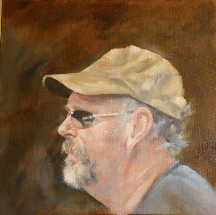
Stringy
After many months of painting water and fish, I wanted something different. I wanted portraits again.
There is endless interest in the human head and face, with so many people to choose from. I thought I'd get some practice in with some people I know before I hunt down new victims :).
This is one of my husband's friends who helps out in the woods. Brian, often referred to as 'Stringy' was a neighbour when I lived in Pouch Cove and his children went to school with mine. Odd how people get nicknames, more so males, isn't it?
This is in oils on a 12" x 12" canvas panel completed in about 4 hours.
Sunday, September 23, 2012
Sound waves
Don't ever throw away your rejects in paper or canvas, you never know how they can be adjusted and resurface as swans.
This was the case for this piece. I was doing to printmaking, using repeating patterns as a theme and as with most printmaking, not every single piece will be a winner. I liked the base colour which was in acrylic and the subtle patterning marks on the surface, but it was too faint to stand on its own.
I added some bands of texture using natural sand paste and once dry added watercolour washes, letting it seep into the crevices and highlight the texture of the paste on the surface. once dry, I added strokes of intense colour using soft pastels. These hit the high points of the textured surface and the whole reminded me of graphs of sound waves.
This is 8" x 10" on subi paper.
Subscribe to:
Posts (Atom)