Saturday, March 16, 2019

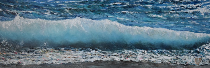
The Wearing (and painting) of the Green

Redemption
24" x 30"
oil on canvas

Green is one of those colours that a lot of artists have trouble coming to grips with.  Me included.  Maybe it's not so much the colour but the subject as I think of landscape frequently when I think of greens and the vastness of landscapes can be daunting.

I can't give you a precise formula for mixing greens, as I use so many small amounts of other colours when creating a colour which is specific to the subject and light.  But I can share the basic colours that I do use as the hopping off points for many different shades of green.

On my palette you'll always find

  • Ultramarine Blue
  • Pthalo Blue (green shade)
  • Cadmium yellow light or medium
  • Cadmium lemon 

ultramarine blue and cad yellow light
pthalo blue and the cad lemon

These two mixes provide strong basic greens to which I can lighten with the yellow or darken with more blue, changing the way they "lean" i.e. warmer or cooler. With the addition of other colours I can create other hues.

You can watch a short Youtube video I made on basic colour mixing here to see some of the base greens that I mix using these colours.  And another on colour matching here. This one deals with the principle of colour mixing and doesn't specifically deal with the colour green.


Celebrating St. Patrick's Day?  Let your walls join in and celebrate "the wearing of the green" all year round!  Save 17% from March 16 - 23 on select original green paintings.  Click here to see what's available.

And Happy St. Patrick's Day!

Saturday, March 02, 2019

Thoughts on Abstraction


Circles and Ladders
12" x 36"
oil on canvas

From time to time I wander into abstraction.  Never purposefully, more by accident.  A stroke here or there that is misplaced but looks interesting leads to other strokes placed more deliberately but without a concrete subject in mind, just colour against colour.

Abstraction is seen as easy and something anyone can do.  And there is a lot of bad abstract paintings out there just as there are in representational work.  Abstraction demands colour and value knowledge and a lot of patience.  It takes endless layers and decision making to create something that is pleasing to the eye. 

Cropped detail section

As this piece emerged, I considered why it emerged and what I was thinking as it developed and put some of those thoughts into words in a short video.

Monday, February 18, 2019

Freeloader blues

Freeloaders
24" x 36" x 1.5"
oil on canvas


I loved all the blues in this subject when I first saw it.  Then I hated all the blues in this subject by the time I really got into the painting.

Isn't it like that sometimes?  The concept seems perfect but the execution doesn't go quite as planned making the urge to abandon things very strong.


I have to remind myself with pretty much every painting that it goes through phases and that sometimes the "ugly" phase takes a bit of time and effort to push through.  It's well worth the push and the angst when suddenly everything starts to gel and you can see just what stroke to put where and it works.

It's often little things that create that turning point, like deepening contrasts and adding just the right amount of detail to make object come alive. 

In reality this painting did not take the forever that it felt like while creating it, but it did test my patience and my observation skills from the initial drawing, which was complex (a lot of measuring to get proportions right), to tackling all those blue hues.  Using colours that are very similar, like these blues, require the insertion of other colours to liven them up.  Complementary colours and touches of contrasting colours provide some reality and vibrancy, even if at the time, they seem unreal.


Friday, February 15, 2019

Beginnings, middles and ends


Paintings are almost like books or films with predictable processes - and unpredictable results. 

They have a beginning where I have an idea, some thumbnail sketches and a colour study.  It's like starting an introduction to the characters and setting the scene if it were a book.

The middle is where the action starts.  I put down paint, change ideas and colours and sometimes even scrape back the whole piece and restart! It can be unpredictable.  I know that sounds odd but I often don't know just how the painting will turn out as it evolves so much over time.  The plot thickens as the paint is applied and decisions are made and reversed.

Finally, the end is in sight, where I can see the goal.  Suddenly one day, after hours and days of work, that "light bulb moment" happens and things all start to fall into place.  My favourite part is the end.  At that point I can forget form and values and concentrate on details and touches of colour that bring a painting to life.   Once I can add no more and am simply fiddling with paint, I know its time to call it finished.

This painting is at that final stage now where I can start adding detail.  It is a restart over an previous work (Recycling) and has gone through its stages.  Each stage has its own challenges and rewards but for me, the end is sweet.

Wednesday, February 13, 2019

Gallery Insider - Rejection is a good thing

Bottoms Up
36" x 36"
oil on canvas


It's not until you own an art gallery that you truly appreciate the work that goes into making art available to the public.  Running an art gallery is not for the faint of heart, but that is true for any entrepreneurial undertaking. 

Artist partnerships are the backbone of the business and developing relationships over time is crucial.  While hard and firm contracts are not always the norm, especially in a seasonal gallery, quality is and with the curation of what goes on the wall comes rejection of paintings or artists whose work doesn't fit for a variety of reasons.


Rejection is often seen as a terrible thing and I've seen (and heard) lots of complaints about gallery owners who decline artists' work.  I've been there too, believe me.  I don't think there is an artist on the planet who hasn't been had a rejected application or painting for a show.  While it may sting a little at first, rejection sends artists a message and an opportunity.  In many cases, rejection of a piece of art provides the artist with the opportunity to reflect on their technique, process, subject and style and look at ways to improve it.   With so many people dipping their toes into the art world these days, Pareto's Principle applies:  20% of artists will be saleable; 80% will not.  Producing art that the public wants is subjective of course, but good art and good materials are objective from the gallery perspective and non-negotiable.

I see work submitted on inferior supports and materials and off the shelf framing that sends me the message that the artist does not take their work seriously.  If I can tell if you have dollar store canvas and whether you know technique or colour theory, so will a potential buyer.  Yes, it is expensive to paint and to frame with quality supplies.  But supplies are the tools of the trade and to be represented at a fine art gallery and have the public spend money on your art, it needs to be the best quality that you can afford.  If  quality products are not used to create, artists may need to rethink where they want their work will hang.

So, how do you improve your chance of getting into a gallery?

1. Read the (usually downloadable) information on submitting work to a gallery.  It is there for a reason and usually answers most questions that you may have about responsibilities of the gallery and the artist, as well as financial transaction information, intake dates, etc.  Follow the instructions, provide the necessary information and don't turn up at the gallery with a car load of paintings that you expect will be approved on the spot.  "I didn't know" doesn't sit well for gallery owners and may well get you a rejection.  Again, its about professionalism.  Your art is your business.  If you don't care, why do you expect someone else to?

2. Use quality materials.  Quality shows in everything, from the painting to the framing.  It is your representation to the world.  Make sure it is the best you can offer.

3. Research the gallery genre and make sure your work fits in.  If you've never visited in person or even been to the website and you make X when the gallery only sells Y, you'll be rejected.

4. Don't cut and paste your cover letter/email to the gallery.  Sure, its quicker if its very generic, but if you don't take time to tailor it to the curator/director, your professionalism is judged immediately.  Cut & paste also runs you the risk of adding details of another gallery or show in the body of the email.  A sure fire way to be rejected.

5. Find your own style and stick with it.  Hopping from medium to medium and subject to subject confuses buyers and galleries.  The gallery is there to sell your work and be your spokesperson.  If four of your pieces look like they are from completely different artists it is a problem.  Also if your work looks like ten other artists' work, or the work from an artist at the latest workshop you've attended, that is a problem too.

6. Hone your technical skills.  Poorly executed art shows lack of knowledge and technique.

7.  Don't take rejection personally.  It is an opportunity to study your work, where you want to go with it and how you want to improve it.  Take advantage of that so when you apply to a gallery again, you'll have some more meat on the bones of your art.

For information on  2019 submissions to The Baccalieu Gallery, Heart's Content, NL Canada, click here to download gallery information and submission form.


Friday, February 08, 2019

Recycling


A couple of times a year I do a clear up and purge of art supplies and old paintings.  I throw out or burn unusable things, give away what I know I'll never use and recycle what can be saved.  I also vow to not buy more supplies than I know I'll use.  Well, I try.  To be honest, I don't buy a lot of random art supplies any more.  I have a pretty strict art supply list that I stick with that consists of oil paints and canvasses and tend to buy in bulk twice a year.  Of course a few "treats" find their way into those orders, using printmaking supplies and a nice fountain pen and ink.  See how easily I get waylaid?

Among the usual stash of pencils, paints and papers that I part company with, there are always starts on canvasses.  They were ideas that never took shape or simply went in the wrong direction.  If they're not textured and if the medium used can be painted over, I reuse them for another piece.  Sometimes, I gesso over the piece, sometimes, as in this one, I draw directly over the old start then paint over it.


This was a start of a flooded path in the woods that didn't inspire me so I turned it upside down and created this dory.  I rather like how the boat form envelops the previous work in its initial stage.

So what does your stash look like?   Do you have a sampling of everything or do you stick with materials that you constantly work with?

Sunday, February 03, 2019

Puffins


Mind Your Head
12" x 12"
oil on cradled wood panel
Available for purchase online  Click here for details

Puffins are the Atlantic version of parrots.  Colourful, stocky and low flying, they seek shelter and homes on outcropping on the edge of land or on islands just offshore.  And in Newfoundland, we are lucky enough to have them close by and see them from land or on a boat just off shore.  At present, about 60 percent of the North American population breeds on four islands in Witless Bay off the east coast of the island of Newfoundland

There seems to be a universal appeal for these birds, especially in their breeding season when their beaks are brightly coloured.  After the breeding season, the beaks change to a dull grey, making them almost look like an entirely different bird.

They aren't elegant and if you've watched them take off and land you'd see their lack of grace as they crash into other birds as they land or fall into the sea when taking off.

Saturday, February 02, 2019

The Road Less Travelled


The Road Less Travelled
oil study on canvas paper - 6 x 9

The Baccalieu Gallery is located in Heart's Content, about a 130km drive from my home in the city.  Although the building is empty during the winter/early spring, I have technology on my side so that I can view every part inside and out through remote cameras, with motion activation alarms and smoke detectors on 24/7 alert. 

But, I still like to visit the property every couple of weeks to double check in person.  Part of the drive to the gallery is my favourite, across the Heart's Content Barrens.  This is a stretch of road that can have a completely different climate from down by the ocean or in the city, but the roads are kept well sanded and plowed, making travel pretty straightforward unless there is a major snowfall or snow squall.

The views across the barrens is, to me, always spectacular and always interesting, no matter what the weather.   This view shows a front of snow coming in fast on a cold day in December.  The almost monochrome palette gives drama to the scene and the snow was flying by the time I got to the other end of the road.


Sunday, December 02, 2018

Win an original painting!


As promised, here are details of how to win an original painting.   This giveaway is for Canadians only.  (USA residents can participate in a draw for a new OttLite lamp in separate giveaway here.) 

This painting is titled "Three on Lace" and measures 9" x 12" in oils.  I work exclusively in palette knives so there's lots of texture and vibrant colour to fit any setting.   I'm happy to send it to its new owner and this is how to get your name into the giveaway.

Head over to my Facebook page and let me know in the comments on the giveaway post what province you live in and what tradition you love most about Christmas (or another winter festival).  On December 15, 2018, a winner will be randomly drawn and notified. 

Good luck!

Saturday, December 01, 2018

Win an OttLite lamp


I'm happy to partner with OttLite in reviewing one of their newest lamps, the Cool Breeze LED Fan Lamp and offer one lucky person their own lamp in this seasonal giveaway.  Have a look at my review, this really is a very functional lamp for any individual who needs good light to work in.  From OttLite's Wellness Series, the lamp is designed to reduce eyestrain, so for me, having just finished cataract surgery in both eyes, good light is crucial for me to create effectively.

Regional restrictions limit participation to US residents only for this giveaway.

Here's how to enter:

Go to my Facebook page post and tell me the comments what state you're from and why you would like to win this lamp.  If you are subscribed to my mailing list, you get an extra chance to win!  Click here to subscribe

Links to subscribe and to my Facebook page are in the show notes on the video.  Just click the "see more" link under the video.  A winner will be randomly drawn from entries on December 15, 2018 and notified.

And if you're Canadian, check out an exclusive giveaway just for my fellow Canucks to win an original painting.  More details on that tomorrow, or check it out on Facebook.

Good luck!

Friday, November 02, 2018

Remembrance Day 2018

In Flanders Fields  -  SOLD
12 x 36 
oil on canvas

The gallery season is over and after all the taking down of paintings, packing personal effects and moving back to the city, there is a transition to "civilian" life again.   Of course that doesn't last long as exhibitions, new paintings and events leading up to Christmas take over from day to day gallery life. But  before that, my concentration is on November 11th - Remembrance or Armistice Day in Canada.

Fallen - SOLD
8" x 10" 
Oil on Panel  
Click here  for details

Each year I create a small painting of a red poppy for Remembrance Day in honour of my great uncle who died in WWI and of those who fought and died in World War I and II and those still serving in peacekeeping and conflicts around the world.  Poppies are the only flower that I paint and only for Armistice Day, as my subjects are usually boats and water.

Survivor - SOLD
6" x 8"
oil on panel

This year I started earlier than usual with a larger painting.  "In Flanders Fields" is 12" x 36" and sold before I shared it on social media.  So I painted my usual smaller one and then one slightly larger.  Survivor has sold but Fallen is still available along with a couple of others from previous years.  You can view details of them in my webstore.

Thursday, August 16, 2018

Gallery Operations I


Bright & Early
30" x 40" oil on canvas

I own and manage The Baccalieu Gallery, in Heart's Content, Newfoundland since August 2017.  So who am I to offer advice you ask, with a gallery technically still in its infancy?  I am learning as I go and hope some of the information I share will be helpful. I want to show you the good and bad sides of gallery operations and open your eyes to the reality of operating an art gallery that you may not know or have not considered. If you have questions, comments or suggestions for topics you would like more information on, let me know in the comments or email me directly.

Running a gallery is harder than I thought.  I mean I'm no slouch when it comes to work but there are some rules I set myself to make sure things get done and still leave me painting time (and sanity). 

1.  Always stay on top of the finances.  Invoices, bills, suppliers, utilities, all those things that make the world go round or come to a screeching halt  need attention.  Immediately.   I have gotten into a routine that ensures there's never a backlog of accounting  tasks to deal with.  I enter revenue at the end of day and make adjustments as required.  I also deal with receipts and bills as they come in, otherwise I can't sleep at night, knowing they're waiting for me.

2. Marketing.   Putting the brand and myself out there is crucial to making a mark in this world of art and galleries who are all vying for the same centre stage.   But I don't want it to take over my life or have me tethered to a computer all day, so I plan ahead.  I have a pretty good ideas of what social media message I'll put out the next day and what image(s) will go with it.   Then it takes me 10 minutes in the early morning and its done.  I don't usually check it again until after the gallery closes.

3. Treat suppliers and artists like gold.  Because they are.  These are the people who keep you in business.  Neglect them and you're toast.  Communicate, encourage visits, respond to emails promptly and provide payments on time.  Basically, treat them as you would expect to be treated.  With courtesy and respect.

Pretty much every thing else under these three topics is simple and straightforward.  That old saying, "Don't sweat the small stuff." is true.  Take care of the major players and all else falls into place. 

Sleep, eat, clean, paint, repeat.

Thursday, August 09, 2018

Breaking Point


Breaking Point
12" x 36" oil on canvas

Its time to get back to writing again. 

A year ago I opened The Baccalieu Gallery and its been an learning experience, mostly good, that is worth sharing with others. I will share my thoughts in a series of weekly gallery posts that I hope will help artists and gallery owners or those considering that option. 

I still paint of course and am enjoying a more relaxed pace of life for the season in the little seaside town of Heart's Content, where the gallery is located.  Inspiration here is at every turn and the ocean is a literally a stone's throw from the gallery.


As always I can be found online on social media, on the website and through email.  I can't wait to reconnect with old friends and new.   I've changed my Studio News to quarterly, so the next one will be emailed in early September.  Sign up is quick and easy from any of my contact points including this blog (see the right hand panel).

Saturday, July 01, 2017

I'm opening a gallery


I've been sitting on news for a month and now that the paperwork is complete I can finally let you know that I'll be opening a seasonal gallery in Heart's Content this summer!

I have been searching for a long time for what I hope is the perfect property and location for a seasonal gallery and believe that the delightful, historic seaside town of Heart's Content, on the Bay de Verde Peninsula is "the one".  With a name like Heart's Content, it beckons you to rest and relax, doesn't it?

Why do I want to open a gallery? 
  • I'm a prolific painter and have work  not currently in galleries that I want to share with the world.
  • I want to provide other artists with an opportunity to showcase their art and build their art careers. 
  • I want to be next to the sea all day and night.  It is my inspiration for many of the paintings that I produce.
  • I have a business and art background that fits this industry and I want to put those skills to work.
  • And many other reasons that I can't begin to articulate!  

The building is a large gallery space, about 1500 square feet, with an attached apartment that I'll be calling home until the end of October. It sits a stone's throw from the waters of Trinity Bay on Route 80, on the Baccalieu Trail, 1.5 hours drive from St. John's.  It is located right next to the Heart's Content Cable Station where the first permanent telegraph cable connecting Europe and North America was hauled ashore at Heart's Content. With plenty of free paved parking available right outside the door, its convenient and comfortable for access.

Right now the space is big and full of echoes but July will be crazy with refurbishment to turn the previous pharmacy into a gallery space. Some inside restructuring, painting, flooring, hanging and lighting systems as well as all the other things that will turn the space into a functional art business are in full swing.

I am aiming for an August opening and will announce the date as soon as the building is ready . The website for the gallery is incorporated into my website www.jeanettejobson.com  and updates on the refit progress will be posted there and on social media.

While the season will be shorter than usual this year, submissions from artists who believe their work would fit in with the island's newest the gallery are welcome. The feel of the gallery will be predominantly coastal - marine, aquatic, boats, fish, etc. 

Artist Submission Guidelines are available here.  

Thursday, June 22, 2017

Line Fishing

Line Fishing - Sold
22 x 28 x 1.5  oil on canvas

Dried salted cod was the staple for food and almost currency in Newfoundland for hundreds of years and still can be found drying on flakes and lines in late summer.

The colours that can be found in what initially looks like a bland cream coloured kite shape is amazing when really studied.

Tuesday, June 20, 2017

Islington

Islington - SOLD

8"x 8"  oil on panel


I cannot resist a boat sitting, waiting to be launched into the water.   This punt was resting on the wharf in Islington.  The lighting was diffused with sun just starting to show through and gave a pastel feel to the scene.

Wednesday, May 24, 2017

Seeing colour

Drying cod - work in progress

Artists seem to see colour within forms that many others do not see.  If you've seen a beginner's painting, it often has a solid block of colour making up a form, while an experienced artist's painting shows a number of colours that are used to create the same form.

For me, when I look at an image, I see the overall hue and that is often my foundation colour for that area.  Value changes will make that base colour lighter or darker as it moves across the form.  The colours overlap and intertwine.  They reflect light and hide it.  They try to create a cohesive painting where light and colour direct the viewer's eye and provide interest.

Summer Cove - oil study

Within a colour there are what I call "mini colour wheels".  These are colours that have common hues in them that harmonize with the area that I'm painting.  Often they harmonize with the whole painting.  They are the same area range of colours but more or less saturated depending on the form and light.

If you have ever created colour charts you'll be familiar with the range of hues and values that you can create with your palette or what new additions can create.  Everyone has their personal preference for paints on their palette and mix according to what they need.

Sunday, April 30, 2017

Chilling

Chilling
15" x 30"     oil on panel

“She had never known that ice could take on so many shades of blue: sharp lines of indigo like the deepest sea, aquamarine shadows, even the glint of blue-green where the sun struck just so.” 
― Malinda LoHuntress


Aside from a few details and tweaks, this painting is complete.With no shortage of sea ice and icebergs this year, there is lots of inspiration that the ocean provides, so there may be more ice paintings.


As with most of my paintings, shards and spots of unexpected colour find their way into the composition towards the end.  As long as the values are appropriate, colour works.

Thursday, April 27, 2017

Fog

Fog Blanket Over Middle Cove
11" x 17"  oil on wood panel

Fog is such an elusive thing.  Ghost like, it is there one minute and gone the next.  I stopped at the lookout in Middle Cove and watched its progress up the cove and over the land.   You can drive past the cove and be socked in with fog then drive a tiny bit further and see clear blue skies.  There is never a dull moment with the weather here.  I've sketched and photographed this vantage point several times capturing sun and fog.  Now there's a bit of both in this painting.


Painting fog with oils is all about pressure for me.  I put in a thin layer of the background then meld the fog colours over it with very light pressure and a good amount of paint on the knife.  Picking up some of the background colour with heavier pressure gives that illusion of land showing through the fog.   Its worth a little practice on a spare piece of paper or canvas to get the hang of it and decide on the fog colours, as they will change depending on the weather and the background.

Middle Cove Fog


Wednesday, April 26, 2017

10,000 years and counting

Untitled
15" x 30" oil on panel

This painting in progress is of some large chunks of ice on the shoreline.  The colours in the ice are amazing always and combined with the water lapping at their bases made a good composition.

I seem to be encased in ice lately.  My previous post at Easter about the first iceberg of the season seemed to send a signal to Mother Nature to open the floodgates.  And given the gift of ice, I figured I may as well paint it.


The pack ice pushed in to shore off and on depending on the wind direction and last weekend we had 60 hours of freezing rain and drizzle, coating the landscape.  Oddly enough it didn't seem to affect roads too much which is unusual.


Today, the sun was bright but the wind cold, but icebergs and more loose ice moved into the harbour where I live.  The sun lit the bergs and ice and the colours were beautiful blues and turquoises against the deep indigo ocean.


As the ice was so close and even on the shore, the opportunity was too good to not pass up the chance to harvest some glacial ice for drinks.  This ice is dense and melts much less quickly than the ice you'd make at home.  It was rinsed and broken into smaller pieces (this glacial ice is HARD) then to the freezer to add to drinks.  There are tiny pockets of air in glacial ice and they make popping sounds as the ice melts in a drink.  Its very unique.