Friday, March 15, 2013
The Chase
It's here! The Chase is the print for March in my Fishy Bits! project
The codfish is a classic Newfoundland image. A codfish chasing a capelin still common especially in summer when the capelin are plentiful and the cod become too full to ever be tempted by a fisherman.
A few weeks each year recreational cod fishery is open and many people take to the water to get their quota of five fish daily. Last year the fish they came back with were huge - too large to sacrifice to me for printing. So I made my own! You can purchase your very own cod/capelin chase hanging on your wall by visiting my website
These are printed using oil based ink on Japanese papers. The piece here is printed on Masa paper.
I'm presenting the finished prints in various frame options over time to give you an idea of how they look framed.
This is a simple frame, 13" x 13" square with a 5" x 7" opening. The print area is 4" x 6" and the larger opening allows space for the signature and title to show. Sorry about the reflection of me ghosting the image, a hazard of photographing glass.
Left or right?
Which is your drawing hand? Left or right? Or are you ambidextrous?
My right hand is my drawing hand, my most everything hand. The left goes along for the ride but doesn't have the dexterity for fine skills such as drawing. Any drawing I've tried with my left look like a child's drawing - shaky, broken lines without the smooth strokes that the right hand can produce.
This sketch is of my right hand. I was lying in bed, considering light and shapes and hands and took some shots of my right hand and wrist with my cell phone camera. Drawing extremeties can be challenging for artists, but as with most everything, if its broken down into simple shapes then built up from there, the intricacies can be figured out. The idea of a small series of hand drawings, perhaps in charcoal piques my interest.
Did you know?
- Approximately 8 to 15% of the adult population is left-handed.
- Studies indicate that left-handedness is more common in males than females.
- Left-handedness, in comparison to the general population, also appears to occur more frequently in identical twins, and several groups of neurologically disordered individuals
- Statistically, the identical twin of a left-handed person has a 76% chance of being left-handed, identifying the cause(s) as partly genetic and partly environmental.
- It is also noted that many bisexuals and homosexuals are left-handed more than their heterosexual counterparts.
- Also people of South Asian, Eastern European, Southeast Asian descent are more left-handed than any other ethnic groups in the world, while people of Western European, Northern European, and African descent are less left-handed.
Thursday, March 14, 2013
Jellyfish
I'm fascinated with jellyfish and depicting their shape and movement in the water. Light passes through them and creates amazing colours that you'd never think possible. Blues, yellows, purples, reds... However, this sketch is simple pen and ink, finely hatched. The beauty of the jellyfish is that the shape is simple but complex too, allowing the pen to build up layers to create form without worrying about strokes out of place.
I love to see them floating in the water, long tentacles trailing into the dark water. Their movement is so graceful, like a ballet in water. But have you ever seen a jellyfish like this one? The comb jellyfish, a voracious feeder, eating its own weight in food daily.
Wednesday, March 13, 2013
What does $25 buy?
What does $25 buy? You could buy a decent lunch. A weeks' worth of fancy coffee at Starbucks. A really good bottle of wine. But what do you have to show for it besides a memory after its gone?
Your contribution of $25 to my Indiegogo campaign gets you an original relief print from the January, February or March collections of Fishy Bits printed on Japanese paper. To keep. Forever. And a lovely hand printed thank you card from me.
Your $25 invests in local art, future printmaking and knowledge sharing. In this age of instant everything, artists who invest time to learn traditional techniques and share their inspiration through the creation of quality art are a dying breed and need your support.
Of course if you would like to contribute more than $25, it would be very welcome and the investment return is more substantial. And if you'd like to contribute less, that's possible too. If you have no spare money at all and could only share this post or campaign link, you'll have good karma always.
I'd love to share my art with you and make you the proud owner of one of Newfoundland and Labrador's cold water marine fish. Find out how your contribution can help make it possible by clicking on the campaign information below.
Or cut and paste this direct campaign link to Facebook, Twitter or a blog post to share with your networks.
On March 15th, a new Fishy Bits print will be released and available from my website. I can't wait to share it with you.
Starting from scratch
Ages ago I bought a round gallery canvas. I don’t know what possessed me to as I had no idea of what I’d paint on it. Until today.
I was thinking of fish again and the sketch of what I wanted appeared under my pencil. its good to see something evolve from concept to finished piece. Now to work on enlarging and transferring the drawing. The painting may not start til this weekend simply due to lack of time.
I keep looking at the sketch and wondering if I should give it a turn and if it would look better a quarter turn to the left, like this. Which do you prefer?
Tuesday, March 12, 2013
Red-breasted Nuthatch
Originally called Le Torchepot du Canada, the Red-breasted Nuthatch is familiar to most North American bird watchers. Its present name in French is La Sittelle à poitrine rousse, a literal translation of its standard English name. It has been locally called "upside-down bird" (Newfoundland and Labrador)
Started on newsprint with charcoal, here's the original sketch then I added soft pastels.
Monday, March 11, 2013
George Street
In St. John's, there's a famous street in the downtown core called George Street. Its home to a pedestrian only two blocks of bars, pubs, restaurants – and nothing else. Its the entertainment centre of amusement, alcohol, music, dancing, and crime - not in any particular order.
Its rare that I go to George Street, even though all ages tend to populate it, however, it is predominantly a younger group. When people visit from other places, they want to see George Street at night in all its glory and its then that I venture downtown as tour guide.
And of course when there I tend to people watch and sometimes try to sketch. This is the result of me tucked into a corner trying to be unobtrusive and a woman watching me watching her. She never said anything or approached me and I tried my best to avoid her gaze and blend into the background.
Sunday, March 10, 2013
Ducks
There are only two ducks left in the barn now. B.D. and Lucky.
B.D. is a Muscovy duck and my very favourite boy. Appropriately named Big Duck (BD for short) as he's large, about goose size. Muscovies don't quack but make a hissing sound and BD greets me like an old dog when he's out of the barn, rushing forward, crest up, hissing madly, tail wagging furiously.
Lucky, the other duck, is a Pekin, the classic white duck of fairytales and nursery rhymes and who the sketch is based on. Pekins are lovely ducks but very, very chatty. They are constantly on the prowl, sifting through grass and talking to anything that will stand still long enough.
Lucky was so named as he survived a bad attack by a mink and then another by an owl. A tendon in Lucky's neck was damaged so his neck is crooked, aside from that he's just fine. He and the two remaining ducks who survived the mink attack had been placed in a pen in the meadow til the owl visit, that killed his two companions. BD had recently lost his constant companion Buddy, so he and Lucky joined forces and are inseparable. One would be lost without the other.
I think I would too.
Saturday, March 09, 2013
People watching
I love watching the interaction of people with the world around them. While uniquely individual, they are all the same in terms of repetitive motion. That's what makes sketching in public easier for me
People change position, move around, walk, bend, eat, drink and I put down a few lines here and there then wait til they resume the position again, which they invariably do. I move from person to person with a line here and there then back again and hope they don't leave the scene entirely before I'm done. I like to test myself with just how much information I can get down in a very short time frame.
While waiting today, I sketched heads of others. I find most people that I sketch are engrossed in their own activities and rarely aware or interested in what I'm doing. The lead in my mechanical pencil gave up the ghost mid sketch and all I could find today was a ballpoint pen in my bag to sketch with, but it fits the bill to capture lines. I think the next challenge will have to be about unusual tools for drawing. Toothpicks, twigs, etc. etc. Never be afraid that your sketchbook is too precious or your drawing not perfect enough. Each line is a moment in history. Your history.
Keep mark making.
Friday, March 08, 2013
Inchworm
Bugs. Shudder.
Those who know me know I don’t tolerate insects well. I’ve been known to sleep in other rooms if a moth invades. Wasps and bees freak me out and I loathe spiders and barely tolerate earthworms. Even butterflies are just colourful moths to me and I don’t want them anywhere near me.
Inchworms? Well they’re a little different. They’re tiny, or at least the ones I knew were, and a lovely chartreuse colour. I remember playing games with them with I was a child, watching them pull up their centres and stretch out again to move ahead. I loved seeing their strength as they extended their tiny bodies to test for the next landing point, waving gently back and forth
Who remembers this song and your own adventures with inchworms?
Thursday, March 07, 2013
Cup o’ Joe
A couple of years ago, several dozen seagulls in St. John’s met their untimely end due to ingestion of coffee grounds. Seagulls seem to populate every part of town and are voracious eaters, tackling any garbage bag they see and I imagine there are coffee grounds in many bags, especially if they find one from a local coffee shop.
The expression on this bird seems a little surprised. Its that wide-eyed look, a little frantic and undertone of calm supporting it, verging on the edge of wanting to go back for more, but feeling that he shouldn’t.
I love gulls, crazy, pugnacious and greedy as they are. Drawing this one was very enjoyable. This is day seven of my March Sketch a Day project. Each day sharing a sketch with you on a blog page devoted to just that. You can take part too and add your sketch during March. Doesn't matter if its each day or only one, its all about the drawing practice!
Talking about aggressive, take a minute to watch the video below of a very bold seagull who swiped a woman’s camera in San Francisco while she was filming the sunset.
The camera was still filming and the gull eventually relinquished it in another spot after determining it wasn’t edible. The gull-eye view footage, including the thief’s getaway, was included.
Wednesday, March 06, 2013
Little things
On February 24th, my eldest daughter had her first child, a boy. I'm looking forward to meeting him for the first time in early April, but until then I have to be content with virtual visits and photographs.
This is the first sketch of my new grandson and I'm sure there will be many more to come.
Tuesday, March 05, 2013
Reynard II
Reynard the Fox was a medieval European trickster figure, a nasty but charismatic character who was always in trouble but always able to talk his way out of any retribution.
I'm not so sure whether this fellow is quite so willing to talk his way out of trouble. He lies in wait in the grasses at the edge of the meadow, hidden enough from view but with full view of his surroundings.
Foxes have very cat-like features I think and quite delicate faces, legs and feet. I've had quite a few encounters with them on the farm and just the other morning saw a silver fox race across the road as I left for work. Red foxes are much more commonly seen so the silver one was a treat.
This fox is drawn on newsprint in pastel. 12" x 12" approximately.
Veiled
Drawing casts is a traditional method of learning to draw form. All kinds of sculpture is used to draw from and good lighting helps the artist create the play of light and dark that gives the piece shape.
This is a form of gargoyle found on many buildings, little heads with various expressions that populate churches, cathedrals and buildings of importance.
This is a quick sketch done at lunch today that will be turned into a drawing. I have vowed to produce several complete drawings this year and this will be one of them. I think I hear charcoal calling for this one...
Monday, March 04, 2013
Reynard the Fox
Living in the country, there's always animals around. Some wanted, some not so wanted.
Foxes are elegant opportunists. They watch unseen from the woods and lurk on the edge of the field, waiting for a moment to grab a chicken or duck that's wandered too far or if very bold, they venture into the barn to see what's available.
Although I don't like it if they do kill one of the birds, I also have a degree of sympathy for them, as I know they're simply looking for a meal to feed themselves or a den of kits.
This sketch is the start of a small oil painting of Monsieur Reynard. Drawing is the backbone of art and the need to draw and sketch daily pushes me to keep those hard earned skills intact.
You can add your sketch for one or all days in March on my March Sketch a Day page. Simply add your name, blog post url and image to the Add my Link button on that page.
Sunday, March 03, 2013
Youth
The classic lines in this fellow's face appealed to me and it may be worth expanding into a portrait. For now, just a sketch.
Saturday, March 02, 2013
Afternoon stroll
Still in Vilnius, I came across this older woman out for a stroll in the dappled sunshine. It seems the world over the stance, hair and accessories remain the same. These sketches are being completed in a 3" x 5" trave e logue sketchbook. The paper is fairly substantial and holds water well, so I thought I'd take advantage of that fact.
If you'd like to add your sketches during March, go to the March Sketch a Day page on my blog (see the page tabs above) and use the button to to add your image and link back to your blog post. Let's see how many people will join in this month!
Friday, March 01, 2013
March sketching
Drawing has always been my comfort zone, but painting does eat into that and I while I usually sketch something most days, I don't usually share it.
I've decided that I will devote March to sharing a sketch a day. One, it puts a bit of pressure on me to ensure that I do produce and two, it continues to ensure I keep my drawing skills honed.
I'll be posting the sketches in a Facebook album and also sharing them on my blog on the March Sketch A Day page. I'd love others to join in and share what they've drawn during the month. You can add a thumbnail of your sketch on my March Sketch a Day page which also links directly to your blog post. The basis of the sketch should be a drawn line, but colour always livens things up after you have the "bones" down.
I'll start the month off with a sketch of a row of sheds on the side of a road in Vilnius, Lithuania. If you're looking for something new to sketch try The Virtual Paint Out. You never know what's waiting for you there!
Wednesday, February 27, 2013
Glass continued
This is why I rarely use a photograph if working from a reference piece but leave it on the computer. That way I can zoom in and see detail and colour that no printer, no matter what the quality of output, can ever produce. Here is the current work's progress, using layers of oils on top of the acrylic from the last post.
There's still lots more to do and I want to leave it for a couple of day to dry a little then start some glazes over the glass surface in some areas.
Monday, February 25, 2013
Painting glass
I've determined that my love of painting water and fish and reflective objects is all down to that play of light and how it forms shapes so well. Capturing the reflective quality is a challenge to me and a bit like a puzzle that I always enjoy tackling. Glass tends to be one of those perceived difficulties for artists who view the whole and panic, wishing there was a "glass" paint to achieve the transparent and reflective surface.
Reflective surfaces need to be studied carefully to understand just what makes up their form. When you dissect a highly reflective object in bright light, you see that the lines between values are very well marked and break the general rules in painting and drawing of not having crisp edges between values. It is that edge that defines what we see and interpret and shiny. If the bright light was not reflecting off the surface, the effect would still be there, but less intense.
Yesterday I created the study of a glass bottle (top of page) using watercolour in a 6 x 12 multimedia sketchbook. I love my studies as many of you know and wanted to see if this would be worthwhile to turn into a painting. And I believe it is.
The form and reflections work well and I've drawn the bottle again freehand with acrylic paint and blocked in some form with dilute acrylic washes. Next I'll start adding colour in oils. Acrylic backgrounds are almost another form of study, letting me block in colour quickly to set the stage for what is to come.
This is on a 9" x 12" canvas panel.
Saturday, February 23, 2013
Indiegogo project
I've taken the plunge and have launched an Indiegogo project to fund my printmaking project Fishy Bits! in 2013. Funding will help provide me with an entry level printing press as well as professional carving tools and supplies.
I'd be grateful if you could share this information with your networks. The more people exposed to the message, the better chance I have of achieving my goal. And of course, there are perks for contributions! Contribution levels are available to suit every budget and if you can't contribute financially, sharing information on this project is as good as any contribution. Facebook, Twitter, Google+, your blog, your website...anywhere!
Meanwhile, the March fish print has been carved and will be released on March 15th. The January and February prints are completed and available from my website. Happy fishing!
Friday, February 22, 2013
Reality and fantasy
So many beginning artists believe that fantasy work is all in your head. Its quite the opposite in fact, with reality front and centre. The concept comes from within, but the creation is based on real objects and people. The skill is in composition, and morphing real into the unreal, which is still based on reality, if that makes sense. For instance, a rabbit would never wear a jacket in reality, so my research is based on two images: the first of a rabbit, the second of someone in that particular pose wearing a jacket. Merging the two becomes simple once the idea is in place of putting an animal into a human pose. Little touches of whimsy are added on as the piece progresses and my mind wanders.
My art group has been tossing around ideas for a new project that may or may not get off the ground - a Newfoundlandized version the classic story, Alice in Wonderland. This is the thumbnail sketch of the Mad Hatter's tea party, or my version, in its infancy. Of course in Newfoundland the best party always seems to gravitate to the kitchen, so of course, that is where the tea party would have to take place. I've been compiling little sketches here and there over a few weeks to see what ideas gel and how much complexity to put into something. Even if they never make it into full paintings, the process gives a lot of food for thought and a lot of good practice on drawing and composition skills.
The beauty of creating something out of nothing is that it allows your mind to pull up memories, then flesh them out with solid research for forms. While very time consuming in terms of researching and drawing, the results prove quite interesting.
Wednesday, February 20, 2013
Fractured duck
Duck Bucket
5 x 7 oil
No, no don’t report me for duck abuse! Its only the paint I fractured, not the duck!
I had downloaded a Artbyte tutorial on Daily Paintworks by Julie Ford Oliver on using fracturing in painting (thank you Julie!) and because I get side tracked easily from my main painting tasks, I thought I’d try it out using this image of one of my ducks from a few years back. Also check out Celeste Bergin’s experiments with fracturing paint too here and here. Love that red chair!
I didn’t have the scraper tool that Julie adapted, so substituted a Catalyst rubber blade made by Princeton which was flexible and about an inch broad, but likely need to adapt a scraper to fit the bill.
I think my piece is more palette knife than paint fracturing, but it was fun to do and I may try again with a more refined technique instead of slapping on paint quite so lavishly.
The duck story? I had quite a few ducks a number of years ago, and the white Pekins were one of my favourite. Chatty, busy birds that made a line around the farm and laid lots of eggs as well as cleaning up grubs from the grass. They always seems to be looking for something in the grass and if an inanimate object was found, they would “wash” it in their water bowl and there it would stay.
Pekin ducks LOVE water. And yes, you say, ducks do. But not all ducks do. My Muscovy ducks didn’t like water much and BD, who I still have, really, really dislikes water except on days so hot he needs to cool down. However, Pekin ducks make a beeline for any water. A red bucket of water had been put out for them and a few minutes later I could hear scrabbling and quacking and went to investigate. This duck got too excited and climbed into the bucket then, of course, couldn’t get out and had to be rescued. Its a bit like having toddlers around. You need eyes in the back of your head!
Never a dull moment around here!
Sunday, February 17, 2013
The fall back
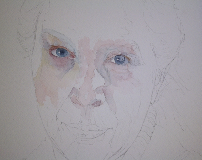
When inspiration isn't high or other things are on my schedule, I have a fall back. Its me. Or more precise, self portraits. They help me work out solutions, experiment with mediums and techniques and there's never much complaint from the model or any fees to pay.
The comfort level comes from familiarity. After all these years, I know my face, good and bad, well. I have the ability to see skin tones in an instant, adjust lighting to suit my needs and tweak without protest. Self portraiture creates a historical record of features at a specific point in time. Not that future generations or public will hold me up as a celebrity, but they may be curious about the time or person that connects in some way to themselves.
When I think of generations long gone, I would love if they had recorded themselves in words and paintings for me to see and get a glimpse into their life, whether real or imagined.
I enjoy using watercolours for portraits. They give a soft but strong impact and work so well for skin tones and eyes. I love seeing features appear out of the white paper as if by magic. This seems to happen more with watercolour for me than oils where I block in more colour at the start. Of course I could do the same with watercolour, but I go with the eyes first then work my way out from there. I drew this out yesterday between bouts of doing other administrative tasks and started adding some colour today, again, between tasks.
Its not really a work in progress though you will see more complete versions appear in the future, provided the muse doesn't push me into another direction before that happens.
What's your fall back subject?
Thursday, February 14, 2013
Heart
I threw out a little challenge to other members of my local art group to come up with a heart for Valentine's Day. The time limit was very short - I only considered the option on the drive home about 36 hours ago but a couple of people in the group joined in.
Unfortunately, the Arts Northeast blog won't let me post pictures tonight for some reason, so I'll show you what I created and hopefully the gremlins in the system will allow me to post on the ANE blog later.
This started out with a sheet of watercolour paper that I had gessoed tissue onto and let dry. The resulting texture, with some additional string gel made a perfect surface that reminded me almost of veins and arteries running through the heart. A tiny bit of silver leaf finished it off. Its about 5 x 7" and acrylic as I wanted quick dry time.
I hope your V-Day was full of love.
Wednesday, February 13, 2013
Laid back
Sometimes you just have to relax and goof around. This is Jessie’s motto for life. There are no pretentions, no trying to impress, its all about enjoying life and having a good time. What you see is what you get and if you don’t like it, she doesn’t understand why and tries to persuade you otherwise. We could all take a page from a dog’s approach to life and just go with the flow instead of fighting it every step of the way.
This was a loose sketch done in pastel on newsprint. It was good to get loose and just let colour and shape guide my hand. A piece of paper that’s big enough, forgiving enough and with no expectation of outcome. I think I’m getting the canine insight into life already!
On another note, you may notice that my Etsy store widget is missing from my blog. After a number of years of selling on Etsy, I have closed my shop. I’ve found that Etsy no longer meets my needs. The sellers are too numerous and its looking more like a shop browser’s paradise and difficult for a fine art collector to sift through the craft to local original art. So I’m moving my small pieces for sale through my website at the moment and may try them on another small painting site in the future. But for now you can find them on www.jeanettejobson.com
What has your experience been with Etsy? Have sales slowed over the last year? Is there more craft than quality? Are fees an issue on Etsy or on other sites selling small pieces of fine art? Where do you sell your small pieces? Any input is always valuable.
Saturday, February 09, 2013
Winter Light
Pears are one of the most common subjects for painting and drawing. Simple, but also complex to capture the values to produce that round shape. I can't say that pears are my favourite thing to paint. Their overuse makes them seem almost too common, however, revisiting simple shapes and interesting light is always a good warm up.
Here's a short video of the steps I took getting to the final piece. I hate the red pear by the way it looks like a block of wood no matter what I do to it! :)
Thursday, February 07, 2013
Cecelia - SOLD
Cecelia sat by the surf, contemplating yet another herring. Yes, fish was good for the waistline, but her need for something more comforting was ever present. With one more look at the sea, she took to wing, heading for the nearest McDonald's parking lot to barter with the crows for left over french fries.
Yes, another small painting. I’m on a bird track but I do have other paintings in the wings, large pieces that will start to take shape over the next few days.
I do love birds of all kinds but haven’t painted many of them and not a seagull, well herring gull in this case. I find seagulls fascinating and living on the sea there are always hundreds of them around and they always seem to hang out at fast food restaurants. Easy pickings I presume. They are huge birds with bad tempers and a love for a fight with most any other bird that crosses their path. I recall a particular scary encounter with gulls at Paignton Zoo years ago at an outdoor restaurant.
Despite that, I still think they’re beautiful and deserve a large painting of their own soon.
Tuesday, February 05, 2013
Sparrow - SOLD
I can’t seem to settle into a major painting since before Christmas and keep producing studies or small paintings. I have ideas for larger pieces in my head and filling sketchbooks but they don’t seem to translate onto paper or canvas. I must buckle down and just produce and not let myself get side tracked.
This little house sparrow was one of the side tracks. 5” x 7” on stretched canvas in acrylics.
And some interesting facts about house sparrows:
1. In 1883, House Sparrows were legally protected in Texas. There was a law that disallowed the killing of any sparrow back then.
2. The House Sparrow first came to North America in 1851, when it was introduced to Brooklyn, New York. From there, the House Sparrow population quickly spread to the Rocky Mountains and on to the West Coast, mainly due to introductions in San Francisco, California and Salt Lake City, Utah.
3. Incubation of eggs takes just 11 days, and two weeks later the young will leave the nest.
4. Most pairs will try and raise at least two and often three broods a year.
5. Their adaptability can be gauged by the fact that they have been found living and breeding 2000ft underground in a coalmine; others have been recorded living their whole lives inside warehouses
Friday, February 01, 2013
Orange study - SOLD
Pigments Through the Ages states:
The color we know as orange was referred to in Old English as “geoluhread,” which means yellow-red. The word “orange” was adopted after the eponymous fruit was introduced to English via the Spanish word naranja, which came from the Sanskrit word nāraṅga.
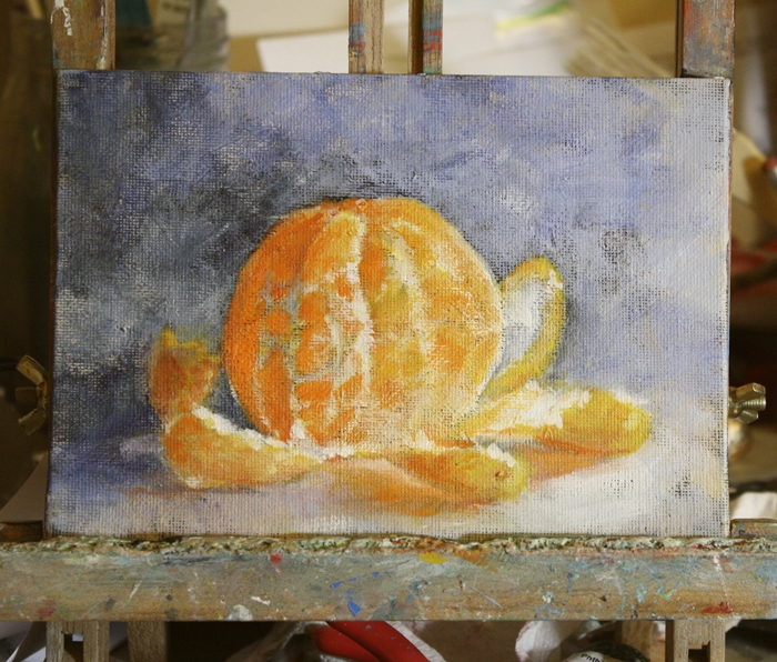
Orange and turquoise are my two favourite painting colours and they turn up over and over, especially in my fish paintings - well in most of my paintings you'll find traces of them. The orange I like is pure pigment, cadmium orange is a warm colour which turns more towards yellow and my turquoise of choice (more like easy access/no mix) is Daniel Smith cobalt teal blue, however I do create my own turquoise using ultramarine and pthalo green with titanium white. There are endless combinations of colours to create turquoise, depending on what value and warmth/coolness you want.
Still in acrylics I started this study of a clementine over a panel that I scrapped then restarted, using a black background over the offending part of the original painting and leaving the perimeter pale. Of course a form of blue and lavender crept in to offset the orange and there it was. No, not turquoise, but blues are never far away.
.
Monday, January 28, 2013
Blue Mussel
I couldn't settle on anything specific to paint tonight and decided to pull out my acrylics for some practice. After using oils for quite awhile, there is always a bit of a learning curve in using acrylics again. They're more common lately, as so many people have issues with oil paints and solvents and clean up is easier.
So hunting through my archives I found this little blue mussel shell. These are so common in Newfoundland seen on every beach it seems and are grown commercially. Unfortunately I am allergic to shellfish, so simply admire them from an artistic point of view.
This is on a 5" x 7" stretched canvas. I toned the canvas black and like the effect of a little darkness coming through the layers and will use the dark tone again I think.
Friday, January 25, 2013
1892
The Great Fire in St. John's, Newfoundland and Labrador on July 8, 1892, is remembered as the worst disaster ever to befall that city.
Daybreak on the morning of July 9, 1892 revealed the full extent of the fire's devastation.
"When morning broke the thick clouds of smoke still ascended from the burning ruins, and it was hours before it had cleared sufficiently to admit a view of the track of the desolating scourge. A walk through the deserted streets demonstrated that the ruin was even more complete than seemed possible at first. Of the whole easterly section, scarcely a building remained… of the costly and imposing structures and public buildings which were the pride and glory of the people, scarcely a vestige remained; and St. John's lay in the morning as a city despoiled of her beauty, her choicest ornaments, presenting a picture of utter desolation and woe."
There have been fires since, but none having the devastating effects that this had on the city. Rows of tightly packed old wooden houses and a strong wind whips fire into a frenzy and there have been a few near misses in the not too distant past.
So what is the connection between this painting and fire? I’ve been mulling over abstract or modern painting and dissecting the why and how of it to make it clear in my head. I’ll be writing another post about abstract art and my thoughts and ideas of how to get started with it for my own art group and will share some of those thoughts at a later date.
What I will share now is my finding that abstract art is not unlike most other forms in terms of construction. There has to be a concept to start with and an idea of palette, otherwise you’re slinging paint around without any pleasing form or contrasting areas.
For me, in creating abstract art, I become the medium and the painting shows me the path. Form and colour become intuitive and you just “know” what to do next. It is the case with this piece. It started out tamely enough, then a smear of modeling paste here and there, a strong pigment and a line and the idea of fire started taking over, just as a real fire would.
I have found that letting the painting guide me, as new age as that sounds, is a truth. Until you experience it, you cannot know the freedom it unfolds.
Saturday, January 19, 2013
Hot wax
Winter is a lovely time to dabble in encaustics, as there are always elements of heat involved. Melting wax on a hot griddle and fusing the layers with a hot air gun aren’t often things you want to do in summer’s heat, but they warm up me and the studio nicely in the colder months.
I don’t have a lot of experience using encaustics, but I do enjoy experimenting with the process of blending colours and more currently, embedding objects into the wax. These are two small pieces 6” x 6” on encaustic board where embedding is used. In the first, I’ve used a print of one of my paintings under layers of transparent wax. The fish and their circle is an original coloured pencil piece that I’ve only now made available for sale. The circle and its eternal, yet opposing directions reminds me of life and with that life, its origins, represented by the embedded ‘eggs’ on the lower half of the piece. In reality they are pink peppercorns.
The second piece ‘Eye of the Forest’ was inspired by the wooden layer of bark that I found discarded by some felled trees, the remnant of a knot where a branch arose. The patterning and placement flowed from there, as I wanted it to fit into a natural, yet somewhat dream like place.
Look for more encaustic from me this year, as time allows. I fully intend to test this medium and push its limits. Next step: burning surfaces, but not til I can get a clear day and a dry patch of driveway!
Sunday, January 13, 2013
Alternate watercolour techniques
Frozen Pond
Mixed Media 6” x 18”
Its good to flex my artistic boundaries and play around with the interaction between the real world and that which is on paper. One way to do this is through frozen watercolour. Of course being in a northern climate, it makes it a little easier during winter to be able to test this out.
Frozen watercolour is a technique of exposing very wet watercolour pigments on a paper surface to freezing temperatures. The result is unpredictable, always different and quite unique.
In the painting at the top of this post, Frozen Pond, I wet just the water section of the painting before freezing so I would only obtain the patterning on that section of the piece. The majority of the frost patterning is on the right of the painting, just where I wanted it. I used optimal temperatures for this piece and in the image below, it was much colder. You can see the difference in results for the formation of ice crystals. They are longer and sharper then in the lower temperatures.
I hope to create a full tutorial on the subject, but will share what I have learned here if you would like to try this technique yourself.
1. I have found that optimum temperatures are between –5C and –7C (23F – 19F) that produce the classic feathery frost patterning. If very cold (-12C – 10F plus) the patterns formed are random sharp crystals.
2. A domestic freezer will not produce temperatures low enough to affect the water on the surface. It will freeze but with no resulting pattern.
3. Wind and humidity play a role in the pattern formation and you have no control over the end results.
4. The paper must be flooded with water, then very strong pigment washes dropped onto the surface, then quickly placed outside on a flat surface.
5. Allow about 30 minutes for the freezing process to take place.
6. The best watercolour paper to use is 200lb if not stretched. 140lb MUST be stretched prior to the freezing or it will buckle when wet and the crystals will form in the wetter areas.
7. Each and every time will provide a different result, based on weather, wind, humidity, paper, pigment, amount of water, etc.
8. An image can be painted and let dry then glazed with wet washes that freeze over the original painting. (see fish above)