Wednesday, August 28, 2013

Drawing


Constructing a shell - slideshows

UPDATE: I removed the sound file from this slideshow.  It was making me crazy and I presumed it was doing the same to you. Seemed like a good idea at the time...brain fart. Sorry :)

I have embarked on a series of workshops that I am offering from my home studio and the interest level in these classes is beyond my expectations, especially for the Introduction to Drawing Workshop series.   The first two workshops are filled and the last available one for 2013 begins on December 7th.  The painting workshops are rapidly filling and I know people often wait til the last minute to register for something that's a couple of months into the future.  However, there's just one spot left in the Painting Realistic Water.  This workshop was originally planned as an online workshop and I still hope to offer it that way.  The preparation of video and demo pieces is very time consuming but I promise you'll be the first to know when I have it available!

I love to see that desire to learn to draw.  For me, of course, its a no brainer.  To do any kind of art well I firmly believe that you need to have a good grounding in drawing.  Often people jump in to painting without the security of the structure that only a good drawing can provide, to find they need to make endless corrections and become frustrated with the whole process.


It seems there is an eager group of people anxious to learn the tricks of the trade and I'm happy to share my information with them.  There is no feeling better than seeing someone succeed and being there when the lightbulb goes on over their head as they realize its really all down to technique and practice, not talent.  Yes, of course, an interest needs to be present, but there is no smoke and mirrors, no magic.  Its a learned skill, no different than driving a car or playing the piano.  However, art is looked on as a "gift" or "talent", but people would never place skills such as driving or playing a musical instrument in the same magical category.

If you want to learn just how easy it is to draw,  register for the next Introduction to Drawing workshop, or maybe you want to learn more about painting. I can help you there too. You can register for available workshops through my website.  Dates for 2014 workshops will be posted in late December.

I put together this little slideshow of a drawing of a shell as an example.  Its a simple shape but complex too. It uses traditional drawing techniques including observing shapes, contour drawing and measurement of points to ensure accuracy.

Saturday, August 24, 2013

Strung Out - the update

 Strung Out  SOLD
12" x 24"  oil

Quite awhile ago I started this piece and it sat idle for a couple of months while others took the limelight. In between paintings, I thought I'd add more paint to it and see how its resurrection works. Close. Very close to completion.

These are salted cod drying on a clothes line in what was a neighbour's yard when I lived in Pouch Cove. Its an occasional scene one comes across that shows the bones of Newfoundland's heritage and how the salted dried cod, bacalhau to the Portugese, was currency and life in this province for hundreds of years.


Salt cod is an icon in the province and a common source of art in many forms.  I've used it in my gyotaku pieces and workshops as it rehydrates beautifully and with the skin and fins intact, very interesting prints can be made.   


Dried, it mellows to a creamy ochre colour with a variety of colours appearing in the flesh from pinks and purples to greens and blues.  Eating it, its a salt lover's dream.  Even with a day's worth of soaking and changing water, its still very salty and while I adore salt, its a bit much even for me at times.  Its a taste that probably needs to be acquired and is often served in a traditional fish and brewis, which is a "hash" of salt cod, rehydrated hard tack or ship's biscuits, potatoes and topped with a butter and onion translucent sauce (drawn butter), then topped with more heart stopping diced salty fat back pork that has been fried til crispy and known locally as "scruncions".  Like I said, its an acquired taste. 

The dish goes back hundreds of years and points to the way of life at the time.  Lack of refrigeration, limited fresh supplies and salted or dried food being a main source of preservation with dried ship's biscuits rounding out the meal to fill hungry bellies.  This food likely wasn't great nutritionally, but it was cheap and filling for families who depended on fishermen's incomes for subsistence.  For those brave enough to try it and who can access the ingredients, here is a recipe.

Tuesday, August 20, 2013

Colour matching


One of the challenges that many beginning artists have when painting is getting to grips with colour theory.  It can be daunting with many formulas, favourite primary colours and different colour wheels to choose from.  Too often the concept of colour mixing and determining the correct value and hue is misunderstood and mud happens more than is liked.

I'm determined to simplify the colour process in my workshops by breaking it down into basic colour mixing, understanding just what colours are in some of the primaries and why mud happens.  While there are a number of colours on my palette, some are standards, some come and go.  Here are the most common:

Cadmium yellow light
Cadmium red light or medium
Permanent rose
Alizarin crimson
Ultramarine blue
Phthalo blue
Raw or burnt sienna
Titanium white

From these I can mix pretty much any colour I want using variations of primary secondary and tertiary colours.   One of the exercises that I use in the workshops is getting participants to match colours on paint chips and in common objects.  This helps students explore the paint colours and understand the effects of one colour added to another and everyone really enjoys the challenge.

In the image above, I was matching paints to Mango Madness, a BEHR paint chip.  I don't know if I'd be brave enough to have this colour covering a whole room in my house, but I LOVE the colour.  What do you think?  Did I get it right?  Next time you're in a hardware or paint store, grab some paint chips you love and take them home to try to match the colour in paint.  And don't forget to write down what colours you used to get that hue, along with a paint swatch on paper or canvas. Its a great resource to keep colour swatches and notes about them.


This exercise and lots more will be used in my Painting Realistic Water and Palette Knife Painting workshops that are available this fall and winter from my studio in Flatrock, NL.  Registration is simple, classes are relaxed and learning is guaranteed.  For more details or to register, visit my website.  I'd love to see you in the studio soon.

Thursday, August 15, 2013

Working in series


Producing a series of paintings, even a small series, can help focus the mind and let you explore a subject in-depth and push further into ideas, composition and painting techniques.  Repetition is how we learn and each painting is different, even if similar material appears in each.

While I know I can jump all over the place with subject matter sometimes, I always drift back to the water and fish and reflections, whether aquatic or hard surfaces.  That play of light continues to draw me as well as challenge me.

I've completed three pieces in a series of paintings of people and the water.  It started out with the capelin fishery in June after watching children and adults wading out to catch the little fish in buckets and nets.  I am continuing to explore that with more paintings of people in the water waiting their turn at the easel.  I continue to go down that avenue, accosting people at the beach and asking if I can photograph them or their children.  Everyone I have asked has been very obliging and quite interested in what I'm doing.  No arrests yet. :)

I have other ideas of water-related paintings and need to set some up with models or patient friends willing to head into the water for the sake of art.  And the Atlantic can be cold!  However, last week when I was in it, it was surprisingly warm, after expecting it to be breath stoppingly cold, so there may be hope for models for me yet.

One of the paintings I wanted to do was of a baby at the water's edge.  I will be working on that and made a sketch of a possible painting from a photo of my daughter and grandson.  I enjoy working out compositions and pulling in aspects of more than one reference to create what I need.  Taking the time to draft out a plan helps solidify ideas and work out concepts before investing time into a larger piece that you discover won't work when you're half way through it.

There will be some cohesiveness beyond the subject matter as most of the pieces will be on the same size canvas - 12" x 24", except for the 12"x 12" capelin painting.  That may need a companion to go with it for balance.

You can see the other pieces in the series on my website:

The Capelin Catcher
The Bounty Hunter
Capelin Scull

Sunday, August 11, 2013

Gary Everest Portrait - complete

 Gary Everest
Oil on canvas panel
11" x 14"

I have virtually sat on my hands to avoid overworking this portrait.  There is a fine line between just enough and too much and failure and I walk it often.  I wish there was a delete button or a warning siren that would go off and prevent me from adding another brush stroke.

I've adjusted the colours and refined the shapes and added some colour to the shirt, that may need a little more work before signing.  Right now, its going to sit for a week to dry and look at my from across the studio while I contemplate any last alterations before its final and hands off.


Here's a closer view of brush strokes and colours.  As usual, my photography skills and photoediting as well as computer monitor colour limitations detract from the original.  I so wish there were a way to get a true representation of a painting online.  Or maybe its just my inability to do so well.  In reality, the portrait is warmer in value.  I may take the painting outside shortly and see if I can get a truer representation of colour.

I really enjoyed working on this portrait and Gary's working on mine which is quite fascinating to watch unfold.  I love seeing how other artists work, its like peeking over their shoulder in their studio and is always such a privilege to do so.  Do visit Gary's blog and watch his progress, you won't be disappointed.

It is always a challenge to work from a photograph and not have even brief access to the person in real life.  The combination of the two, especially in portraiture, provides a wealth of knowledge visually that a photo can never reveal, both in skin tone and in personality, that are vital to making a painting work well.

Saturday, August 10, 2013

Gary update 4


I know, everyone is likely tired of this week of little updates, but this is a bit more substantial I hope.

I've had a free morning and the brush and brain seemed to kick into high gear so I made good inroads on this portrait of Gary.  I'm still in colourful, impressionistic mode and so far its working, at least in my eyes.  Gary may be horrified! :) 


Here's a closer view showing more of the strokes and colours.  As always, the camera and my photoediting skills fail.  The portrait is...pinker...in real life.  If the sun comes out and I get some decent light I'll try for another photo. 

A note on colours for those thinking of what colours I used and why.  In anything, its really not about colour, but about value that makes or breaks a painting.  I could use any colour on the face and if it is the correct value for light or shadow, it would work.   However, in most skin tones for caucasian faces, there is the traditional palette that I use consisting of:

Cadmium red light
Cadmium yellow light
Yellow ochre
Sap green
Manganese blue
Ultramarine violet
Titanium white

From these colours, all the variants arise in the stronger pastel shades of blues, violets, oranges and pinks that add interest.  I haven't used any medium with the oils, but mixed colours out of the tubes, washing the brush in odorless turps when required.  The strokes are not blended much, its more like studying the light and shadow, choosing a colour then laying down a stroke.

There are still refinements to be made on the face and the shirt to be done.  The background is an off white that I may darken a little in spots for interest.  I wanted that contrast with the figure and intense light instead of a traditional darker background.

Friday, August 09, 2013

Gary Everest update 3


I feel like I have a split personality in painting as I arrange and rearrange colours constantly at times before settling on a palette that works for me.  It comes intuitively and after much knashing of teeth and pulling of hair.

Gary lives in Hawaii, so tropical and beautiful and both colour and light rich, so I wanted to reflect some of that light and colour into the portrait.  Not as a background but in the skin itself.  I am introducing blues, reds, greens and pale oranges into the skin and seeing how the values 'read' for me as I work my way around the portrait.  I want this to be a loose more impressionistic painting.  Its moving more into a style I find myself leaning towards in my work lately, despite tight paintings of fish in previous posts!

Note that I haven't completed the eyes yet.  They are usually the first thing that I tackle in a portrait and I have - several times.  And wiped them - several times.  All will be well.  Let's see what tomorrow will bring in terms of colour and light.


Thursday, August 08, 2013

Portrait update

 
My update is small and tentative.  I'm still finalizing my palette for this portrait of Gary Everest and confess its been wiped several times.  I want colour and movement and life in it as Gary's just that kind of person I believe.  Shots of colour below were a bit too intense, so I'm moving into a more sedate version above, but there will still be intense spots of colour to pull in the viewer.


I'm adding to it a few minutes here and here as time is limited right now, but I'll get there after my eureka moment when all falls into place and the brush takes over from the brain.

You can have a peek at Gary's progress on my portrait over on his blog.  He's hitting up the colour too!

Wednesday, August 07, 2013

Portrait in progress

 
Me and my big mouth.

Ages ago, I sort of challenged Gary Everest to a portrait swap of sorts.  What was I thinking?  Gary is a portrait artist extraordinare located in Hawaii and I, well I paint fish and water in Newfoundland!   At least we're both on islands!  However, the deed is done and now I have to come up with the goods, as Gary has already made a start on my portrait which you can see on his blog Gary L. Everest Paintings.

Portraits are challenging subjects but so very interesting.  Like everything else, its a matter of breaking it down into pieces, analyzing light and shadow and matching colours and values, all while keeping a likeness.  Gulp.


My week off work is filled with visitors and activities so I haven't had much of a chance to work on it, but early this morning, when even babies were asleep, I did a freehand sketch on an 11 x 14 canvas panel.  The mottled purple you see on this panel is from a watercolour stain.  I was using the plastic wrapped panel as a support for a watercolour piece and there must have been a small hole in the plastic where the water leaked through.  It won't impact the painting as I spray a light coating of matte varnish over my under drawing to seal it before starting to paint.

I'll be adjusting the drawing and angles as I paint to get it to do what I want. Now I need to decide if I want to use colour or try a grisaille using the new tube of Gamblin's Torrit Grey that I got yesterday.  The reference has a lot of interesting colours in it that I can emphasize, but I like the thought of monotone too. Decisions, decisions...

Saturday, July 27, 2013

Capelin and classes


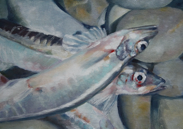
After many thin layers of glazing, I've finished the capelin painting.  Its interesting to build and see the colour in beach rocks that initially seem to have blue/grey only.  Layers of purples, reds, blues and ochres are all present to give depth to the stones.

Its a similar story with the fish, adding layer after layer to reach a point where flesh and skin looks as it should.  If you haven't used glazing, I'd highly recommend it.  Yes, its time consuming, but well worth it for the depth you get with the technique.

For those interested in Painting Realistic Water, I will be holding an 8 week course at my home studio in Flatrock, NL.   This intensive course will provide participants with the knowledge and techniques required to understand and paint water surfaces that have depth.  The classes will be limited to four people to allow lots of one on one guidance.  The first course is scheduled to begin on September 18, 2013 and you can register on my website.  More courses will be scheduled as demanded.

I will also hold an Introduction to Drawing workshop on Saturday, September 21 and 28 from 1 - 5pm.  These classes are for individuals who want to learn the basics of traditional drawing or for those more experienced artists who would like to refresh their drawing skills. 

Sunday, July 21, 2013

Turmoil

 Turmoil - SOLD
22" x 28" oil on canvas

I've been struggling with this painting for the past week or more, but have finally conquered it, though it was winning there for awhile.

Its easy to give up when a painting hasn't yet reached its turning point and we can't quite see the vision that was in our head forming in front of our eyes.  But so often,it just takes a bit more perserverence and a lot of observation and thinking of where to place key strokes that will bring it all together.

Yes, there is an intuitive point where you know the painting is beyond redemption and it is time to scrub and start over, but more often its a matter of pushing through and developing the sections that don't interest you as much to bring the cohesiveness of the elements together.

Abandonment is a trademark of many beginning artists who want instant results without struggle.  There is always struggle to produce something worthwhile, otherwise everyone would be an artist if it were simple.  Practice is the key.  Every day, no matter what.  The best advice I have heard was from Robert Genn"Go to your room." For six months or a year.  Simple but true.  Go to the space where you create art, be alone, and paint. Repeat daily.  Don't spend your time reading art books and taking workshops.  Yes, they may be interesting, but in the end only you can be responsible for what you produce, for developing your own style and that can only be done by putting in the time actually painting.


This jumble of koi at feeding time was challenging as I kept losing track of where I was in the painting and how to separate the fish but keep the flow going.  The saying for carpentry applies to painting as well.  Measure twice,cut once.  For art, observe likely many more times than twice and apply once.

Monday, July 15, 2013

Mermaids Skating


During 2013, I am creating an original print each month of a cold water marine fish found in the waters around Newfoundland and Labrador.


The print for July is Mermaids Skating. The Winter Skate, (Leucoraja ocellata) is also known as the big or eyed skate, is one of the larger species of skate found in Atlantic Canada, reaching a maximum size of about 109cm or 43 inches. The egg cases from skate and other members of the shark family are unique, known locally as "Mermaid's Purses" and sometimes "Devil's Purses" and can be found on the beach from time to time, washed up after the young skate has hatched. You can read more about Winter Skate here.

This is an original print in sepia oil based ink on kozo paper with deckled edges, titled and signed. It is an open edition print and available from my website, along with previous prints, for $25, including shipping.


Sunday, July 14, 2013

Fish get everywhere!


Its been a bit of a whirlwind lately with painting, an exhibition, planting, work, all coming together for the perfect storm and leaving me exhausted by the weekend.  It seems when my body has any downtime after being really busy, I get sick.  Not seriously sick but generally feeling blah and Saturday my body decided it was the day to regenerate and catch up with itself.  So naps and snacks and snack and naps were the order of the day and today I feel better, so its back in the saddle again.


Thursday evening was the opening reception for the group exhibition at Peter Lewis Gallery.  Four other artists, Michael Kilburn, Sarah Jane Conklin, Julie Duff, JJ Allwood and I took part and it was great to see new art and meet new friends.  The exhibition is open until August 1st and if you have time, I'd strongly suggest you visit and see the Come Rain, Drizzle or Fog exhibition.  You won't regret it.

I put in a couple of water/boat pieces as well as a couple of fish, one gyotaku and one oil painting of a koi, as seen above.  That yellow boat is a magnet for everyone who sees it.  I think bright colours do bring in viewers' eyes, but ultimately, beyond colour, a memory kicks in that gives an emotional response that becomes the trigger to want to see that painting every day on your own wall.  Cross your fingers that these paintings provide the triggers!

I'm plugging away with the capelin painting and making progress.  I'm building layers and adjusting colours as I go.  I find the colours of the rocks and fish are very similar, a perfect camoflage for their environment no doubt.  There is still a fair bit of work to do on it but its more detail work now that the main colours and values are in place.


I have another painting in the wings, a larger, palette knife piece, full of bright colours and great shapes.  I can't show anything at the moment as its in its ugly stage.  You know that point, where you wonder if you can ever turn it around into something worthwhile and the self doubts kick in?  I'm fighting hard to overcome the doubts and keep moving ahead on the path I want.   Wish me luck!


Wednesday, July 10, 2013

On the rocks


Capelin of course! :)  But there are quite a number of beach rocks in this painting as well.  I don't know what the final name for the piece will be, but it will come to me eventually.

I wanted to create a fish piece to tie in with the two capelin girls in the water that I previously completed.  These were the fish being harvested and in the water that day at the beach and I found some lying on the rocks and had done some sketches as well as taken a few photos of them as well.  I just love these little fish.  The size, shape, colour, everything fascinates me.  I felt a little sad that these fellows were out of the water, but knew they'd be preserved in a painting and live on somehow and gave them a silent thank you for their sacrifice.


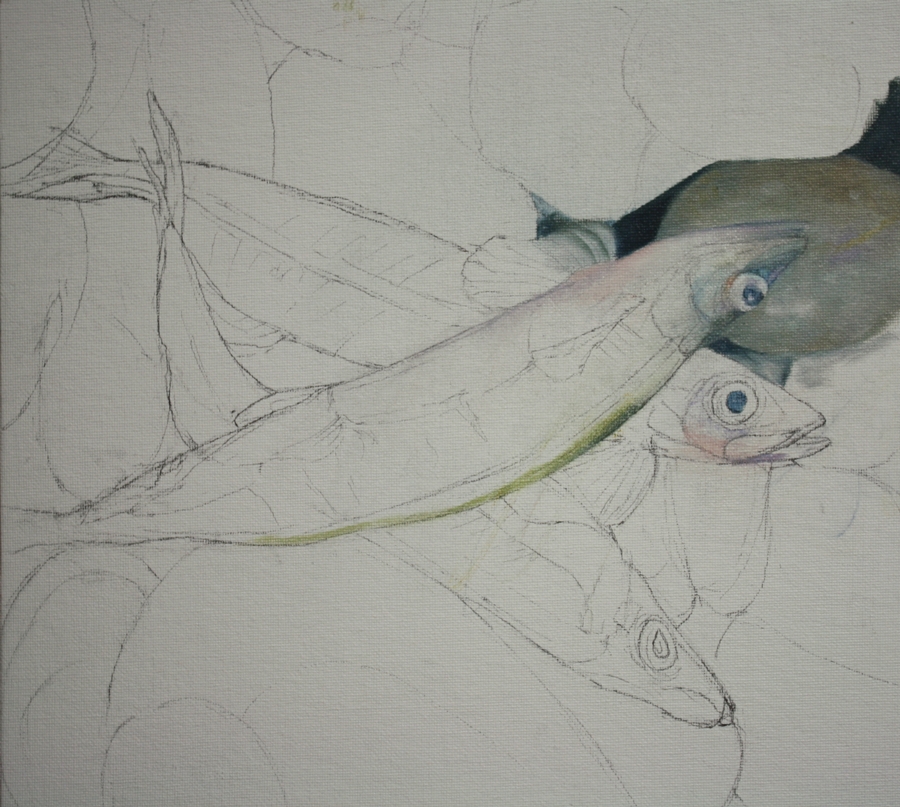
I drew the fish and stones on a 12" x 12" canvas panel and started adding colour.  I usually build layers and take my time in pieces like this where precision is required pretty much to get the realism I want.

I'm not sure which part I'm enjoying painting more, the fish or the rocks.  Both provide a challenge, perhaps more so in the smooth stones as I haven't painted a lot of those.  But one by one, I examine them, check colours and add layers.


I find that I'm using the same colours in the stones as I do in the fish which ties them together well. And as in nature, animals or fish often mimic their environmental colours as a protection factor, so the colour theme is natural.

As I wanted to sit instead of stand when I painted this, I created my own vertical palette to keep the paint out of my way but handy, if that makes sense. I bought a couple of cheap plastic translucent cutting boards, the lightweight, flexible kind and pinned one to the wall beside my table easel.  I squeeze smaller amounts of paint onto the surface and it doesn't move.  I can mix on the surface and clean it easily, but its cheap enough to be disposable if wanted after the painting is complete.  (I think they were about 50 cents each in the Dollar Store)


I like having the colour mixing at eye level and against the white wall it works well, even if the plastic over the white gives a slight greyish tinge. I may insert a piece of darker grey paper behind the plastic to give more contrast for colour mixing. 

So this is my basic "fish" palette of colours.  The "L" shape of colours from the top left going down and then right is asphaltum, ultramarine violet, olive green, indigo, manganese blue, light turquoise, cold grey deep, natural yellow ochre, rose grey and titanium white.  I have also added cadmium red to the palette.  The swatches are simply my mixes for painting.  My paint brands are predominantly KAMA Pigments, but I also have Gamblin, Daniel Smith and Winsor & Newton on the palette as well.  I find that its always an experiment, finding the right colour that a company produces then if you like it, sticking with it.  Predicatability can be a good thing in some aspects of painting.

Sunday, July 07, 2013

July Exhibition


I will be exhibiting with a group of four other artists at Peter Lewis Gallery in St. John's from July 11 - August 1.   The opening reception is Thursday July 11th from 6:30 - 9:30pm and I'd love to meet you there if you have time to drop by.


Saturday, July 06, 2013

The Bounty Hunter complete


Painting the water and reflections in this second piece have been testing me, but after a late night last night and early start this morning, I was determined to finish it and then make a start on a new piece.


This is the companion piece for the previous The Capelin Catcher and here they are together on the wall of my studio in their resting phase while I consider any adjustments that are needed before the final seal of approval.  There may be more in this series as the summer progresses.

These are 12" x 24" in oil on stretched canvas.


Wednesday, July 03, 2013

Back into the water

 Refining detail

Block in colour
 
The Drawing
 
Because I'm a glutton for punishment or I like painting reflections or because my model had a sister in the water, I thought I'd do a companion piece for the first painting The Capelin Catcher.  This is the same size canvas, 12 x 24" and in oil.

The viewpoint was different and the light on the water revealed a lot of greens in the darker areas that weren't in the first painting.  I'm slowly working my way through the reflections and they're testing me more this time for some reason.  But head down and keep going, right?

This is glimpse of where the piece is at the moment and the drawing and blocking in of it.

I'm contemplating adding more to this series of "capelin people".  I will have to entice more children and adults to venture into the icy Atlantic to pose for me.  Or if you have any images of children or adults with buckets or nets or similar in the water that I can use, I promise a quality reproduction of the finished painting if I use your image.

Sunday, June 30, 2013

The Capelin Catcher


Nearly a week since I posted!  Time has gotten away with me or perhaps its the warmer weather than tempts me to do other things.  And of course there's always painting to pull me in too.

From the initial concept sketches and some photos I took at Torbay beach last weekend, I concentrated on developing a finished painting of The Capelin Catcher.  The water and the reflections took the most time to complete, rather like working on a giant jigsaw puzzle, putting all those shapes and colours in place.

In complex pieces people often panic and think its difficult to do but the reality is it is simply more time consuming breaking down the piece into sections and shapes and that is what puts people off sometimes.  But you get into a rhythm, almost like pointillism, and it just flows as you fit one section into the other.

I thought I'd share the work in progress from sketches to finished painting in a collage form with the completed piece as the central image.  Its 24" x 12" and in oil on stretched canvas.

Monday, June 24, 2013

Sketches by the sea

 
The capelin are rolling once more on local beaches.  These little fish swarm the shallow waters every year to spawn and are gathered by people for food, and by me for painting.  Capelin are my favourite fish to paint.  Perfect size and shape, I see amazing colours in what most people see as simple grey/silver fish.  Pink, purple, blue, green...they're beautiful!


I went to Torbay Beach yesterday to see if the capelin were in. The huge flock of seagulls on the water and circling overhead gave me my answer long before I could see the fish in the water or on the beach. I also like to watch people who brave the cold, cold water and wade out to gather them in buckets and dip nets and this young girl caught my eye.  Her stance in the water and the red hair and pale blue dress were perfect and I could see the painting in my mind already.

I took a lot of photos as well as doing some on site thumbnail sketches for future paintings.  These were started with pencil and pen and I added Faber Castell markers to preserve the colour memory for painting later.  If I run out of space, i just add in objects or sections that I need to make the image work later. This year, I feel as if I'm really using my sketchbook as a better tool to assist in my paintings.  Every medium I want goes in it and nothing is precious anymore.


Gulls where everywhere, grabbing capelin and squabbling.  The noise was amazing. I'm sure the whales weren't far away either.


The dark shadow in the water in the photo above is the shoal of capelin, about 15 feet out in the water, easily accessed when the tide is low.


Sunday, June 23, 2013

Questions

 Cadmium red and Haemoglobin on the palette

I do get asked what colours I use in my paintings, as turquoises and oranges consistently play a role in many of my pieces, especially those involving fish.  While I have quite a few tubes of paint in a variety of mediums, there are some that are staples that are consistently on my oil palette for aquatic scenes.

I don't have loyalty to a complete brand of paint as they all vary and when I find a colour I like, I stick with it, no matter what the brand.  However, I do like Daniel Smith paints for quality and price and of course, Old Holland are a dream, but so expensive, but if I had to choose a current favourite, it would be KAMA Pigments out of Montreal.  They have a distributor locally so that's a huge bonus for me as I have quick access if I run out of a colour.

So here's my water/boat/fish palette!


I've provided a single link to the oil paints on the Kama Pigments site where all their colours are listed.  This is a Canadian company based in Montreal with fabulous quality paint.  I just love them!

  • Kama Pigments - Haemoglobin
  • Kama Piegments - Indigo Blue
  • Kama Pigments - Cold Grey Deep
  • Kama Pigments - Light Turquoise
  • Kama Pigments - Azur Blue
  • Kama Pigments - Spanish Gold Ochre
  • Kama Pigments - Simms Violet

Again, a single link to Daniel Smith's oil paint page.  They have a huge variety of paints and colours available.  I haven't been disappointed in the quality yet.
  • Daniel Smith - Cobalt Teal Blue
  • Daniel Smith - Manganese Blue
  • Winsor & Newton - Ultramarine Violet
  • Daniel Smith - Moonglow
  • Daniel Smith or Winsor & Newton - Cadmium Orange
  • Daniel Smith - Cadmium Red
  • Daniel Smith - Cadmium Yellow Light

 
Transparency is important to me if I'm using glazing, adding layer after layer to a painting.  This information can often be found on the back of the paint tube, or if not, on the paint manufacturer's website.  A square that is clear, half filled or solid indicates the level of transparency or opacity of the paint.  For glazing, transparent colours are the only ones that work well or your risk obliterating everything you just painted with a solid colour.

Next time, I'll share my choices of supports.

Straight Sailing


I have another of my paintings available for bids for one day only, tomorrow June 24th, on Artbomb. By subscribing to Artbomb, you have one email daily sent to you, providing up to three original pieces of art from Canadian artists available to bid on for that day only.  If your bid is final, the framed painting is shipped to you, worldwide.   Have a peek tomorrow, or check out their Facebook or Twitter pages,  you could be sailing....