Sunday, November 06, 2011
The Wasp Jar - WIP
I was clearing out some shelves today and found this glass wasp jar. A wasp jar, for those not familiar with them, were the original environmentally friendly method of eliminating wasps. The jar has a raised dome inside with an open centre. Sugar water is poured into the jar about an inch or so and it is hung in your wasp problem area. The wasp enters the jar from the bottom, slides down the dome in its efforts to reach the sugar water and, unable to climb the slippery slope again to find its escape, succumbs to a sugary death.
The shape and colour of it appealed to me and I played around with compositions and lighting for awhile before deciding on adding the marble as a stopper and some crumpled wax paper to soften the background. I'd seen some of Sadie Valeri's work with still life and waxed paper and it inspired me to try painting some waxed paper and see what happens.
I drew the piece straight onto a 9 x 12 canvas with a small brush and diluted payne's grey in oils. I seemed to get a little lost in the marble, but that went by the wayside as I started refining shapes and adding some colour to its current point.
This piece may take awhile or it may go quickly, depending on how the glass and waxed paper cooperates!
Saturday, November 05, 2011
Charcoal
From time to time, a few grapevine or willow trimmings are collected and made into charcoal. Its a bit of a hit and miss affair, as there are so many variables involved in the process. In a nutshell, it involves securing the woody pieces in an airtight container and placing them in the embers of a fire (in my case this is usually the remains of a fire used to burn off old boughs.
The process of heating the wood until it becomes carbon, but without flame actually touching it, produces the familiar carbon pieces that artists draw with. Its likely the original drawing medium going back to pre-historic times. Of course, the size of the woody pieces, type of wood or vine, heat of the fire, external environmental factors (think wind, rain, etc.. that controls the heat of the fire) and you see the problems that arise in getting a suitable product.
However, the planets were in alignment this time and my batch of grapevine trimmings turned out well. Dark, soft, smooth to draw with. This homemade charcoal was what I used for this drawing of a stone lion fountain. There's still more detail to add with this drawing which is 19 x 22 on a grey/brown Canson paper.
I've been so busy painting these last few months, I forget how much I love drawing. So it was a pleasure to get my hands dirty with charcoal again.
Thursday, November 03, 2011
Marbles and technology
When in doubt, paint marbles.
I've fiddled around in the studio, between paintings, and picked up a brush and the remains of some oils and tried out a marble. Spheres are one of those things that look deceptively simple but become quite complex. I refused to add more paint to the left overs on my palette so made do with colours already there.
Spheres are a great loosening up exercise, especially when I don't consider them any more than simple shapes and values. There's something about the brain that likes to add just too much detail if allowed to steer my brush.
I've tinkered with technology again. I was updating the book that I created, The Gyotaku Project, and realized that it can now be created into an e-book for iPod, iPhone and iPad. As I'd just upgraded my iPod to a 4g it seemed like a good idea to give it a test run. Having my book on my iPod provides an instant reference piece for anyone I want to show it to. The images are very crisp and clear as is the text. The best part is the price. Just $3.99 to buy it and download the book onto your device. The only other thing required is iBooks - free from iTunes - to view the book. It is likely compatible with other e-book readers, but I haven't tried any others at this time.
You can click on The Gyotaku Project in the link on the right side of this blog to preview 15 pages of the book or to purchase it.
Tuesday, November 01, 2011
Help or hindrance. What does your blog do for you?
Eifuku chimneys - in progress
10 x 10 oil
Have you noticed the bloom fading from the blogosphere over the last year? Is it me or is there a lack of postings, a lack of interaction, an overall malaise that's taking over?
I know there is a lot more competition with blogs besides just the physical numbers of blogs that have appeared. There are also the social network sites that turn everything into bite-sized pieces so that communication is done in half sentences, often just a word or abbreviation. Attention spans and interest levels become fleeting as one thing or another draws our attention then we discard it for something brighter, prettier, more controversial.
I have been blogging since 2006. That is a lot of posts and a lot of time invested in the action of writing, considering topics, sharing, venting - and painting. My original purpose behind my blog was to goad myself into action and make myself accountable to produce more art. And it has done that and I have met many good and creative people along the way. Now I wonder if that tool is required anymore.
Looking through stats, I see that Illustrated Life is classed as being in the top 75 art blogs. What does that mean? It means if you talk enough and post enough for long enough, you attract attention. Is it the right kind of attention? Who knows. Its not led me down the road to fame and riches. That sliver of the pie I've had to cut out the good old fashioned way in real life networking, marketing and showing art. Yes, some online contacts have been made, but ultimately they lead into the real world to become effective.
Interaction.
I am not a comment junkie. I produce art whether anyone reads or comments, its simply what I do. I occasionally look at statistics but aside from telling me that the world loves my post about gummy bears and that tutorial freebies are the crack cocaine of budding artists, they give me little practical insight into being a better artist. A better insight into marketing yes.
I've been thinking back to pre-internet days. Remember those? Well, some of you will. I produced art then, I shared in visual arts circles. No, not so instantaneous in either sharing or receiving input, but that could be a good thing.
Pre-internet I wasn't influenced by a thousand painters imitating a thousand painters. Everything seems so predictable these days. If I see one more slap happy painting of a pear I will vomit. The daily painting movement, while it increased production and practice for many, also increased the number of really horrible paintings too. Churning out pieces daily doesn't work for everyone, but many seem to want to go in that direction. A lemming race perhaps?
So I wonder what I want from this blog now and what it does for me as an artist and a person. Has it become a habit or is it a necessity in the sharing and marketing of my art on a personal and business level? Do I let the blog slide and rely on my website or keep it going? What is the relevance of a blog in 2011/12?
Eifuku chimneys They satisfy my need for bubbles, blues and water.
Monday, October 31, 2011
Halloween Challenge
Unmasked
8" x 10"
8" x 10"
Watercolour/gouache
Last month Chris Beck asked if I would like to take part in a Halloween Challenge along with some other artists. I was thrilled to take part, as I always look forward to the challenges that Chris and Pablo Villicana Lara come up with seasonally, so I spent ages in the dollar store finding props that might make a worthwhile composition. I arranged and rearranged pieces until this set up seemed to work for me. 'Unmasked' is 8" x 10" on 200lb paper, using watercolour and a little gouache.
My new assistant holding "Unmasked"
Now that you've seen 'Unmasked' and learned a little more about masks, go to the other challenge artists' blogs and see what Halloween goodies they have prepared for you. Images from all artists are on Chris's and Pablo's blogs and individual artists have their own painting and links to all other artists. I know you won't be disappointed.
Challenge organizers:
Chris Beck: http://chrisbeckstudio.blogsp
Pablo Villicana Lara: http://www.mylittlepaintbox.b
-------------------------
Participating artists:
Janet Belich: http://janetbelich.blogspot.c
Debbie Cannatella: http://www.dcannatella.blogsp
R. Garriott: http://www.rgarriott.
Jeanette Jobson: http://illustratedlife.blogsp
Ron Morrison: http://
Diahn Ott: http://artbydiahn.blogspot.co
Suzy Pal Powell: http://www.suzypal.blogspot.c
Terry Rafferty: http://terryrafferty.
Kay Smith: http://kaysmithbrushworks.blo
Deb Ward: http://debwardart.blogspot.co
Brenda York: http://brendayork.blogspot.co
The bird mask and the jack o' lantern seemed to be contrasts. One cheerful, the other with a more sombre history. Venetian masks are known worldwide and associated with grand parties and carnivals, but this bird beak one is a little different. It was associated with the bubonic plague.
Some plague doctors wore a special costume, although graphic sources show that plague doctors wore a variety of garments. The garments were invented by Charles de L'Orme in 1619; they were first used in Paris, but later spread to be used throughout Europe. The protective suit consisted of a heavy fabric overcoat that was waxed, a mask of glassed eye openings and a cone shaped like a beak to hold scented substances.Some of the scented materials were amber, balm-mint leaves, camphor, cloves, laudanum, myrrh, rose petals, storax. This protected the doctor from miasmatic bad air. A wooden cane pointer was used to help examine the patient without touching
One of the more notorious plague doctors was Nostradamus. Nostradamus' advice was the removal of infected corpses, getting fresh air, drinking clean water, and drinking a juice preparation of "rose hips. What a novelty, cleanliness and vitamin C!
Saturday, October 29, 2011
Sea jelly
Sea jelly
15" x 30"
Mixed media
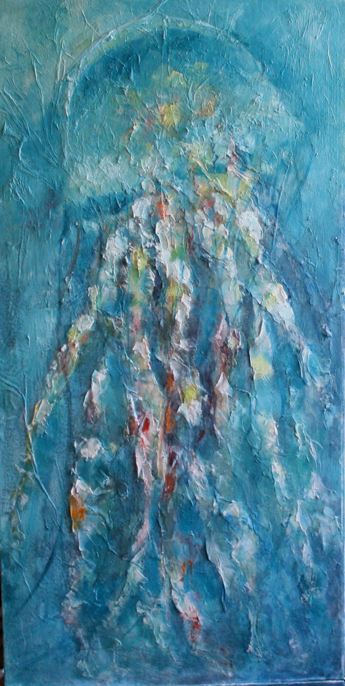
I think I'm calling this jellyfish done.
Its a departure from my normal style of painting and I have had such fun doing it. The act of simply slapping on paint and paste without too much cerebral involvement is very freeing and quite satisfying. I like the textured surface and how it stops me from being too fiddly.
I added a few more washes of watercolour, then broke out the oils to intensify colours and put in some shots of yellows and oranges. I reshaped a few sections of the tentacles with more molding paste. Now I'll let it sit and see if anything else calls out to me for adjusting.
Friday, October 28, 2011
Carrot and stick - continued
Or should it be the stick and the carrot? Either way, the idiom remains the same.
I seem to have more stick than carrot lately, and am taking most of it in stride. Occasionally one comes across a mean spirited person with a chip on their shoulder. I have learned that the chip is there for a reason and that they probably hurt more than I do. With this in mind, I let the words or actions roll past and wonder if they do not get the reaction they want if it helps or hinders them. Maybe they just need to lash out at someone. No, its never fun, but it happens.
But here is another update for the original carrot and stick painting that I needed to get out of my system. The pieces are more refined, but I think it needs a little more work to deepen the shadows and put more detail into the stick and the carrot. Its fiddly, rainy afternoon work, just the thing for this coming Sunday if the forecast is correct.
Thursday, October 27, 2011
Chasing jelly
Yes, I'm still on my quest to conquer the elusive jellyfish, or at least a decent painting of one.
I started with a loose study in watercolour a few days and have now advanced onto a mixed media piece. This is a 15" x 30" canvas panel that I gessoed then put scrunched up tissue over, with more gesso embedding it further. Once dry, I started adding washes of watercolour. I liked how the rough surface would catch the pigment and intensify it in pockets.
I threw in a little oil paint on tentacles last night but wasn't really happy with that so tonight I formed more texture over it with modeling paste. I love that paste, its like making mud pies, such fun to use with a flexible palette knife.
So here is its current state, waiting to dry and have more colour added. Where will it go from here? I really don't know. The painting will guide me I'm sure. Does anyone else feel that what you paint sort of pushes you in different directions? I wanted to move to a looser style and this is definitely loose!
Did I show you the jelly fish self portrait photo I took a couple of weeks ago? I went to Salmon Cove and there were a number of jellyfish washed up on the sand. I tried to save some, but they'd been out of the water too long and just kept washing back in. The colours in them were beautiful - gold and purple I believe they are lion's mane jellyfish. When I uploaded my images, I found this one - a self portrait in a jellyfish.
I started with a loose study in watercolour a few days and have now advanced onto a mixed media piece. This is a 15" x 30" canvas panel that I gessoed then put scrunched up tissue over, with more gesso embedding it further. Once dry, I started adding washes of watercolour. I liked how the rough surface would catch the pigment and intensify it in pockets.
I threw in a little oil paint on tentacles last night but wasn't really happy with that so tonight I formed more texture over it with modeling paste. I love that paste, its like making mud pies, such fun to use with a flexible palette knife.
So here is its current state, waiting to dry and have more colour added. Where will it go from here? I really don't know. The painting will guide me I'm sure. Does anyone else feel that what you paint sort of pushes you in different directions? I wanted to move to a looser style and this is definitely loose!
Did I show you the jelly fish self portrait photo I took a couple of weeks ago? I went to Salmon Cove and there were a number of jellyfish washed up on the sand. I tried to save some, but they'd been out of the water too long and just kept washing back in. The colours in them were beautiful - gold and purple I believe they are lion's mane jellyfish. When I uploaded my images, I found this one - a self portrait in a jellyfish.
Tuesday, October 25, 2011
Sketches on the move
Toronto to Vancouver
I've spent the last week travelling and working, which gives me little time for drawing or painting. However, while trapped on long flights, on on layovers in airports, it does give me time to sketch. I've found it fairly easy to sketch in these situations as people aren't usually moving around as much as they normally would. Even then, the same positions are taken over and over again, so if someone moves, I move on to the next person and wait for the first to move back into position again.
Here are a few sketches of faces along the way. The last fellow wasn't on a plane : ) only in my head.
St. John's to Toronto
Vancouver to Calgary
Airport heads - Vancouver
Stars, clouds and night flights inspired this fellow
Monday, October 24, 2011
Jellyfish experiments
I worked on a jellyfish image previously in oil paints and still am not happy with it and its at the 'trash it' point. I have some ideas about reviving it but perhaps through multimedia, not just oils.
Jellyfish speak light, colour and texture to me. The smooth bell and long rippling tentacles give many possibilities, but maybe need a looser treatment and more watery medium to bring out the subtle colours and shapes.
This is a small study in watercolour that moves me into the direction I'm thinking of. I need to get away from the tightness while painting and just let my brush flow. I have ideas for a larger piece using paintings, physical texture either through modeling paste or additional textural objects to achieve an almost abstract feel. It just feels right to do this, I can't explain it any other way.
I'll also try a small piece to explore the textural idea before translating that onto a much larger support. Long flights lately give me lots of time to think and repaint things in my mind. Now I'm anxious to get some painting done.
Monday, October 17, 2011
Christmas card decisions
Its time to choose a design for the 2011 Christmas card! Which of these two images do you like best? Click 'Like' on my Facebook page to comment on your favourite and to enter the draw to win an 8 x 10 reproduction of the one that is chosen.
You have until October 23rd to make your choice. On the 24th, I'll choose a name randomly from those who've made their choice. But you have to be a subscriber on my Facebook page to enter the draw!
Fish Light
watercolour
Circles
Coloured pencil
Sunday, October 16, 2011
Rorschach VIII
Rorschach VIII
Oil, stretched canvas 8" x 16"
I worked off and on today on a painting that I started yesterday of rocks and the sea. At 8pm I wiped the painting. It looked insipid and boring. Very, very boring.
So left with a smeared, stained canvas, I played with a palette knife and the contents of the oil palette and this is the result. The Rorschach Test VIII. A sprinkle of minute green/gold glass beads complete the piece and add more texture as they embed into the paint.
Test # VII seems the closest in form and colour of the ten inkblots that make up the test and the commonly found characteristics of the original inkblot have determined this:
People often express relief about card VIII, which lets them relax and respond effectively. Similar to card V, it represents a "change of pace"; however, the card introduces new elaboration difficulties, being complex and the first multi-colored card in the set. Therefore, people who find processing complex situations or emotional stimuli distressing or difficult may be uncomfortable with this card.
The Roschach test is a visual test used by some psychologists to determine personality characteristics and emotional functioning of subjects by reviewing their reactions to inkblots of varying shapes. There is controversy around its use and In the 1959 edition of Mental Measurement Yearbook, Lee Cronbach (former President of the Psychometric Society and American Psychological Association) has been quoted as saying, "The test has repeatedly failed as a prediction of practical criteria. There is nothing in the literature to encourage reliance on Rorschach interpretations."
Despite the misgivings about the test, the reaction to this inkblot rather sum up my painting "a change of pace". What do you see in it?
Saturday, October 15, 2011
Rocks
A fine day and a walk along a favourite and pretty much deserted beach last weekend led me to some on site sketching and the start of a study back in the studio. I want to go much larger and likely will if time allows me to do so. This is done with watercolour in a kraft paper sketchbook with a small addition of gouache to add a little solidity to the rockface. The paper in this Daler Rowney Earthbound sketchbook isn't designed for watermedia, but it seems to stand up to it very well.
Rocks jutting out of the ocean always interest me. On this beach they become an obstruction for waves that break around them and the resulting lines of water that cross on the shore is fascinating. This 8 x 16 is the start of a painting of more of the rocks on this beach. Its difficult to show the scale, but they are very large, more like mountains.
I took a number of photos in my explorations and a lot of them of rocks. Its hard to go far here without them and I love the formations and how sometimes it can almost seem as if I'm in a different world in the barren landscape that they form.
Tuesday, October 11, 2011
Head in the Clouds
Clouds are fascinating to draw or paint and they are forgiving too. You can rearrange them a little and still have them appear quite cloud like. On the other hand, clouds do have form and values and those need to be taken into account when painting them just like any other object.
And, of course, a closer view above, for those who like to see how the strokes are put down.
This study is painted in oils on a 6 x 12" canvas and I'd like to translate it onto a much larger canvas. Concentrating on the sky alone with no land allows the eye to really see the cloud formations and colour.
Monday, October 10, 2011
Etching - the print
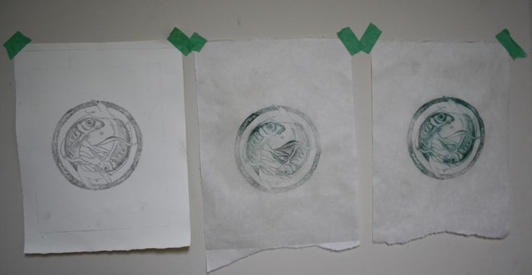
I spent most of the morning being frustrated with the printmaking process, but believe the 'aha' moment has arrived and most of it is to do with paper choices. After yesterday's etching process, today was the printing. I do not have a printing press so need to use a baren/brayer to achieve a decent image.
I started out with Rives BFK paper. Its fairly thick and strong, even when well dampened. I perhaps overdampened and ended up with some blurred images. The inks I used were Graphic Chemical oil based inks and initial prints were with Intense Black, a commonly used ink for etching. I'm not sure if it was the ink or the paper or me, but the results were pale, the lines weak and soft. However, with initial prints, it is a bit of a test to see what works and what doesn't.
1st print on BFK Rives paper
2nd print on Okawara paper
From left to right: BFK Rives paper, 1st print on Okawara, 2nd print on Okawara
Sunday, October 09, 2011
Come up and see my etchings
Well, they're not quite ready yet, but I'm heading there.
I was reading The Printmaking Bible and learning more about the process of etching, drypoint in particular which does not involve acid baths. Perhaps that will come at a later date. Since the concept of the idea the other day, I've been trying to find suitable materials to test with and in this town, that's never an easy task, so one learns to be inventive.
As copper or zinc plates weren't available, I decided I would try plexiglass and actually ended up with some acrylic blanks used for glass painting practice. Then not having an etching needle, I tried a scratchboard knife which seems to work well on the softer surface.
I decided I would use an old drawing of a circle of fish that I had completed last year and have pretty much completed etching the drawing onto the acrylic sheet. Tomorrow I'll test the printing. This may be a challenge as I don't have a printing press so I'll see what weights and a baren or rolling pin will do. Stay tuned!
Friday, October 07, 2011
Terry's portrait continued
I am slowly working my way through unfinished pieces. My goal is to have them all complete before the end of the year. What is it about my inability to complete paintings sometimes? Easily distracted perhaps. I always see something else that I want to get down on paper or canvas and think 'I'll just start this and finish the other later.'
This is a portrait of Terry Rielly, a gifted musician and entertainer. I've known Terry for....oh more years than I remember. We recently became reacquainted and I promised him this portrait after seeing the image of Mikaela's Rock online.
I started the portrait in watercolour and then, with other things overtaking it, it was put aside. Now I've pulled it out and have started adding more layers of colour and am probably about two-thirds near completion. I thought the beard would be my undoing, but instead it may be the rock!
I promise Terry that you'll have the final piece soon!
Tuesday, October 04, 2011
Idioms and exhibits
My painting time has been limited this week, as I prepare for the exhibition which opens on Thursday. This evening after work, all the pieces were hung, ready for the opening on October 6th. If you're in the area, I'd love to meet you there. Great art, nibbles and drinks will be on hand from 5 - 7pm at MUN Botanical Garden, 306 Mount Scio Road, St. John's, NL. You can read all the details here.
Here's a little glimpse of one of my pieces that you can see at the exhibit. Its a gyotaku ocean perch, or red fish, as they are often called here. Reflections are part and parcel of pieces framed under glass unfortunately. Drop by on Thursday and I'll tell you how these unique gyotaku prints are created.
Meanwhile I've had a few minutes here and there to add a bit more paint to the carrot & stick painting that I began a few days ago. It set my mind off on lists of idioms or common sayings that could generate paintings...its endless how one idea sparks another, isn't it? Which one would you choose to paint?
Sunday, October 02, 2011
The Carrot and the Stick - in progress
Ideas for paintings come to me at odd times. Driving to or from work, in the shower, or when I wake in the middle of the night and can't sleep. In my internal struggles in art there are rewards and setbacks. Paintings that didn't go the way I want, paintings that sell, rejection and acceptance, on and on it goes. For each stick blow, there is a carrot to reward. Sometimes it goes in the opposite direction too. I prefer the stick first personally.
So this thought of the carrot and the stick idiom stuck in my head in one of those random times of thinking too much and I knew it had to be put on canvas.
The concept has sprung, literally, from the ground up. I dug some carrots from the field, trying to find just the right one and then a quest for a stick that would meet my needs. With so many trees around and lots of damage from last year's hurricane, there was no shortage of dead branches to choose from. I finally decided on a piece from a laburnum. The pale smooth branch with small pieces of golden brown bark still clinging to it and little knots adding interest worked well. I also harvested more branches from other species such as larch and maple then headed to the studio to work out composition.
I played with a number of compositions with dominance from the stick or from the carrot, but finally decided that equal representation worked best.
This is the start of the layout of shapes and values and I'll start getting into more depth and detail with it soon. Its being painted on 16 x 20 gallery canvas in oils.
Thursday, September 29, 2011
Night flight
I love flying when its dark or the sun is just setting. Its as if you're suspended between two worlds, with a perfect sky above and hints of life seen below the clouds.
This little painting was from memory, flying over a headland, getting ready to land. Little breaks in the cloud allowed glimpses of the lights of a town below, looking like pins of light on a map.
This is 6 x 6 on gesso board in oils.
Wednesday, September 28, 2011
Jellyfish
I keep trying with this jellyfish and am very slowly making progress with glazing and layers of colour. The head of the jellyfish still isn't the right shape, but its moving into the place I want it. Its in oils on gallery canvas and looks so much different in real life. I know I always say this, but photographs, especially ones taken at night never do justice to images. And why this decided to turn on its side, who knows??!
I may try this subject in another medium and see what happens. I'm thinking that it may make a good candidate for a wax batik piece or perhaps a watercolour on paper textured with tissue. A little study to test the waters may be in order.
I'm just about ready for the next exhibition which opens next week. Deep breath. I have a number of smaller works in this exhibition as well as some larger pieces too. Keeping up with production to ensure there is something new is challenging, but doable. A couple of the new pieces framed up beautifully. I'm almost loathe to part with them now! But I'm hoping they'll find new homes to go to during October.
Tuesday, September 27, 2011
Dabs of paint
A pale self-portrait looked out of the mirror with the serious eyes of all self-portraits. Vladimir Nabokov
Monday, September 26, 2011
Exhibiting virtually
VirtualGallery.com is a meeting point for art buyers and sellers; we play a mediating role to facilitate the purchase and sale of works through a system that guarantees:I'm starting with Virtual Gallery for a trial to see how a virtual gallery performs and what interest it garners. The gallery performs as a three dimensional room or rooms, depending on how many pieces are displayed, with art on all walls which can be viewed as the mouse (viewer) turns right or left.
- A reliable environment for both parties.
- The authenticity of the works on sale.
- The opportunity to return them.
Closer views of the art can be seen by clicking on a piece, as well as information about the piece, pricing, etc. The software works as a cross between a website and a gallery , with a commission paid on sales and future development into on demand printing being researched by the organizers. The commission rate for the free version is 20%. If you buy the package, it drops to 10% with more options available.
There is an option to link updates and events to Facebook or Twitter and to have an opening event for the gallery. I haven't really looked at the sales option for this trial, as I'm not sure if I want to go this route in this environment or not yet.
I'm using some of my gyotaku and fish paintings for this gallery view. If you take a peek at the virtual gallery, I'd love to know what you think about the concept and how you think it compares to blogs, websites and online gallery options for potential exposure and sales of art.
Jeanette Jobson Fine Art - The Gyotaku Project
Sunday, September 25, 2011
Colours and shapes
Its been another really busy weekend and only tonight that I've had much time to concentrate on any painting.
Today the exhibit at Masonic Temple was taken down and now another one is looming which opens on October 6th.
While I deal with the flurry of things that must occur to make the next exhibit work, I'm still considering where I want to go and what I want to do with my art. Sometimes just painting without thinking too much about it helps. I know I always overthink my art and that can be the downfall. Those first strokes are often the best ones, only to be obliterated by other strokes that take away the freshness.
I was determined to let the paint lie as it fell in this start of a self portrait. Its oil on an 8" x 8" canvas panel. Nothing serious, no under drawing, no thinking, just me feeling my way through the world of colour and shape.
Subscribe to:
Posts (Atom)