Tuesday, April 27, 2010
Art at home
Today my piece that was entered in the Arts and Letters competition was picked up and is back home after its vacation of 4 months.
I put a pen and ink piece in the competition just before Christmas and waited to hear its fate. It wasn't until late March that I received the letter telling me that the winners had been chosen. My piece wasn't one of the winning art works, but was it was given an honourable nod and was on display at The Rooms from April 6 - 18th. I visited the exhibition and spent time trying to figure out which pieces would be the winners. I think some of my favourites made the cut. You may view the winning pieces here. I wish they would provide the sizes of the pieces when they're posted online, otherwise there is no way of knowing the scale.
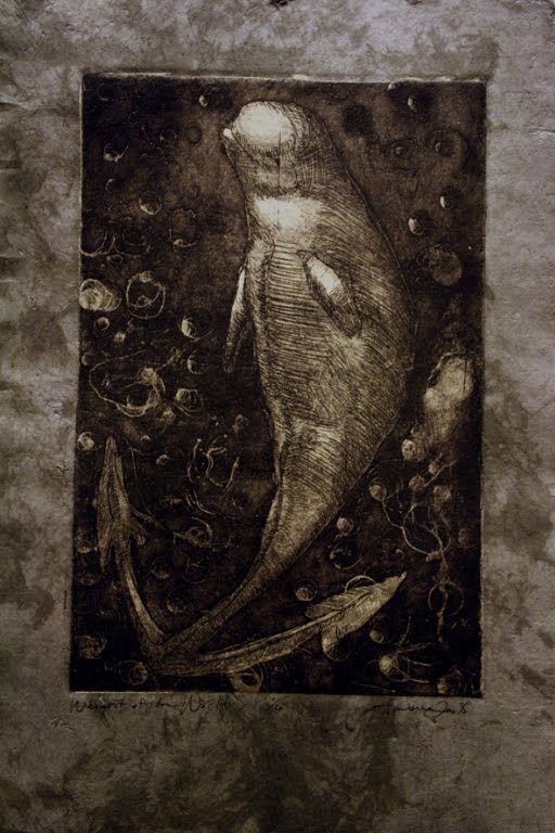
From time to time I add a little piece of art to my own collection. Today a new piece arrived in the mail. Its a shodo chine colle by Ambera Wellmann of Halifax, Nova Scotia. I came across Ambera's work on Etsy and the sombre piece 'Weight of the World' caught my eye. The beluga whale, weighted down by its anchor tail in the dark water, bubbles floating around it, appealed to me. The paper is a mottled silver grey, adding to the overall appeal for me. The print is 1 of 6, so a very limited edition and measures about 9 x 6 for the print, 12 x 8.5 overall.
You can see more of Ambera Wellmann's work in her Etsy shop.
Monday, April 26, 2010
An aquatic circle
I'm having a little break from drawing beads and have been working on a piece that's been in my head for ages.
I've tried endless subject matter and compositions and think that I may have what I was thinking of finally. Of course it could all change again. My plans are to execute it in watercolour. Its on 300lb Arches paper, measuring 11 x 15. The circle that makes up the drawing is 8.5 inches in diameter.
Its strange how we get something in our heads, but can't quite make the connection onto paper sometimes. Fish, water, movement and connection through the seaweed binding the fish. Yes, there is symbolism there. No I won't tell you what, that down to you to decide.
Sunday, April 25, 2010
Masai update III
I've starting working on the bead necklace for this piece, trying to get at least some base colours and shapes down then defining them.
Tedious detail work is the making or breaking of many drawings for a lot of artists. Its easy to lose interest in broad stretches of repetitious work. To make it easier, I break it down into small sections instead of contemplating the whole piece. So once the base values are in, I take perhaps just one colour section of the necklace and complete that then move on to the next. It gives me an easily achieved goal and helps things move forward.
Kim Barker of.Top Artists Directory has kindly featured me in Featured Artist of the Week, highlighting the fun, but slightly sinister, painting of the child/clown that I completed the other week. Thank you Kim.
Thursday, April 22, 2010
Masai update II
Here's another small update. I'm starting to model the shapes and colours in the face and head as well as define the beads. I'm hopping around with the beads, never being as methodical as I should be. However, coloured pencil doesn't often smear and I do use a hand guard so I'm not too worried about it.
I'm trying to fit in as much as I can on this piece this week as next week my time will be limited for drawing. I have other ideas brewing in my head as well for other pieces and while I am not rushing this piece, I also want to complete it in a reasonable time frame. I also know that I can get distracted easily when it isn't a commission.
I quite dislike the close views of images on screen as they don't usually come across as they ever would in real life. With this piece, the colours from a distance look so entirely different than when I'm working inches away from it. No photographic tricks can provide that perspective unfortunately.
Mi-tientes is designed for pastel or charcoal and has a reasonable tooth. I am using the smooth side as the textured side I consider very unpleasant and detracting from any image. The smooth side doesn't have much tooth so I'm trying to make my layers light and think carefully in terms of colours so I get values in place before losing tooth.
Wednesday, April 21, 2010
Masai Update
I've worked a little more on this portrait. The beadwork is slow going so I'm taking my time. I feel as if I'm making this necklace myself!
Sometimes people have challenges using black paper and it seems that the colours almost sink into it, making them appear duller or more muted. I don't think that the pigment can actually move into the fibre of the paper. I believe its more a trick of the eye with lighting and viewer position as well as the black paper not letting the colour reflect as it should. However, if someone has a scientific reason behind the theory of colour and black paper, I'd love to hear it.
I've experimented a bit more with photographing dark paper under artificial light and in this image I used the TV setting. In TV mode I select the shutter speed and the camera selects the appropriate aperture and the quicker shutter speed seems to make a difference with the black paper. I don't get the same level of glare back from it.
Tuesday, April 20, 2010
Masai
I had a discussion about portraiture today. Its not a lucrative genre unless you're in the right geographical place or have the right connections. Larger centres with bigger populations, more disposable income, spare wall space and a sense of narcissism perhaps all help.
However, I love drawing portraits and always have. There is something about faces that pulls me in and becomes my comfort zone in many ways. So whether they make money or not, I will still produce them.
And tonight I made a start on another piece. I'm obviously a glutton for punishment as this piece is on a Masai woman done on black paper and the necklace is very intricate beading. I'm using coloured pencil for this - Derwent Coloursofts right now and its on a piece of black mi-tientes paper 19 x 25 which makes it a bit larger than lifesize.
Of course under artificial light getting an image that looks anything like the real thing is nigh onto impossible so this is the best I can do for now.
Sunday, April 18, 2010
Sea mysteries
A few weeks ago, on one of my beach explorations I found these devil's purses washed up on the high tide line. Egg cases like these are found worldwide and come from skates, rays and some sharks and are also known as 'mermaid's purses'.
They vary in size and colour, these being fairly large. By the time they are washed up, the embryos are usually long gone from their casing into the open sea. I was given a link to an egg casing identification site and by comparing size, shape and colour have determined that the casings that I have likely come from Undulate Rays.
Rays and skates belong the shark family and are common in waters around the world.
I had the casing in front of me in the car and the only paper to hand was the back of a large brown envelopeso this is the resulting sketch. I'm currently working on various sketches and compositions with these for a larger drawing or painting.
Saturday, April 17, 2010
Facepaint - complete
I've added the final layers and the 'icing' to this piece. What is icing? Its those lovely little touches that bring a piece to life. A subtle highlight on a lip or nose. The change in light as it strikes a curve of the hair; the catchlight in a eye. All these are the 'icing' for a painting. They push the piece over into a different place and breathe more life into it.
After the icing there's no going back. All you should see in front of you is a stop sign. A rest from view, then a closer inspection in a few days to see if there are any glaring problems. Touch ups or not then it joins the pieces of history.
Friday, April 16, 2010
Orange on black
Orange on Black
9 x 12 pastel
As a break from the portrait that I'm working on, I did a quick sketch of an orange. I didn't have a reference or live fruit in front of me, so worked from memory. That's not always a good thing, as memory plays tricks and not always good ones.
Of course as I used black paper for this pastel sketch, its a nightmare to get the colours to ring true. That and artificial light. And a scanner would be even worse no doubt with the reflection from the light.
I would like to try some more fruit in pastels. The medium seems to work well and I like the texture and rich pigments. Its as close to painting as you can get with a dry medium I think.
Thursday, April 15, 2010
Facepaint update II
More layers.
I'm building the skin tones and starting to lay in the hair. I think the right eye is pretty much where I want it to be. Its in deep shadow but still has a hint of catchlight there that I want to remain very subtle. This girl has freckles too and I want to indicate those as well under the makeup but not make them prominent.
The scarf of course needs more work to develop form. I don't know if I'm going for detail of the knitted fabric on it, likely not.
Each time I pass by this image I see something new. The piece is a little unnerving, perhaps that direct baleful look that has that effect. But having an effect on the viewer is all part of art I think.
Wednesday, April 14, 2010
Facepaint update
I've added more layers to this portrait. I'm still not sure if its going where I want it to yet. Parts of it are, parts not yet. The right eye won't cooperate, but I'm hoping to persuade it to before long.
The paint around the eyes will be more smudged and defined at the same time. The hair is a wig and bright blue. That's a challenge and I may have to call in a bit of pastel to help me out on it in places. At least the 300lb paper is robust and allows some flexibility in scrubbing back without damaging the surface.
The whole piece is a little creepy but interesting at the same time.
Tuesday, April 13, 2010
Face paint
I always return to portraits as a comfort zone even though I wander all over the map in terms of subject matter. There is something about constructing the human form that is endlessly interesting.
I saw this reference in the April portraiture forum of WetCanvas and knew that I needed to try it. Its a bit sombre, almost eerie if you look at it long enough, but fascinating enough to keep me interested.
I figured it was time for another watercolour portrait. This is the start of it on 300lb Arches paper. It measures 12 x 15. There's a lot of layers to go yet.
Sunday, April 11, 2010
The finishing point
You know how sometimes you just don't stop when the voice inside your head tells you to?
Today was one of those days.
Early this morning I started playing around with some pastels on a full size sheet of red mi-tientes. It was coming together nicely and I was happy with the mix of colours and contrast against the background.
I had a break and a cup of coffee then came back to it and started fiddling around. You know how the scenario goes. "Well, I'll just touch up this section here by the stem. I wonder what it would look like if it was darker on the right?" Then before you know it, you've changed everything and it looks worse than that haircut your mother gave you in third grade.
But its all part of the game. Live. Learn. Screw up.
Saturday, April 10, 2010
Takeover plans
I'll call this study complete and consider the final composition for a larger piece. I bought some large sheets of coloured mi-tientes paper today as stock was low. Finding alternate coloured papers locally is difficult if not impossible, so if I run out, mi-tientes is my fall back paper until I can reorder online.
I need to reorganize the paper storage for my studio. Right now its all sitting on top of a large shelving unit. While that's ok for keeping it flat, it makes it more difficult when it comes time to actually find papers, so I end up hauling out everything to find just one piece. More storage space is the answer and I do have my eye on expansion of my studio or at least expansion of some storage areas in the room adjacent to the studio.
Where my studio is located is on the ground level floor of the house, well partially ground level. At least the windows to the studio are at ground level, the walls beneath the windows are subterranean and a direct entry 3 or 4 steps down from ground level. Beside the studio there is a large areas where laundry is located, then a utility room, a cold room for food storage and a half bathroom. By taking over the utility room, it gives me a whole new area to isolate storage or to provide classroom space.
I'll just have to slowly take over the space so others don't complain too much...
Friday, April 09, 2010
Pebble study
Newfoundland is full of rocks. It *is* one big rock sitting in the Atlantic Ocean. So its not surprising that I have an affinity for rocks, stones and pebbles of all kinds.
Last night I played around with a bucket full of rocks, creating little towers, mini Inukshuks and arranged and rearranged the shapes, sizes, colours and lighting until I found something that pleased me.
This is about 60% complete of a little study for a larger piece, perhaps in charcoal. I like to get a feel for the work before I tackle something large. I want to make sure that it will be exciting enough to inspire me to keep going until completion.
Often the simplest shapes are the most difficult to render in graphite. Smooth stones with tiny pits and subtle gradation of colour always seem more challenging to draw well. The lines of granite through the charcoal grey stone on top always fascinate me. There are a couple of fine lines in the middle stone and the striped layers evident in the stone resting on the table.
I'll do a bit more on this study, then plan for a full size piece. Maybe tomorrow I'll visit the beach and find some new models...
Wednesday, April 07, 2010
Another portrait update
This is another small update on the portrait of my mother.
I'm working on the patterning on the sofa cover, trying not to make it too strong and distracting. As it takes up two thirds of the surface, I still have a ways to go, so I'm doing other little pieces in between to stop the boredom setting in.
I have told you that this is done on Stonehenge, but as I noticed the watermark tonight, I realized that its Somerset. That would explain why its shedding as I blend or brush it. The charcoal works well on this but doesn't give as smooth a gradation of values as I would like for portraiture. But too late to turn back now!
Tuesday, April 06, 2010
The Arts Map
Are you on the Arts Map yet?
The Arts Map is a listing of artists and their contact information and the work they produce from across the globe. If you're travelling and want to check out some new artists or find a workshop, this may be the place to do it.
There is no charge to sign up and place your dot on the map. I've created mine here and have the distinction - dubious or not - of being the most easterly in North America at the moment.
The Arts Map is about inclusion, not exclusion. Our goal is to provide a resource which will benefit the entire arts community.It is a beta release, meaning that the program is still undergoing some tweaks and upgrades.You can read the FAQs and learn more about the program and decide if you want to join in. The world of art is all about exposure and networking. I see the Arts Map as another tool that helps this process.
We hope you will create a marker and put yourself, your work, or your organization "on the map."
Monday, April 05, 2010
Surf
Surf
6 x 9 soft pastels
I invested in a new box of pastels today to augment what sticks and stubs I already had floating around in tubs and trays. There is an immediacy about pastels that fills the gap between drawing and painting. The feel of them as they deposit pigment on a rough surface is very satisfying, almost as much as the intensity of colours that can be created with them.
The drawback with creating pieces in pastel is the challenge of shipping them when someone buys one who isn't local. Its rather more elaborate to ensure the pastel doesn't disappear from the surface or get smeared by the time it reaches its location. However, so far, so good, with any shipments of pastels that I'd made. As long as I sandwich it with a gap between and make sure the piece can't move it works well.
This piece is still water, but not another river view of Salmonier. This is a view of the ocean breaking over the rocks at Flatrock. The beach, if you could call it that, has a handful of rocks at its edge, breaking off from the flat rocks that give the area its name. The movement of the water over the rocks is endlessly appealing to me.
This little study was more a trial run of the new pastels than a serious piece. However, blue is the other attractant to me, so air whipped water turning turquoise always captures my attention.
Saturday, April 03, 2010
Ambitious Peep
Ambitious Peep
9 x 12 watercolour
9 x 12 watercolour
I have distinct likes and dislikes in foods and it usually is a texture issue. Marshmallow is one of those things that I cannot abide, smelling it, touching or (shudder) eating it.
However, I had seen shelves full of Easter treats for the past month or more and one of them was the culprit - Peeps. Pure marshmallow covered in bright shells of coloured sugar. I kept meaning to buy them as they appealed in shape and colour for future paintings.
Then a few days ago Chris Beck had posted about the challenge she had with Jelaine Faunce and Pablo Villicana Lara in her blog, I'm Painting As Fast As I Can. They each had created a piece around Peeps. I strongly encourage you to go visit all three artists and images, they are priceless.
So, with images of Peeps in my head, and a box of the (shudder) marshmallow candy in my studio I played around with various Peeps images. The result was the cross between a Peep and a goose egg.
This watercolour is about 9 x 12. Thanks for the extra inspiration Chris, Jelaine and Pablo! Happy Easter!
Friday, April 02, 2010
Back road at dusk
I love the time of day when light is fading. It starts to dull colours in landscapes and intensify colours in the sky as the sun moves down in the sky.
In Newfoundland there are so many gravel roads in varying conditions that are not travelled as much but always turn up interesting views. This is near the end of a small back road with a view of a tiny community across the water. The skies are dramatic, almost looking as if they were on fire with the sun and the dark clouds above them back lit.
This piece is 22 x 15 and in pastel.
Subscribe to:
Posts (Atom)


