Wednesday, September 12, 2012

The Storm

 
The last two days have been disrupted by Hurricane Leslie as she barreled through, taking trees and power lines with her.   With winds clocked at 137 km per hr there was a lot of damage on the property to trees, luckily no structural damage or not much.  Power was out for about 30 hours for the farm and the generator was called into action for basics - and to please the chickens who like a little light later in the day.  I know, night lights for chickens, but have to keep those egg layers happy!

Most of St. John's was closed down for the day due to the high winds, downed power lines and poles, trees and debris flying.  I didn't attempt to head into the city as I didn't know what streets would be closed or what may fall in my path or if there even would be power at work.

I spent some down time finishing up the demo piece I started in the workshop last weekend.  This is watercolour on gessoed tissue.  

Trees went down all over the farm.


at the pond...


the back road to the woods...

 at the edge of the driveway

within the woods near the house

and in the driveway

Lots of clearing up to do, but power was restored this afternoon and life gets back to normal, more or less.  I guess there'll be lots more firewood that wasn't planned for this year.

Monday, September 10, 2012

Say it out loud: I am the Artist


I posted this awhile ago, but couldn't show the completed piece as I was saving it for a Creativity workshop that I was teaching on Saturday.  The workshop was great fun and pushed some out of their comfort zones, which is always a good thing for learning new techniques and ideas.

There were a few glitches, like blowing a circuit in the studio so we couldn't dry gesso and then my smart phone decided to not be quite so smart and refused to take photos and shut down.  There were about 17 OR 18 people in the workshop, so it was busy and we got creative both with work and with problem solving!

  photo credit  Dora Cooper

Isn't it odd how difficult it is sometimes to say out loud "I am the artist"?  Why are artists so self deprecating and scared of announcing their profession as if its something to be embarrassed about?  This multimedia piece puts that voice into a less intimidating package that you can display on your wall or send as a note card to someone who may just need that little extra pat on the back to reinforce what a great artist they are.


I have made this piece available as a reproduction, which is available in several forms from paper to metal supports as well as note cards.   On my Facebook artist page, if you share the post with this image in it, you will have a chance to win a 10 x 14 paper reproduction of this cropped section of the original painting "I Am The Artist".  So drop by my artist page on Facebook and share with your friends so everyone can have a chance to win.

Or if your really despise Facebook but still want a chance to win a reproduction of I Am The Artist, share this information on your blog and let me know in a comment on this post and you'll be included in the draw on September 30th.  The more the merrier!

Or if you can't wait til the end of the month, you can purchase your own card or fine art reproduction from my Fine Art America link.


Sunday, September 09, 2012

Looking over my shoulder


This is a continuing series of Sunday posts where I reflect on Sundays past, subjects, topics and progress.  This week is September  2006 and a progress shot of a dog portrati that I was working on in coloured pencil.

I haven't used cp in quite awhile, but always enjoy the process of layering and developing the piece.  The final effect of coloured pencil work is unique and always beautiful and has really come a long way into the art world, with Canada now having a society dedicated to the medium.

Coloured Pencil Society of Canada

You can read the full post from 2006 here.

Friday, September 07, 2012

Goldie

Goldie
 5 x 7     oil

Goldie, such an unimaginative name for a goldfish, isn't it?  I wonder how many fish in the world are called that by small children. Funny, how a colour inspires a name. I'm still in fish mode, but working on this small goldfish painting.  This is a challenge with the scales and colours of reflected light, that irridescence is hard to capture along with the shadow.   Also, it really is being difficult to photograph and/or adjust colours to read as they should.

But not to worry, I'll conquer it eventually.  I'm spending too much time on this little piece but I'm like a dog with a bone, I HAVE to do it correctly or it will bug me forever.  So hopefully, this weekend, all the fish pieces will be complete.

Tomorrow I'm teaching a workshop in creativity and use of multimedia so I need to spend tonight packing up the materials I need.  Its always chore, this packing and unpacking, isn't it?  Paint and palettes and canvasses and paper and brushes and, and, and...but worth it in the end as the workshops are such fun.  And after tomorrow I can share the full multimedia painting I showed you awhile ago as well as more that people did at the workshop.


Tuesday, September 04, 2012

Capelin Season continues

 12" x 12"
oil on canvas panel

I just love painting these little fish.  If I ever moved, I'd have to get someone to mail me some! Here is a small update on Capelin Season that I've been working on, off and on.  The fish are just about done, the paper bag is giving me problems.  Its just not looking papery enough.  I have to pay more attention to the values and colour to get it to fall into place.

Its funny how I do the parts of paintings that I like most to almost finished stage, only blocking in other sections before returning to them again.  Then its overcoming the 'blahs' to get the rest finished.  Its a bit like eating the cherry on the ice cream first, then wishing you had it back again.

A few more sessions with the bag and it should be complete.  Wish me luck!


Sunday, September 02, 2012

Looking over my shoulder


I mentioned yesterday that this is my seventh year of blogging.  What an adventure that has been and it continues to be a main platform for me to share thoughts and art and processes, along with a few wild rants about perceived injustices. :)

I thought that Sundays would be a good time to look back over the Sundays past on the same date.  This image is a sketch from September 2, 2006.  Watch for more reflections on the past as I look over my shoulder on Sundays.

Bread and Seasons

Saturday, September 01, 2012

Waxing


I haven't got a lot to tell you, as I've been in 'head down' mode, writing and planning and getting new painting ideas underway.  As a result, a lot of electronic communication has been pushed to one side while I work on other things.

I sometimes wonder about the effectiveness of blogs vs social media and believe that blogs still deliver a bigger bite of information that has its place in the sea of information we all sift through each day.  Social media allows that quick glimpse into lives and art but without the commitment of a long read or analysis in most cases. In the past year my blog posts have dwindled in numbers, as have many others that I read and I sometimes wonder if I'm talking to myself.  This is my 7th year of blogging! and I often feel as if I've simply run out of things to say, but even if I'm not as frequent in posting, it seems I always have something to say!

The image above is part of an encaustic experiment that I'm trying, using a gyotaku print of a sole.  What you see here is some of the embedded cheesecloth that resembles netting. I've also been carving into the cured wax with an etching stylus and will fill the grooves with oil paint then fuse the wax a little more to seal it in when it dries.  I'm not really sure whether I like this piece or not yet.  It is large, 15" x 30", and complex - I never seem to do things by halves lately - so it may all change again before its done.


A copy of Koi magazine turned up on my doorstep this week and in it a small review of The Gyotaku Project, a little book I'd written about my adventures in fishing printing.  There are huge numbers of koi fanciers in the UK and I'm pleased to have a little more exposure in the fishy world through this best selling magazine.


Wednesday, August 29, 2012

I am the artist


I will be delivering a workshop next weekend on Creativity and Multimedia for a local art group.   I've been working on finalizing it as well as creating some demo pieces to show technique.

There is satisfaction in paint and pastes and gels and papers and working on combinations of them to create what pleases the eye.   Each piece is a revelation as shapes and ideas form, almost without a lot of thought, one idea leading to another, one colour or hard edge sparking off a new idea.  The layers that build in time are limited only by imagination.

Here's a glimpse of one of the pieces I'm working on, using multimedia and acrylic.  I won't show the full piece until after the workshop on September 8th.  I'm limited to acrylic for this workshop due to restraints of the space and to allow quick drying time.  Unfortunately, any pieces done in acrylic won't be candidates to continue on with encaustic layers, as only oil would be compatible.

Each day a new layer is added, I think I could go on forever.  Tonight its embossed foil which give a lovely sheen, similar to metal leaf beneath the surface of a semi matte gel. But its not complete yet as more layers are still to be added before I can set it aside. The piece is 8 x 16  on canvas panel which remains immobile for the multi layered surface.

Sunday, August 26, 2012

Empty Bed Blues


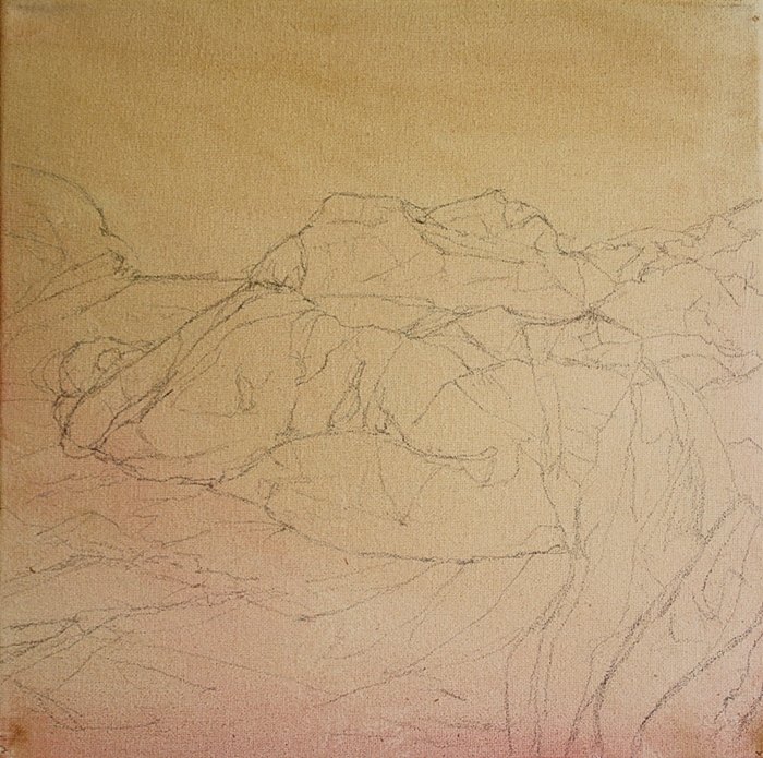
Painting drapery well, whether it is bed sheets, clothing or curtains relies on two elements; accurate drawing and good value control. Without these, the painting becomes an exercise in frustration.  This is one of those times when rushing in without a plan seldom works. A detailed drawing on toned canvas was done on Friday night, ready to start work on this weekend.


Drapery always looks intimidating and complex and many people steer away from it, but like most things, if broken down into individual sections,  and with a value map to guide me, it becomes much more manageable. 

This painting is 12" x 12" oil on stretched canvas.  Its at the stage where I have the shapes and values in, now its time to add more detail and make adjustments to bring it to completion.   I had titled the painting Empty Bed Blues, then realized there was an 1928 song from Bessie Smith called the same. Does that mean I need to change the title?


Thursday, August 23, 2012

Texture


Texture is addictive and so full of possibility.  One cannot help but adore it.

I'm still working on tissue and gesso with watercolour washes and am preparing a snapshot of different pastes and gels and how they behave for an upcoming workshop.  I splurged today and ordered some more to add to some of the basic ones I already have and look forward to seeing what I can produce with them.


This is a piece called 'Laundry Day'.  I love the look of an unmade bed, all those wrinkles, dark corners and mounds.  Making a bed, well that's another story, one of those chores that have to be done without a lot of thinking.

I have a painting in mind for an unmade bed and need just the right light to make it happen, hopefully this weekend.

Tuesday, August 21, 2012

Firebird


The beauty in abstraction is that it can also let you find form where you thought there was none.

This combination of gesso and tissue on watercolour paper was randomly placed, simply 'glued' in place with gesso behind and on the tissue to act as a receptacle for colour.  The crevices that the paper creates and the texture of the gesso give a wonderful surface to experiment with.

After a few washes of watercolour, the form of a bird started to emerge from the surface.  I continued to allow it to come forward with darker washes at the edges and suddenly there was the firebird.  So named because of the intense golds and reds that predominate.

You never know what you will find if you look hard enough.

Saturday, August 18, 2012

Monotypes


Today the art group that I am part of met to do some monotype printmaking.  Its good to get together and see how everyone approaches a technique and subject and to learn from successes and failures.

I was tired today and I think that impacted on how I approached the printing.  While I enjoyed the process, I couldn't seem to create anything that was a 'keeper'.  Not that I expect everything that I do to make the grade, and often it doesn't. Like many techniques, the more you practice, the better you become, the less mistakes and more successes.

I used several plexiglass printing plates as well as a gel plate.  The use of oil based inks allowed me time to work on drawing into the plate with tools, cotton swabs and tissues and this print of a river was one of the first pieces I tried today and about the only one that is worth showing.

I had worked on a series of "hidden" rivers in the city a couple of years ago and this was one of them, fairly close to where I work. Small streams that wind through the city on their way to ocean are often overlooked by the public who walk and drive past them daily.

The print is 8" x 10" on Iwara Japanese paper using prussian blue oil based Caligo ink.

Friday, August 17, 2012

Fossil


 The process of seeing the world through a sheen of wax has inspired me and I'm bubbling over with ideas of things I want to try, both large and small with this technique.

I found an old experimental gyotaku piece I'd done a couple of years ago which reminded me of a fossilized piece. It was a highly textured surface with a print of a smelt on the surface before additional gesso and sand had been added.  Additional texture had been added by pressing spinal column bones of fish into the surface, leaving trails of spikes across the surface. The wax gives a wonderful new dimension to paintings and prints like this, diffusing the light and swirling coloured wax over the surface,still allowing the shapes beneath to show through.  I still don't know which way up the final piece will be.  Logically, perhaps, this should be how it sits, however, a vertical format works well for it too, as well as flipping it horizontally. 


I think this may have merit to try a larger gyotaku piece with, embedding the print into the surface.  I have some more encaustic wax and damar crystal on its way so that I can make my own as well as use commercially prepared wax. That way I can ensure I have the colours I want for the pieces I have in mind.

Meanwhile this piece  6" x 12" shows the range of colour and depth that can be achieved with encaustic wax over other mediums.

Wednesday, August 15, 2012

Floating around


 This is the first paint I've put to canvas in about two weeks and I've missed it.

This boat is part of a demo for an upcoming online workshop on painting water that I'll offer later in the fall.  There's a lot of work to go into the workshop yet and I hope I can meet the deadline I've imposed.  If not, I'll simply push it forward a couple of weeks.

Here's a short excerpt where I try to paint and talk at the same time.  That is so difficult.  I'm sure it comes with practice, but I find one or the other takes precedence, leaving its partner in limbo.

Tonight is the loosely blocked in form of the boat.  I may alter the palette for the darker sections of water.  I used Moonglow, a Daniel Smith oil paint, simply because it was new and I wanted to try it, but its a bit to purple/grey for this piece I think. The experimentation and finding the right palette to ensure success for those following is crucial.  Although any palette of colours could be used, I have my own favourites, one being Manganese Blue.  Its a perfect blue, reflecting sky in the Atlantic I believe. 


Tuesday, August 14, 2012

The working tools

I never lose my fascination for drawing or my need to encourage others to envelop this most basic form of art.   Without strength in drawing, the ability to create is compromised I believe.  To see the concentration on classic technique being lost in some art schools in favour of conceptual art and freedom of expression is worrisome.  The need for knowledge on how to construct shapes, understand values and colours and how to apply paints to surfaces will always be there.  Avoiding the those skill development tools is denying or holding back potential for creation.

Sketchbooks are my working tools. I keep a sketchbook near to try out ideas and compositions and as with most paintings, a drawing is the first step.  This fish I found in a market in Saint John.  I think its a gar, but perhaps someone can correct me.  If I hadn't been on holiday, I would have bought it and printed it!  Instead I had to confine myself to sketching.

Of course water or creatures that live in it are never far from my thoughts, so these, done with a water soluble pencil and wash provide the basis for painting.  I use a sketchbook as way of recording colour as well as shapes.  The notes serve as reminders of specific areas of colour that I want to remember when transferring the sketch to a painting.  I take photos too, but the sketch gives a stronger impression of what I see and feel at the time, such as the one below. 

Tools for creating art are what you make them do for you.  Supports can vary from the most primitive to the most elaborate as can mediums and tools to make marks with.  One is no better than the other, although a degree of snob appeal for branding is present in some artists, no different than there is in clothing that people like to showcase as status symbols. Tools don't 'cheat', they provide shortcuts to lessen the amount of time tedious work takes to complete.  I can't be persuaded that just because an artist lived 200 or 400 years ago that they wouldn't have jumped at the chance to shorten the time it took to enlarge a drawing or use a reference photo instead of freezing themselves in the cold and rain trying to duplicate the exact weather and light conditions for a scene.


Each person has different tools and varying needs, as well as ability.  How important are your tools and the process of creating through technique as well as expression?

Sunday, August 12, 2012

Fissure


There are some pieces that take a lot of coaxing to get out of their shell and this has been one of them.

It started out as a multimedia abstract, fairly straight forward, but with a vision in my head of what I wanted the final piece to look like.  I wanted it to seem multidimensional, layered, as if I could see through it as if looking down into clear water.

I ordered cold wax but it didn't seem to do quite what I wanted, or maybe I didn't really give it enough of a chance to prove its talents.  I have pots of beeswax that I use when I create lotions and creams as well as using it and paraffin wax for batik, and thought they might provide the depth I was looking for.

Then I visited a new local art store which carry KAMA pigment products and I picked up a couple of encaustic paints.  Using small amounts of these diluted with my own beeswax, I created layers and fused them with a heat gun found in the barn.  The process becomes a little addictive and its difficult to know where to stop with it, the temptation to continue to add layers is so tempting.

I bought a small muffin tin to experiment with some of my own mixes of colour for additional encaustic work as I'd like to try another piece to go with this.  The fumes with melted wax can be a bit overpowering so good ventilation is needed, either an open window or an extraction fan system.


Meanwhile, I'm calling Fissure complete and apart from buffing it to a shine, it will be ready for a new home.  This is an 8 x 16 piece on canvas panel.

Friday, August 10, 2012

Online workshop on water


Water is often seen as a difficult subject to paint, but with the right techniques and an understanding of the subject, you will have all the information you need to paint realistic water scenes using oils.

This workshop will provide information on:
  •  How to create the best composition for your water painting
  • Understanding the benefits of creating value maps and studies and how to use them   effectively
  •  Recognizing various types of water surfaces and how the environment affects their appearance 
  •  Understanding how reflections appear on and in water and how to paint them realistically
  • Technical painting information on supports, materials, colour, values and painting application
Each week is reinforced by a practical exercise, culminating in you creating a final painting based on the information and techniques that you learn during the workshop. A step-by-step demonstration for the final painting and video instruction throughout the course, show detail and technique that will build your technical skills and help you develop an understanding of how to paint this unique, ever changing subject.

More details will be released as they become available.  I'll be creating and filming the painting demos that go with the course and registration will be available on September 1st, with the course going live hopefully by the end of September. 

A newsletter will go out within the next few days, so everything's a flurry of activity.  And just three more days of holiday left!  Where does it all go and why doesn't the rest of time go by so swiftly?

Back in the studio


I'm back from a short break and a little travel time.  Heat, new sights, new places and  new inspiration accompanied me.  Unfortunately the inspiration seemed to take a nosedive when I entered the studio.  Some careful consideration of the direction I want to go in is needed again to get my sea legs under me once more.


As usual when travelling I have very little time to devote to sketching or painting unless the holiday is devoted to that task, so I squeeze it in when I can.  This time, I stole some sketching time while relaxing in a hotel and also on a ferry.  Those times, when not much else can intrude on life tend to be the best times for me to concentrate on sketches.

I sketched these hotel room views in a 6 x 12 multimedia sketchbook with a micron pen.


Being a water baby, I gravitate towards the beach and ocean wherever I go.  In PEI  I wasn't disappointed in terms of sand and warm waters.  The red sand reflecting through the water should make for some interesting paintings.  I was struck by contrasts a lot in this trip.  The bright sun helped with strong shadows, emphasizing colours.


I took a ferry to Grand Manan, a small island off New Brunswick and spent a few hours exploring the nooks and crannies there.  Its a compact community spread over the rocky land, fueled by the lobster fishery and tourism.  There I discovered an abandoned sardine smokehouse 'village'.  There must have been a dozen large smokehouses sitting on the shoreline and with the fog that day, there was an eerie, ghost town feel walking around the silent buildings.


I did a little geneology side trip in Nova Scotia to Fox Point and Hubbard's Cove where relatives on my father's side came from and many are buried there.  There is something satisfying about walking on the same ground as they did.  And I can see why the area was appealing.  This little beach in Fox Point made me want to stay too.


Now its time to get some new work underway, get a newsletter out the door by the end of the week and pay a visit to a new art supply store in town, Urchin before heading back to the day job on Tuesday.  I'd better get moving!


Saturday, July 28, 2012

Break time


I've been working on the as yet unnamed abstract piece and flipped in horizontally to see how it looks.  I think I prefer it this way.  I've added more intensity to the colour through glazes which add dept, but am not finished yet, there's still more to go as I wait for some cold wax to arrive.  I want to achieve a translucent look to the piece and the cold wax may do what I envisage.

Meanwhile all will have to wait for 10 days while I take a break.  I'm heading to Prince Edward Island, New Brunswick and Nova Scotia to kick back on the beach, explore, eat, relax, sketch and find inspiration for new pieces.  I'm leaving tomorrow first thing and haven't even begun to pack yet.  I guess I should get a move on with that, shouldn't I?  Then again, I can usually pack within an hour or less and travel as light as I possibly can.   As I don't plan on painting as such, I'll take some sketchbooks and perhaps my watercolour set, a few pencils and pens and I'll be ready to take on new views as they arise.

I likely won't be posting on the blog during this time, but will be providing updates on Facebook.  If you haven't 'Liked' my Artist or personal page there and would like to keep up with my travels, please join me there.  The link is on the right hand side of the blog.


Wednesday, July 25, 2012

Luxury or frugality?


This is about the half way mark of a so far unnamed abstract piece that's 8 x 16 on canvas panel. Its multimedia but predominantly oils and texture added with modeling paste and various gels that I'm experimenting with.  I love the texture that pastes give and how paint grabs the edges and scatters down of the surface.  Paint goes on thickly as do other mediums here.  I add, I take away, I add again, not with a particular method of end in mind, but as the feel of the painting presents itself.  I am never happier than when at the end of a tube of paint or tub of paste.  It shows progress and production for me and means I've created.

Most artists have a stash of paper, canvasses, paint, sketchbooks and all the paraphanalia that goes along with producing art.  What I have noticed is that some keep paper or pencils or paints sitting on a shelf without ever using them.  Some believe the paper is too good to use.  I understand hesitancy in embarking on a sheet of paper that costs $10 or $20 a sheet, but everything else is fair game and the artist is denied the pleasure of exploration into a new realm if supplies are not used.  Oddly enough there never seems to be the same fear embarking on a canvas, just paper.  Some decorative papers are beautiful enough to be framed as they are, but have the potential for creating even more beautiful art if used but canvas remains fairly static in appearance.  Of course, there's the risk of botching it, but that is there no matter what surface is used to create on. Often the repair and transformation turns out much better than what was originally planned.


Then there are the frugal painters who squeeze out a dime of paint on the palette and dilute it so much it never provides the covering power or the impact that it could.  Coloured pencil artists have fear of the sharpener as it uses up their pencils too quickly.  But isn't that what they're for?  To create texture, colour and depth? The frugal pastellists eke out strokes of dust onto paper to preserve wrappers and their sticks of pigment.

I understand the need to be frugal and not waste supplies or money, but when it comes to creating art, you really do get what you pay for, which applies to the artist and the collector.  What does scrimping on paint or supports do?  It frustrates the artist, who cannot create the vision that is in their head as they haven't allowed themselves to paint what they feel and really use their palette.   It supplies a mediocre product if cheap paper or canvas is used that warps or has an inferior surface making it difficult to apply the medium.  And the collector can tell. The gallery can tell. You can tell that its not what it should be.

Art is a luxury item and needs to look luxurious to attract a collector.  Be generous with paints, supports and framing as it always pays off in the end.

Monday, July 23, 2012

27.8


Its been warm for the last few weeks which is a blessing after the abysmal summer we had last year.  I know heat here is probably cool to many who live further south and are experiencing heat waves with temperatures over 100 degrees.  Here the temperatures are moderate, usually not getting up to more than low 80s at most.  The benefit and curse of living on an island.

And of course its all relative to what you're used to.

Sunday afternoon was hot in sun and in the shade beautifully cool.  27.8C = 82.4F  For me, a fabulous temperature to retreat to the gazebo or the shade of the trees in the garden.  This is the view looking towards the meadow at the back of the house.  The sun later in the afternoon was brilliant, bleaching out colour in contrast to the shade of the trees.

10" x 10" on canvas panel in oils.

And, I've noted that for some peculiar reason, all the content from the Followers gadget on this blog has disappeared.  Poof!  The piece is still there, but no names and I'm not sure why.  I shall have to investigate further. Hmmm...

Sunday, July 22, 2012

Bait


The poor capelin is often relegated to being a bait fish and there always seems to be something much larger chasing it besides humans.   Cod feast on capelin and humpback whales rise up from the deep waters, capelin jumping out of their open mouths as they breach.

I have a fondness for the underdog in most species, and the capelin is my favourite fish.  I don't eat them bacause I find the flavour a bit strong, but I do love to paint them.

This is the completed piece that I experimented with using silver and gold leaf.  I added oil glazes over the leaf to tone down the shine which was like looking in a mirror.  Now the silver and gold metals shine through the glazes and give a different appearance depending on the angle its viewed.

This piece is 8 x 16 on canvas panel.

Saturday, July 21, 2012

Printing texture

Pinot Noir

A friend, Brenda Rowe, suggested some printing practice at her studio this morning, so I packed up some supplies and headed over.   I used a gel plate and brought water based and oil based inks with me, as well as some pieces of plant and feathers to add texture to the prints.  This first print is of a grapevine leaf, the variety is Pinot Noir, which I have growing in the greenhouse.  This was printed using Caligo Safe Wash etching ink, carbon black.

It was really odd as the weather was warm today with a breeze which was making the inks dry almost faster than I could print.  The paint was being picked up from the plate onto the roller and it became quite frustrating for awhile.   I switched to the oil based inks and had a few issues but they resolved themselves.   I'll be working on some monotypes for the future when I have time to manipulate the inks on the plate.  This time I worked on textures and printed on subi and rice papers - mostly because I forgot to bring my other papers with me!

Threadbare

I used a combination of cheesecloth and thread for this second print.  This is the ghost print which I prefer to the original, shown here.


 Neutral colours in these prints remind me of etchings, especially when the detail is finer.

 Hanging on by a Thread

I also used colour in some prints and this second 'thread' piece I like as well. 


Friday, July 20, 2012

Pouch Cove Highway


I keep meaning to do some night time paintings but never seem to get around to it.  Living in the country means that the dark is reallllllllly dark with very little lighting besides the odd streetlight and the adjustment of your eyes to the light levels.   Of course on the road, there are passing cars which are a blessing and curse as they go by in terms of lighting.

This painting was done as the sun was going down.  Its amazing just how quickly it does go down and how little time there is to capture that exact moment in light. Its part factual, part memory and part a wish and a prayer.

The sky was dramatic over the sun drenched clouds at the horizon and the lights of the passing car added interest and life to the scene.  

This view of the Pouch Cove Highway is the one I travel daily and the main route off the road I live on.  No sidewalks, lots of trees and the road stretching on to the sea in several directions. 

Tuesday, July 17, 2012

Under the influence

 Under the Influence  SOLD

I am physically close to the ocean, likely emotionally too.  Its ceaseless motion is a constant factor and is influenced by wind and weather.  Its colour by light or lack of light.  Its sound influenced by the surface of the earth that it rolls its waves over.  Sand has a soft sound as the water retreats; pebbles clatter as they tumble with the movement of the wave backwards to its source.

This painting has all those influences in it.  An average sized wave making contact with the shoreline, a mix of gravel and sand.  Light giving shape and colour and the movement of wind and tides showing the water where to go.

It is 5" x 7" in oil on a canvas panel.

Sunday, July 15, 2012

All that glitters...


I've wanted to try a combination of oils and metal leaf in a painting for awhile and thought I'd attempt it with a little capelin.  Fish always have a sheen to them so were the obvious choice, at least for me.

Metal leaf is a fine layer of silver, copper or gold, either a pure form or composite material that is laid on a prepared surface.  The result is quite dramatic and near impossible to photograph well due to reflected light.

For this piece I'm using composite silver so I can work out the kinks without investing a lot of money in purchasing sterling silver or 24 karat gold leaf.   An adhesive is applied to the surface and let to sit to achieve a degree of tackiness.  The leaf is like fairy dust its so fine.  It comes on sheets of tissue backing ranging from 1.5 inches up to 5 or 6 inches square.  The metal is laid on the surface and gently brushed on, a similar technique to printmaking in some ways and you hope the leaf has adhered as you pull up the tissue.   Patching is always a given and is fairly seamless.  I use a template to mask the shapes I don't want covered in silver leaf, using tracing paper or similar to act as the shield.


In this piece I have some lumps and bumps where I was impatient in putting down the leaf when the adhesive was too wet.  The adhesive remains tacky up to 36 hours so there's lots of time to apply but only one chance to apply a sheet.   Over some areas that didn't adhere well, I added some gold leaf for interest in random, organic shapes.


The fish is a capelin and painted in oil.  The piece is still in progress so looks rough at the point, as expected.  It will be refined as I continue.   I'm not sure if I will leave the silver/gold leaf as it is and seal it or apply glazes in oil paint.  A glaze could be interesting as the silver would add another dimension in light reflection, not usually seen in transparent oils.  As its an experiment, perhaps I will try it to see what the effect is like.  I will wait until the oil paint on the bottom half of the image is dry as I want a cohesive glaze of colour over the whole piece.

Usually if left on its own, a sealer is used to prevent the metal leaf from tarnishing.  Again, another experiment of some with sealer before oil and without to see what the results are.

If it works well, I'll invest in some sterling silver and 24k gold leaf and work up some ideas for other pieces.

Thursday, July 12, 2012

Sketches


I had been neglecting my sketching and drawing lately, so am trying to rectify that. I do sketch most days, but not of scenes that I seek out.  My sketches are more utilitarian, sort of like taking vitamins.  You do it because you know its good for you.  I bought a lovely little hard cover sketchbook in Ottawa last month, one that fits nicely into a bag or purse without you noticing much that its there.   I've pulled it out over the last couple of weeks and sketched various subjects.  Sometimes I only have a few minutes and just get basic shapes down, other times I have longer and can work more on shading.

Today was beautifully warm and the water was calling me.  This boat, tied to a wharf fit the bill.  I spent perhaps an hour on this in total.  Thirty minutes wharfside and the rest filled in at home.  I'm still deciding whether or not to add a little colour to it.

 
This was the view of part of the garden at the rear of the house on Canada Day.  I sat in the gazebo and sketched part of the back of the house and shrubbery leading off to the woods.   I added a wash of colour to it after the initial sketch to provide a bit more interest. I would like to do more sketching outdoors and I  hope to get out this weekend.  Its a great way to capture some ideas for new paintings and drawing from life always is more fun, especially if you have people stopping by to see what you're doing.

I have an advantage of not having to go far to see pretty much any range of subject from water, trees, buildings, flowers, animals, fields, etc., etc.  One of the benefits from living in the middle of the woods!