Friday, November 15, 2013

E-book production


I've had my head down over a few projects in the last couple of weeks, one of which is the production of an e-book on palette knife painting.   This came from frustration on my part over the last year or two on not finding any practical resources for palette knife painting that explained the process.   As my experience in palette knife painting increased, so did my frustration at not having something or someone to compare notes with or help me over stumbling blocks.

As I've been teaching palette knife painting workshops as well, students are gasping for a resource that reinforces what they learned in the workshops and that need partially fueled my desire to go ahead with this book.

Necessity is the mother of invention it seems, so I decided that I would create the resource myself.  This ebook is a practical reference guide for painting with knives and covers everything from tools and paint to how the different strokes are created with a knife.  While not a major book (23 pages) I believe it will be a useful one in the arsenal of anyone wanting to learn more about this unique painting technique. 

Creating a resource means I can be selfish and have it the way I like to see art references presented.  Clear explanations and good images always cement the deal for me.  And price.  I want this to be as affordable as possible.  As an artist its important to me to be able to share techniques and ideas and this is one way of doing just that.

I'm currently working on the final edits for the book and then deciding which is the best way to make it available.  It should be ready to roll within the week and I'll have all the details on how to access a copy then.

Excerpt from the preface:


I created the Introduction to Palette Knife Painting as a reference guide for artists who are interested in learning  the techniques used in palette and painting knife to create impasto paintings. It contains practical information on palette knife choice and use, paint use and characteristics, techniques to achieve a variety of surface textures, lines and paint applications, as well as tips for cleaning and storing knives...


Thursday, November 14, 2013

Retail Therapy

http://www.jeanettejobson.com


Its inevitable that the Christmas season is just 6 weeks away and artists, like retail stores are getting ready for shoppers.  Artists do tend to negate the idea that they are also businesses, but its a reality, as we have to eat and pay bills just like everyone else.  Our ability to create visual art comes with the need to show it to the world, so others too can enjoy it and have something beautiful and unique to see every day.

 While I have art available on my website all year round, during this season, I try to become a problem solver for people by making a range of pieces available in several price points.  Not everyone has a huge budget to spend on original art, so there are cards, reproductions, small paintings, workshops and gift certificates available.

On December 1st, I'll be releasing the list of my 2014 art workshops as well as the launch of a seasonal gift suggestion page on my website and blog.   There'll be a few new items as well as some classics, so save the date and perhaps I can help you with your gift list this year! 

Support local artists and local business this year.  Your purchase will help keep visual artists producing beauty and your gift of local art or craft will introduce that beauty into others' lives.

Monday, November 11, 2013

Lest we forget


In memory of Canadians and Newfoundlanders who fought and died.

South African War (1899 - 1902)
First World War (1914 - 1918)
Second World War (1939 - 1945)
Korean War (1950 - 1953)
Canadian Armed Forces (1947 - present)


Thursday, November 07, 2013

Impermanance

Bright Red
18" x 24" oil

“Nothing in the world is permanent, and we’re foolish when we ask anything to last, but surely we’re still more foolish not to take delight in it while we have it.”
― W. Somerset Maugham

I pulled out an old painting that was started a few years ago and decided to revitalize it using a palette knife and some intense colours.  The colours I had, while quite saturated and intense, still didn't fit the vision in my head.  How to really make them stand out?  Fluorescent paint!

I ordered a few tubes of fluorescent oil paint from Kama Pigments and those colours...oh my, they are bright.  Of course, fluorescent paint is vivid in natural daylight which contains ultraviolet light but  under a black light the paint really become luminous.  I don't have a black light, but may get one just to understand the effect on the paint.

Unfortunately, fluorescent paint does tend to have lightfast issues.  Permanance of paint colour is rated on conditions that would represent approximately 20 years of gallery exposure.  The exact time of fading for fluorescent paint under home conditions I don't know.  But exposure to ultraviolet light can reduce the saturation of the colour, sometimes within an hour.

So why use a paint that is at risk of fading?  The colour. Nothing else has the intensity that fluorescent paints which highlight form and pull in the viewer and I love that those tropical colours and will experiment more with them soon.

The very impermanance of something can also be its appeal.

Monday, November 04, 2013

Fox Point

Fox Point
 30"x 40"
Oil on stretched canvas


I'm interested in the past and always feel a connection with what and who has gone before.

I've spent time reading about geneology and the connections to the UK on my mother's side of the family which stretch back to Dorset.  Not surprising, as so many of Newfoundland inhabitants have roots in either England or Ireland.  Going back into the 1600's was as far as I know and many of the towns in the south of England I knew from my time living there.  Some of the villages I wish I could explore more now that I know their names and the connection with relatives who came from there in the 16 and 1700s onward.

I had known little about my father's side until I started my own explorations which traced back to the 1600s again before coming to a stop - back to Germany.  The roots in Canada came direct from Germany with immigration in the 1700s.  So while surnames altered in spelling over time, the trace from then to current roots was in place and neighbouring towns, Fox Point and Hubbards Cove, about 30 minutes outside of Halifax where families stayed and established life became reality.

I visited the area, walked the shores and beaches and revelled in the fact that ancestors walked there before me.  And of course the water and boats pulled me in and this was one of my inspirations for this painting, which was painted thickly with a palette knife.  The texture for the dory and water seemed to work well for this piece.


Sunday, November 03, 2013

The end of an era

 BD
2000 - 2013

BD passed away suddenly on Saturday, probably taking him as much as me by surprise.  In the morning he was out in the garden, taking a bath, having treats, then in the afternoon, was found lying on the grass by the barn.

Just last week I took this photo of him, sitting in a pile of leaves in the garden. He was old, a bit arthritic, but loved slow explorations of the garden with Lucky, his Pekin friend.  He was the magnet in the farm yard for everyone who arrived, curious about who and what he was.


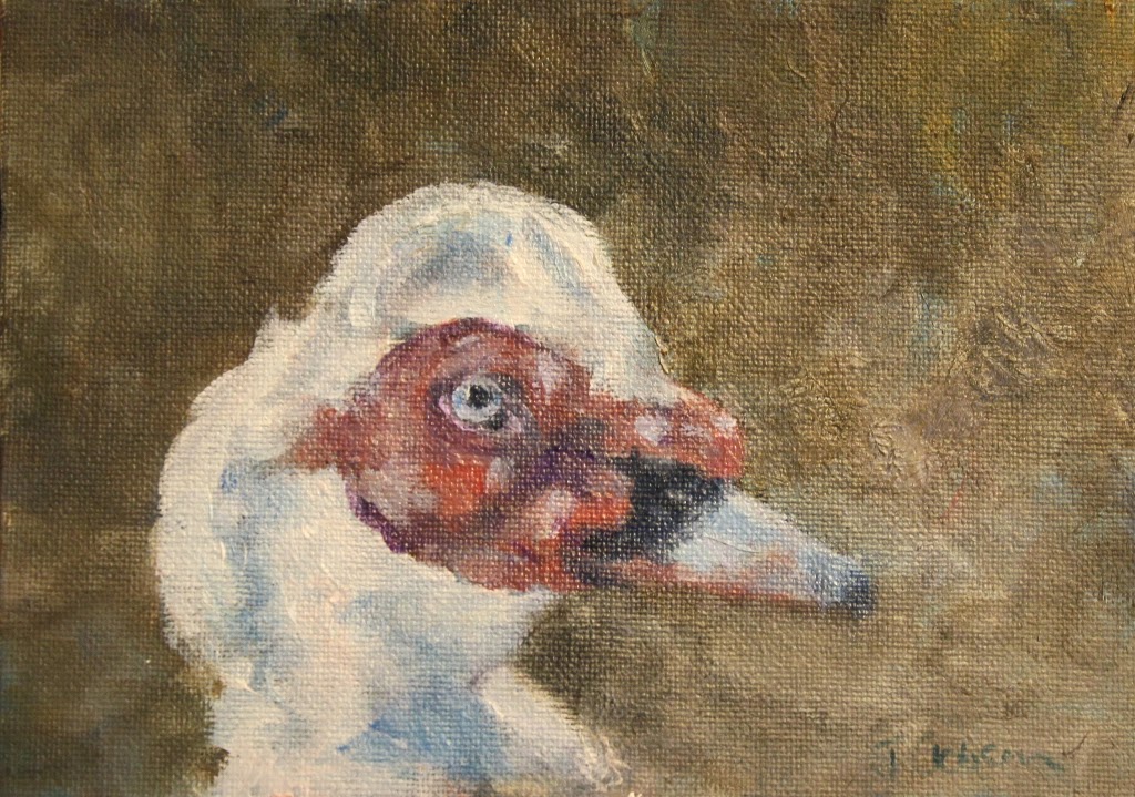
BD (short for Big Duck) was the leader of what was originally a small flock of nine Muscovy ducks that came to the farm in 2000.  He was bigger, stronger, pushier, but never mean.  Muscovies are large ducks, more the size of geese and quackless.  They hiss instead of quack and I will miss his greeting every night when I come home, crest up, tail wagging, hissing, more like a dog than a duck.  Lucky, his constant companion, will have to befriend the chickens more now and I am sure will miss BD.

 BD, on the far left, in his youth,overseeing the "girls" as they explored the car.  These ducks don't display the red facial characteristics until they're a year or two old. When they were young (under a year old) they had a habit of flying up onto cars, looking for interesting bugs to eat.    Not everyone thought it was amusing...

Perhaps its time for an updated portrait of him.  This was a small oil sketch done a few years ago.  I love that Elvis "hairdo" that he had.


Wednesday, October 30, 2013

Exhibition news


I'm looking forward to a group exhibition called Panorama at Peter Lewis Gallery at 5 Church Hill, St. John's.  With seven other artists, I'll be in fine company and would love to meet you there to see and talk about my art.

The opening reception is Friday November 1st 6:30 - 9:00pm and the exhibition runs until November 25th.


Turmoil (oil, 22" x 28") will be one of my paintings available in this exhibition.

Monday, October 28, 2013

Squeeze


As many people know, I've retired my "small works" to spend time creating larger paintings.  But occasionally a small piece slips in there and this is one of them.   Its 6" x 6" in oil on a solid panel that's quite substantial. 

I had barely painted all week outside of demo start,s and the need was there to work up my "palette knife" arm in preparation for a larger painting that is in the works.  This orange hanging in the sun fit the bill well.  There is something about orange that always appeals to me.  Just the sight of a pile of cadmium orange paint or a mixed orange makes me want to lick it!  No, no I don't.  But it does always look delicious.

This orphan small painting is looking for a good home and with that season being just around the corner, it may fit the bill for gift giving.  Adoption papers are available here.

Monday, October 21, 2013

Jekyll & Hyde

 Primary Wave
24" x 36" oil
(sorry for the poor image, better one soon)


I've been squeezing in paintings between teaching and dealing with life in general.  Boy there sure aren't enough hours in the day for me to fit in all I need to do!  But I am trying.

While there is a side of me that loves detailed paintings and drawings, there is also another side of me that equally loves creating large, more impressionistic paintings.  Palette knife painting fits in nicely by hitting my need to speed up the process and to have a looser feel to the work.

Detail from Primary Wave

In one of the workshops that I'm teaching, a demonstration was a wave.  Again, there were two versions:  one 8 x 16 that was detailed and the other 24 x 36 and full of movement, knife strokes and colour.  I'm sure there must be some psychological reason why I do this split, almost right brain/left brain or Jekyll and Hyde.  Perhaps I am cracking up after all! :)

I also bought these lovely little Italian painting knives from Utrecht, perfect for getting detail without smearing paint all over the place.  They have a lovely spring to them, I may well put a bunch of these on my Christmas list.

 Sea Memories
8" x 16" oil

So now that you've seen the wild, crazy wave, now you can see the sedate wave - Sea Memories.   Again in oil on canvas panel. Is it just me or do you have two different styles of painting?  And which do you prefer?

For me, I enjoy both, but there's something about the freedom that allows broad strokes and pulling colour out of the air (or in this case water) that takes the edge for me.  I think size has something to do with it as well.  Smaller picture planes seem to call for more carefully planned detail for me.

Jekyll and Hyde.  I may never change.


Tuesday, October 15, 2013

Country Food

 Country Food - October print

My head is all over the place lately.  I mean I know my focus in art but so many other things get thrown in the path to deal with.  But I am making progress.  One 24 x 30" piece 3/4th painted, another sketched out on a canvas and two more in sketch form waiting in the wings for decisions on size and support.

But today its the 15th of the month and you know what that means don't you??  FISHY BITS!!! :)  Yes, I am slightly crazed at this point but it too shall pass.

The October print is of an Arctic Char and called Country Food.  Northern aboriginal communities including the Inuit, were dependent on the Arctic Char for food and have used it for centuries as a staple fish.   Country food are things like arctic char, seal meat, whale, caribou etc.  Originally these foods were consumed for day to day survival.

Statistics Canada:
Country food remains an important food source for many Inuit. In 71% of Inuit households in the Arctic, at least half of the meat or fish eaten was country food.
  • Country food made up about half or more than half of the meat or fish eaten in 78% of Inuit households in Nunavik; 73% in Nunavut; 70% in the Inuvialuit region and 56% of Inuit households in Labrador.
  • Nearly half of all Inuit children in Nunavut, Nunavik and the Inuvialuit region ate wild meat five to seven days a week. In Labrador, 22% of Inuit children ate wild meat this often.
  • Inuit children in Nunavik were the most likely to eat fish and seafood on a regular basis.
You can purchase this print or any of the previous months' prints from the Fishy Bits page on my website.  All are original prints, no reproductions, printed in oil based inks on various Japanese papers.  This month its on a brilliant white Subi printmaking paper that really makes the Carbon Black ink contrast well.  The paper is 9" x 12" with a central print measuring 4" x 6".  Each print is named and signed and all prints are open editions.

Thursday, October 10, 2013

Take it!


I believe that it is an obligation of every artist to share technical information on how to create art, business information on how to manage your art and marketing information on how to sell your art with other artists.  Its how techniques are passed from one person to another and whether its in a structured environment such as art school or workshop or simply from one artist to another, that sharing process is good.  With the age of apprentices mostly past, learning from others outside a formal educational environment becomes essential.  And yes, its your responsibility as well as mine to pull those cards away from our chests and share them with the world of creatives.

“One of the surest tests of the superiority or inferiority of a poet is the way in which a poet borrows. Immature poets imitate mature poets steal bad poets deface what they take and good poets make it into something better or at least something different. The good poet welds his theft into a whole of feeling which is unique utterly different than that from which it is torn the bad poet throws it into something which has no cohesion. A good poet will usually borrow from authors remote in time or alien in language or diverse in interest.”


T.S. Eliot
Immature poets imitate; mature poets steal; bad poets deface what they take, and good poets make it into something better, or at least something different.
T. S. ELIOT, The Sacred Woo

Read more at http://www.notable-quotes.com/e/eliot_t_s.html#A3a6AV18Hvd16KKS.99

“One of the surest tests of the superiority or inferiority of a poet is the way in which a poet borrows. Immature poets imitate, mature poets steal, bad poets deface what they take, and good poets make it into something better or at least something different. The good poet welds his theft into a whole of feeling which is unique utterly different than that from which it is torn.  The bad poet throws it into something which has no cohesion. A good poet will usually borrow from authors remote in time or alien in language or diverse in interest.”

T.S. Eliot

The quote above can easily translate to artists instead of poets.  Creativity is creativity no matter what vein it takes.

I see other artists mimicking what I do or say or where I exhibit art, how I teach, even down to the same subject matter.  They take the words that I use in artist statements or in workshop brochures.  They use phrases that I use in ads, sometimes verbatim. Now taking information to learn from and taking information to make a profit from are two different things and that subject is complex and likely for another time.  Also taking ideas without permission is pretty rude too.  Often these behaviours are exhibited in people who truly don't know that its inappropriate.  Or it stems from inexperience and individuals wanting to speed up the learning process by using something that is already proven as successful.

As an art educator I see copying as a good thing.  Its what I hope people will do so as they learn, but obviously not if they profit from my personal ideas and hard work.  But didn't we all copy some one at some time?  Whether it was copying lines of the alphabet as we learned to write or sketching a master's painting in a museum, we all learned from someone else. The copying that I see as vital is technique. The copying that helps to explain and enhance skill levels and allows the copyist to understand the tools they need to spread their own creative wings can only be good. 

With a infinite number of ways of interpreting a subject, the world is still a small place and artists bump into each other creatively from time to time. What we see as the perfect subject or idea that we spend hours, days, months creating can dissolve us to tears when we see, on research, that the idea has been done.  Probably several times already.   But that shouldn't stop us.  We simply need to create the better mousetrap by building on that idea and the ideas that have gone before.  Isn't that the purpose of invention and creativity?

Yes, there can be boundaries that shouldn't be stepped on hard, but for the most part sharing should be genuine and open, given to empower others and encourage their growth.

So go ahead, take my ideas, take my words.  Use my templates, download my tutorials, copy my website design.  But on one condition.  You have to share your knowledge with others.  You cannot keep it to yourself and hope, selfishly, that by doing so, you are better than another person or have more opportunity or advantage than someone else.  You are only the better person if you help another person along on their artistic journey.  Karma rewards those who share.

And after all that, here's some of my newest sharing.  I have been creating some short videos on colour theory that I use in my workshops - the abbreviated version of the theory sessions.  This is the overview of a split primary palette that I use, using both cool and warm versions of each primary colour, plus a couple of other colours thrown in.   You can see this and others on my YouTube channel.  If you like it, let me know.  If you don't like it, still let me know. :)  If you subscribe to the channel, you'll get an email telling you when I post a new video.



Saturday, October 05, 2013

Prismatic realism

  Prism
8" x 16"  oil on panel

Doing demonstrations in art workshops is an opportunity to visually show what I talk about.  And as I'm working with artists at all levels, seeing is much more important than hearing about how something is done.  Theory, like any topic, is more easily absorbed using the see one, do one, teach one model. 
Stage 1

Prism came from a demo of a water state in my Painting Realistic Water workshop.  Wait a second I hear you say, realism with those colour in there?  Of course!   Realism comes from values, not colour.  If values indicate the changes in a surface effectively, you can use any colour you want and the piece will still "read" as what you intended to a viewer.

 Stage 2

So I'm asked how do I see these colours at the edge of the wave and on the beach?  Of course I don't have weird vision where I see brilliant colours appear.  I do see colours by close observation, but these colours do not have the saturation of what is in the painting.  My artistic license allows me to push the saturation of the muted colours I do see.  By not overloading the painting with colours that aren't in the same overall family of the water, the effect can work.  All the colours used here are found in the water and shoreline makeup in varying forms.  The saturation and single hue application is what pulls in the viewer and directs them around the painting. 

 Close up of colour and strokes

Additional Painting Realistic Water workshops will be available in 2014 and will be posted on my website, blog and Facebook page in December 2013.

Friday, October 04, 2013

Sharing Saturday


Its always good to share and on Saturday, October 5th I'm doing just that. For one day only I'm offering my Let's Do Lunch program for FREE to the first 10 people who have an art related question. It might be a technical question, about how to apply paint, draw an object, mix a colour or deal with composition or value. It could be something that's stumping you on your blog or website, such as how to add PayPal buttons or place something in a sidebar. It could be about art marketing, such as approaching a gallery for representation, or creating an artist statement.

Ask away! I will provide a written, detailed answer to your question by email. For full details about the program and how to ask your question visit the Let's Do Lunch page on my website.  


Send me your question on Saturday, October 5th and let me help you solve your art dilemma.  If you're not among the first ten questions in this promotion, I will let you know and you can still book a mini consultation.  And if you mention this post when you book your consultation,  I'll charge just $15 until October 15th, saving $4 off the regular price of $19.  (This applies only to mini consultations for single questions).

Art information is definitely worth the price of lunch.  Just ask Sue, Abby, Bruce, Rayna, Carol...  And when its free, well what are you waiting for?!   

Areas that I can assist you with
  • Technical painting and drawing techniques
  • Constructive critiques of paintings or drawings
  • Templates for artist statements, biographies and art resumes
  • Marketing your art
  • Art  blog or website analysis and  recommendations


Monday, September 30, 2013

Portrait swap - Gary Everest


Earlier in the summer, friend, portrait artist and fellow blogger, Gary Everest and I decided, at my suggest I might add...yes, me who paints fish and water, to do a portrait swap of each other.  It never was intended to be a physical swap of portraits, but like Topsy, it grew and grew.

In August I sent the portrait I painted of Gary winging its way to Honolulu to bask in the sun.  Today, Gary's portrait of me arrived to spend its life in a northern climate.  I checked the box, it didn't bring a sweater with it.  Not that it needed it today, it was 24C here today! The life in the skin tones and eyes is lovely in this portrait and really can't be seen in a photo on a computer screen.  If you're in my studio, ask to see Gary's portrait of me so you can see the colours and values for yourself.


Gary's ability at portraiture is apparent and while I didn't try to turn him into a fish, I'm sure the aquatic colouring in my portrait of him crept in there despite my best efforts. :)    Mine was loose and impressionistic, reflecting those colours and light in the Hawaiian landscape that he's lucky enough to live in.

Thanks Gary for a beautiful painting that I shall treasure. Of course, I had my hair cut since the image was sent but its me!  I'd strongly suggest that you visit Gary's blog and take some time to explore his portraits, they are beautiful and full of life.

Would I do a portrait swap again?  In a heartbeat, it was interesting, fun to push my work outside my usual comfort zone but without stress because it wasn't a paid commission.

Sunday, September 29, 2013

The Jumpers - complete

 The Jumpers
15" x 30" oil

Some early morning starts freed up painting time and let me make a concerted effort to complete this painting, The Jumpers.   Between classes and prep time, my painting time gets eaten into a  bit, so I'm finding any way I can to fit it in here and there.  Even with half an hour, its amazing just how much can be accomplished, especially if I don't let myself get sidetracked with email or Facebook, etc.

acrylic colour study   8 x 10

So here is the final image sitting in the studio waiting to see if a tweak or two is needed over the next few days before it joins its friends in the Water People series that's slowly growing.  I have a few more in this series yet to complete with sketches or colour studies done.  All I need is time!


Tuesday, September 24, 2013

Value studies


I am a lover of detail and process in some ways and have learned that the best way to avoid mistakes is to plan ahead.  One way to do this in painting is through value studies.  I know, I hear the groans as people want to jump onto the bright white canvas and slap on paint instantly.  That often leads to frustration as the canvas isn't toned, the composition not clearly thought out and the values as boring as waiting in a line of traffic, leading to endless fixes and fiddling, trying to match the vision in your head.

A hour (or three) of painting value studies really helps work out all the problems ahead of time. And often studies can go on to become detailed monochromatic paintings of beauty or small paintings in their own right.  Or in many cases, they become the map on which to base the painting that you originally had in your head.

As the study isn't precious, often being rendered on cheap canvas paper, changes can be made, colours altered and values adjusted long before you get to the point of frustration on a large canvas.  Or the value study can be done in acrylics then switch to oils for the main painting.

These are my principle elements for a value sketch, very similar to the beginning of a colour painting in fact..

1.  Forget detail -look only for shapes
2.  Squint to see overall values and to reduce colour distraction
3.  Tone your canvas with a neutral colour - raw or burnt umber work well and use the same colour to create your study. Shades of grey are a classic value study hue, but any colour will work in fact as long as you can go from dark to light using anywhere from 2 to 5 values.
4.  Sketch in your broadest shapes with your brush and pull out lighter areas with a rag while the paint is still wet. 
5.  Start with your darkest values and work your way up to the lightest.  Your values will make or break your painting so make sure your range and contrast are there.
6.  Keep sizes small, you're working out ideas, not creating masterpieces.  5 x 7 or smaller work well.
6.  Once you're happy with the result, start your colour journey!


Sunday, September 22, 2013

Studio time

 
Between teaching, writing curriculum and moving my mother into an assisted living home, I've lost a lot of painting time over the last week.  However, I was determined to fit in a few hours in the studio today and with another exhibition looming in November, I need to get some work finished.

Continuing in my Water People series I'm working on this piece called The Jumpers.  Its in oil on a 15 x 30 stretched canvas.   The interaction of adults and children with water is fascinating to watch as each approaches it differently. Children see it as a giant playground with little fear involved.  They create games with the water as these kids here are doing, jumping to avoid the incoming wave.  Adults tend to be more wary and less playful.  Obvious of course as the dangers of the ocean are known and appreciated more by adulthood.


I placed the children centrally in this but regretted it as it seemed a bit to stark, so the beach ball was added to balance the image and pull the eye around the composition.  One of the things that I talk about in my drawing and painting workshops is composition and its importance.  Balance, pattern, movement....all ensure the viewer stays in front of your image instead of moving on quickly.

How the eye tracks over a painting has been explored by several people and is quite an interesting subject that's worth artists reading.  If you know what attracts the viewer's eye, it can be another tool in your compositional arsenal when setting up a composition and palette.

This short video by James Gurney illustrated the movement of the eye over a painting.


Sunday, September 15, 2013

Father-Lasher


I've just released the September Fishy Bits! print.  This is the ninth in the series of monthly prints produced during 2013 of unique species of marine fish found in the waters around Newfoundland and Labrador.  
September's print is Father-Lasher.  This is a local name for the short horned sculpin, Myoxocephalus scorpius, so called for the fact that the male guards the eggs and defends itself by lashing out with its tail and spines. 

So many fish in the sea have been bestowed alternate names by locals based on behaviours or characteristics.  Most fishermen (or anyone one for that matter) aren't aware of scientific names of fish or even common names, so they refer to them based on sight or behaviour of the beast.  The short-horned sculpin is no different.  These sea scorpions are unique creatures, all mouth and spines but with amazing colouring for a north Atlantic fish. They tend to be half feared, half an annoyance when caught and they'll go for anything that passes in front of them.

I was daring enough to try a gyotaku print of one a few years ago without a lot of success.  With the very round and rough body, it was a challenge.  You can see the original post on that here.


You can find the September print and the others in the series on my website.  Prints are released on the 15th of the month and all are originals, no reproductions.  I used one of my favourite  Japanese papers, Kizuki Kozo, for this print, and each piece is hand titled and signed  The prints measure 4" x 6" with a generous border for framing.


Tuesday, September 10, 2013

Breakfast at Cora's


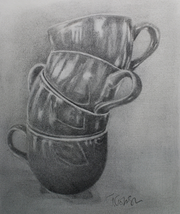
Every reflective surface appeals to the detail freak in me and ceramics are no different.  Its the play of light on hard surfaces that provides a challenge that I can't resist even if it defeats me now and then. 

While I work on demo subjects for a drawing class I came across this photo of a pile of cups.  It was taken in a local breakfast/brunch restaurant called Cora's last month.  They'd run out of the mugs they usually use and provided cups, promising mugs would be substituted shortly.  Making room on the table for plates of food and keeping baby fingers out of grab reach, we piled the cups and, while the light wasn't the greatest, I took a quick photo of it.  I was going to take another, but the waitress grabbed them away to replace them.  I don't think she quite understood why I was taking a photo of the cups.  I've given up trying to explain the things I grab shots of anymore.  It just gets too complex.

So working out the tilt of cups and ellipes and reflections took some time, a lot of measuring and alignment, but I think the drawing is there now.  The paper is in a cheap sketchbook and I would have preferred a smoother surface to work on if I wanted the drawing to be a "keeper".  But isn't that always how it works out?   No doubt DaVinci had bits of paper scattered all over his studio too, wishing he'd started it on something else.

A few tweaks here and there and its back in the sketchbook.


Friday, September 06, 2013

Construction site


I've been working on a few images as drawing technique examples for my upcoming workshops. Anyone who's followed my blog for any length of time knows I'm a strong pusher of drawing as the background substance to all forms of art. Each piece provides information on constructing a drawing using various techniques.  In this case, aligning landmarks to obtain drawing accuracy.  Of course during the workshop it will be talked about in much more detail and demonstrated then practiced, but these idea pages are the starting points for technique detail.

Often drawing is skipped over as boring, but is the "boring" part because the technique of how to do something unknown and frustration sets in?  Or is it wanting to jump ahead to the "good" part of laying down colour?  I know we live in an instant gratification society where we want  xyz without having to invest time, money or effort.  At times it frustrates me deeply.  Yet, the key to success is in technique, and of course, lots of practice.  Without it its like being given a car but no key.  You can play with the knobs and gears and lights, but you can't go anywhere.   With these workshops, I hope to share the techniques that were drilled into me years ago with anyone who wishes to learn them.  Bring a pencil and your patience.

Between technique applications I have to finish flipping my old studio into the teaching space.  Several years ago I bought a second hand professional drafting table for a steal and to be honest, haven't used it to its potential.  Its huge and tends to become the repository for large paintings and sheets of paper instead of the space it could be for creating.  So for it will head to the barn for storage until I decide what to do with it.

As for these snippets of drawing information, they may be compiled into an ebook in the future or some online classes. This one is not the final piece.  The drawing was on a piece of scrap paper (yes, I am not a purist for sketching materials) done at lunch.  Some cleaning up will be done before it reaches the world at large!  Lucky Duck?  Oh yes, he does exist and that is his name.  I'll tell you the story of how he got his name at the workshop if you don't already know it. And he really loves a treat of some bread in case you'd like to visit with him and B.D.


Monday, September 02, 2013

Manuels River

Manuels River
11 x 14"  oil on panel
Available  from my website

I love walking the trail along Manuels River when I'm in the area.  Its a long fast moving river that works its way over a rocky trail of large and small boulders left by glaciers millions of years ago.  The rocks in the Manuels River are estimated at 500 to 600 million years old. The rock formations are quite interesting and the river is very shallow in places with deeper pools and a prolific area in places for fossil discovery.

A new interpretation centre opened just this summer which gives a broader history of the area and the geological features of Manuels River.

Inspired by the river and its ancient rocks, this painting was completed this weekend.  Its 11 x 14 in oil on a gessoed masonite panel.  I use a small pile fabric roller to apply gesso to the panels and quite like the slight tooth it provides to the surface.  The panels are also significantly less expensive than canvasses or canvas panels.  It takes a little prep time, but I usually gesso a number of panels at the same time with a couple of coats and let them dry overnight.

Saturday, August 31, 2013

Let's Do Lunch!


Let’s Do Lunch!

 Lunch and Learn – mini art consultations

I firmly believe that part of the artist code of ethics should be one of  sharing knowledge. There are a lot of questions out there and I get asked quite a  few, some technical, some about marketing, some regarding the business of art.

 The "advice over lunch" concept is one that I use frequently in my business  and wanted to extend that opportunity to artists, but online instead  of  in person.  In a busy world, one on one conversations are the best way  of transferring information.

If you have an art technique that’s frustrating you, a painting or drawing that needs a constructive critique, are looking for answers to art business or marketing questions or don’t know where to start in developing your artist statement or bio, then let's do lunch!

When I officially launch this art consultancy program on September 15th, I will offer these
mini consultations for $19, the price of lunch. The introduction to this email service is just $10.00 until September 15, 2013!  Charges for Skype consultations are not reduced during this period.


How do we connect?  
Email me with a description of your art issue to jeanettejobson@gmail.com.  I will respond by email to confirm whether I am able to help you.  If  I am, you will be provided with a PayPal invoice and on receipt of payment I will email you with a comprehensive answer within 24 hours. (If there is a deluge of responses to this offer, response time may be longer than 24 hours and I will tell you at the time of your request what the expected response time will be).

If your question  is complex and needs additional time to provide appropriate assistance, there will be an additional $19 charge required.  I will inform you of the cost and provide you with the option to decline or proceed with the additional charge prior to invoicing you.

If you would prefer to talk one on one, there is an option for a 15 minute ($30) or 30 minute ($75) Skype consultation.  If you would like to book a consultation on Skype, please request this in your email and I will confirm a mutually convenient time and date for this service in my response to you.

So buy me lunch and let me help you solve your art problems!

Areas that I can assist you with
  • Explanations of technical painting and drawing techniques
  • Constructive critiques of paintings or drawings
  • Templates for artist statements, biographies and art resumes
  • Ideas for marketing your art and increasing your visibility
  • Art blog or website analysis and recommendations
          www.jeanette jobson.com          jeanettejobson@gmail.com          709-746-9968

Wednesday, August 28, 2013

Drawing


Constructing a shell - slideshows

UPDATE: I removed the sound file from this slideshow.  It was making me crazy and I presumed it was doing the same to you. Seemed like a good idea at the time...brain fart. Sorry :)

I have embarked on a series of workshops that I am offering from my home studio and the interest level in these classes is beyond my expectations, especially for the Introduction to Drawing Workshop series.   The first two workshops are filled and the last available one for 2013 begins on December 7th.  The painting workshops are rapidly filling and I know people often wait til the last minute to register for something that's a couple of months into the future.  However, there's just one spot left in the Painting Realistic Water.  This workshop was originally planned as an online workshop and I still hope to offer it that way.  The preparation of video and demo pieces is very time consuming but I promise you'll be the first to know when I have it available!

I love to see that desire to learn to draw.  For me, of course, its a no brainer.  To do any kind of art well I firmly believe that you need to have a good grounding in drawing.  Often people jump in to painting without the security of the structure that only a good drawing can provide, to find they need to make endless corrections and become frustrated with the whole process.


It seems there is an eager group of people anxious to learn the tricks of the trade and I'm happy to share my information with them.  There is no feeling better than seeing someone succeed and being there when the lightbulb goes on over their head as they realize its really all down to technique and practice, not talent.  Yes, of course, an interest needs to be present, but there is no smoke and mirrors, no magic.  Its a learned skill, no different than driving a car or playing the piano.  However, art is looked on as a "gift" or "talent", but people would never place skills such as driving or playing a musical instrument in the same magical category.

If you want to learn just how easy it is to draw,  register for the next Introduction to Drawing workshop, or maybe you want to learn more about painting. I can help you there too. You can register for available workshops through my website.  Dates for 2014 workshops will be posted in late December.

I put together this little slideshow of a drawing of a shell as an example.  Its a simple shape but complex too. It uses traditional drawing techniques including observing shapes, contour drawing and measurement of points to ensure accuracy.

Saturday, August 24, 2013

Strung Out - the update

 Strung Out  SOLD
12" x 24"  oil

Quite awhile ago I started this piece and it sat idle for a couple of months while others took the limelight. In between paintings, I thought I'd add more paint to it and see how its resurrection works. Close. Very close to completion.

These are salted cod drying on a clothes line in what was a neighbour's yard when I lived in Pouch Cove. Its an occasional scene one comes across that shows the bones of Newfoundland's heritage and how the salted dried cod, bacalhau to the Portugese, was currency and life in this province for hundreds of years.


Salt cod is an icon in the province and a common source of art in many forms.  I've used it in my gyotaku pieces and workshops as it rehydrates beautifully and with the skin and fins intact, very interesting prints can be made.   


Dried, it mellows to a creamy ochre colour with a variety of colours appearing in the flesh from pinks and purples to greens and blues.  Eating it, its a salt lover's dream.  Even with a day's worth of soaking and changing water, its still very salty and while I adore salt, its a bit much even for me at times.  Its a taste that probably needs to be acquired and is often served in a traditional fish and brewis, which is a "hash" of salt cod, rehydrated hard tack or ship's biscuits, potatoes and topped with a butter and onion translucent sauce (drawn butter), then topped with more heart stopping diced salty fat back pork that has been fried til crispy and known locally as "scruncions".  Like I said, its an acquired taste. 

The dish goes back hundreds of years and points to the way of life at the time.  Lack of refrigeration, limited fresh supplies and salted or dried food being a main source of preservation with dried ship's biscuits rounding out the meal to fill hungry bellies.  This food likely wasn't great nutritionally, but it was cheap and filling for families who depended on fishermen's incomes for subsistence.  For those brave enough to try it and who can access the ingredients, here is a recipe.

Tuesday, August 20, 2013

Colour matching


One of the challenges that many beginning artists have when painting is getting to grips with colour theory.  It can be daunting with many formulas, favourite primary colours and different colour wheels to choose from.  Too often the concept of colour mixing and determining the correct value and hue is misunderstood and mud happens more than is liked.

I'm determined to simplify the colour process in my workshops by breaking it down into basic colour mixing, understanding just what colours are in some of the primaries and why mud happens.  While there are a number of colours on my palette, some are standards, some come and go.  Here are the most common:

Cadmium yellow light
Cadmium red light or medium
Permanent rose
Alizarin crimson
Ultramarine blue
Phthalo blue
Raw or burnt sienna
Titanium white

From these I can mix pretty much any colour I want using variations of primary secondary and tertiary colours.   One of the exercises that I use in the workshops is getting participants to match colours on paint chips and in common objects.  This helps students explore the paint colours and understand the effects of one colour added to another and everyone really enjoys the challenge.

In the image above, I was matching paints to Mango Madness, a BEHR paint chip.  I don't know if I'd be brave enough to have this colour covering a whole room in my house, but I LOVE the colour.  What do you think?  Did I get it right?  Next time you're in a hardware or paint store, grab some paint chips you love and take them home to try to match the colour in paint.  And don't forget to write down what colours you used to get that hue, along with a paint swatch on paper or canvas. Its a great resource to keep colour swatches and notes about them.


This exercise and lots more will be used in my Painting Realistic Water and Palette Knife Painting workshops that are available this fall and winter from my studio in Flatrock, NL.  Registration is simple, classes are relaxed and learning is guaranteed.  For more details or to register, visit my website.  I'd love to see you in the studio soon.

Thursday, August 15, 2013

Working in series


Producing a series of paintings, even a small series, can help focus the mind and let you explore a subject in-depth and push further into ideas, composition and painting techniques.  Repetition is how we learn and each painting is different, even if similar material appears in each.

While I know I can jump all over the place with subject matter sometimes, I always drift back to the water and fish and reflections, whether aquatic or hard surfaces.  That play of light continues to draw me as well as challenge me.

I've completed three pieces in a series of paintings of people and the water.  It started out with the capelin fishery in June after watching children and adults wading out to catch the little fish in buckets and nets.  I am continuing to explore that with more paintings of people in the water waiting their turn at the easel.  I continue to go down that avenue, accosting people at the beach and asking if I can photograph them or their children.  Everyone I have asked has been very obliging and quite interested in what I'm doing.  No arrests yet. :)

I have other ideas of water-related paintings and need to set some up with models or patient friends willing to head into the water for the sake of art.  And the Atlantic can be cold!  However, last week when I was in it, it was surprisingly warm, after expecting it to be breath stoppingly cold, so there may be hope for models for me yet.

One of the paintings I wanted to do was of a baby at the water's edge.  I will be working on that and made a sketch of a possible painting from a photo of my daughter and grandson.  I enjoy working out compositions and pulling in aspects of more than one reference to create what I need.  Taking the time to draft out a plan helps solidify ideas and work out concepts before investing time into a larger piece that you discover won't work when you're half way through it.

There will be some cohesiveness beyond the subject matter as most of the pieces will be on the same size canvas - 12" x 24", except for the 12"x 12" capelin painting.  That may need a companion to go with it for balance.

You can see the other pieces in the series on my website:

The Capelin Catcher
The Bounty Hunter
Capelin Scull

Sunday, August 11, 2013

Gary Everest Portrait - complete

 Gary Everest
Oil on canvas panel
11" x 14"

I have virtually sat on my hands to avoid overworking this portrait.  There is a fine line between just enough and too much and failure and I walk it often.  I wish there was a delete button or a warning siren that would go off and prevent me from adding another brush stroke.

I've adjusted the colours and refined the shapes and added some colour to the shirt, that may need a little more work before signing.  Right now, its going to sit for a week to dry and look at my from across the studio while I contemplate any last alterations before its final and hands off.


Here's a closer view of brush strokes and colours.  As usual, my photography skills and photoediting as well as computer monitor colour limitations detract from the original.  I so wish there were a way to get a true representation of a painting online.  Or maybe its just my inability to do so well.  In reality, the portrait is warmer in value.  I may take the painting outside shortly and see if I can get a truer representation of colour.

I really enjoyed working on this portrait and Gary's working on mine which is quite fascinating to watch unfold.  I love seeing how other artists work, its like peeking over their shoulder in their studio and is always such a privilege to do so.  Do visit Gary's blog and watch his progress, you won't be disappointed.

It is always a challenge to work from a photograph and not have even brief access to the person in real life.  The combination of the two, especially in portraiture, provides a wealth of knowledge visually that a photo can never reveal, both in skin tone and in personality, that are vital to making a painting work well.